The network for creativity
Join 1.25M professional creatives like you
Connect with clients, get discovered, and run your business 100% commission-free
Creatives on Contra have earned over $150M and we are just getting started
Back to feedPost
Taste Test

I’m currently working on the brand identity for Forno Volpe 🦊🍕
I’ve explored two different directions and I’m stuck between them, so I’d love to get your opinion.
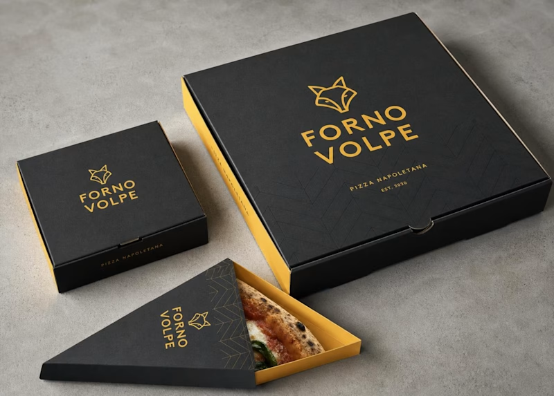
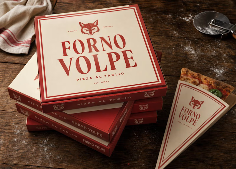
A - Classic & Warm
Cream + tomato red, vintage-inspired typography, and a bold fox emblem. Feels more traditional Italian and welcoming.
B - Modern & Bold
Charcoal + mustard, minimal fox line art, and a more modern, street-style feel.
Both have a completely different personality, and I honestly can’t decide which direction feels stronger.
Which branding would you choose? A or B? 👇

7 votes
Ends in 1d


B is more original and engaging, good design!

Love the black one. May be of the color combo.


the red boxes look great. i would pick A
The network for creativity
Join 1.25M professional creatives like you
Connect with clients, get discovered, and run your business 100% commission-free
Creatives on Contra have earned over $150M and we are just getting started
Trending
retrofuturism
Share your favorite designs from the past exploring the distant future. Or your own take on the aesthetic 🚀
halftone
Dots. Texture. Grain. Let's see your designs using the halftone technique.

Midjourney
Creatives are showing off what they're making with Midjourney.
colorgrade
Video editors sound off: How do you enhance the mood of your video in color grading?



Related posts

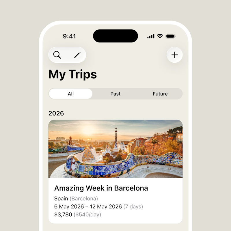
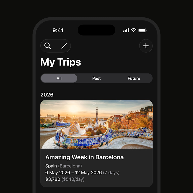
Would you prefer a light or dark color scheme?
57 voted
54%
48 voted
46%
105 votes
Closed

I always prefer the dark, but it's just a matter of taste 😃


Another round of mockups exploring the world of fruity, fizzy, slightly ridiculous refreshment.


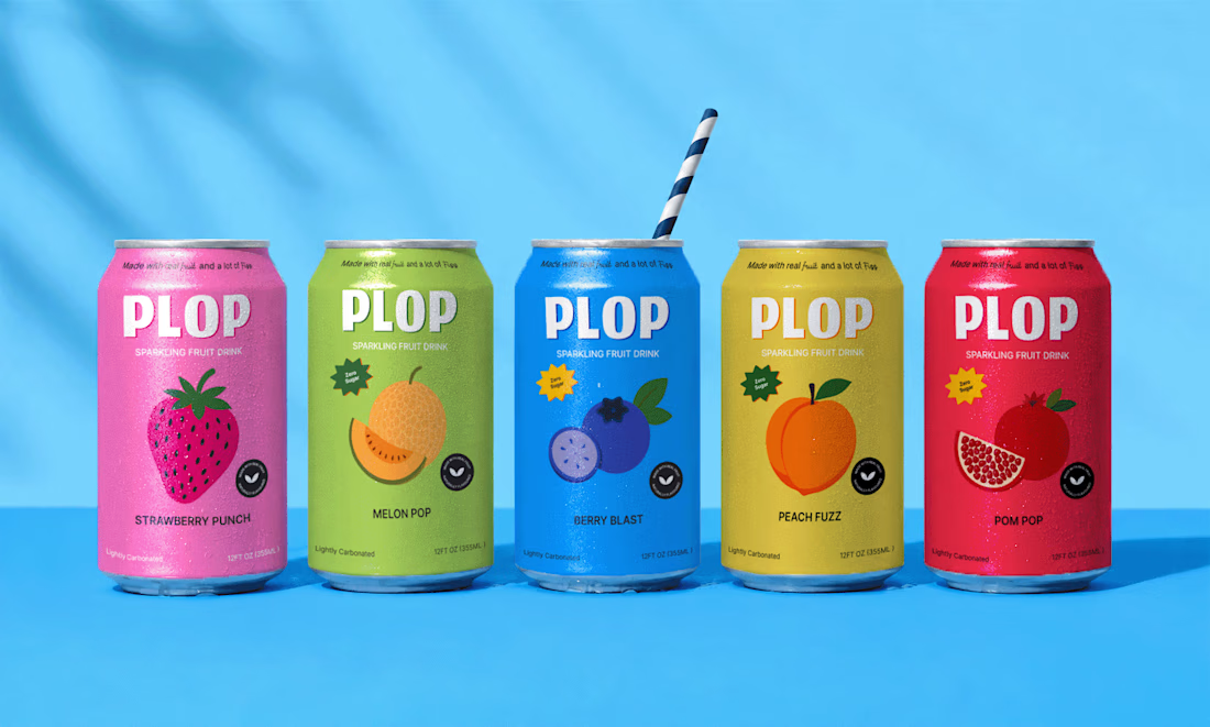
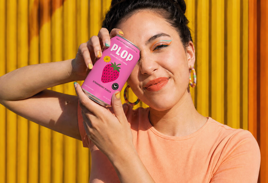
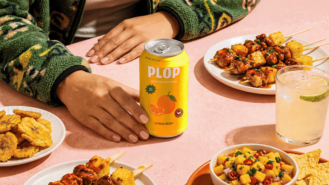

Love this, Karan 🔥

Same brand, same message, different energy.
Which one feels more "premium" to you?
9 voted
75%

3 voted
25%

12 votes
Closed

They both look good! The colors in B pop more 🙌