The network for creativity
Join 1.25M professional creatives like you
Connect with clients, get discovered, and run your business 100% commission-free
Creatives on Contra have earned over $150M and we are just getting started
Back to feedPost

When I design a website, I'm not only thinking about how Pretty it should look.
I'm thinking about what a first time visitor need to see, how they experience the brand and how easily they can move towards taking actions like booking, contact, shop
That's how I approach website projects

The network for creativity
Join 1.25M professional creatives like you
Connect with clients, get discovered, and run your business 100% commission-free
Creatives on Contra have earned over $150M and we are just getting started







Related posts

Working on a website redesign for one of the biggest crypto data providers.
Lots still under wraps, but these cards are my fav so far.
More soon ... 👀


The restraint in these dark cards is doing a lot of work—the tiny pixel details feel intentional, not decorative. The progression across the set makes the crypto product direction feel especially cohesive.



Nice work, Miguel!!

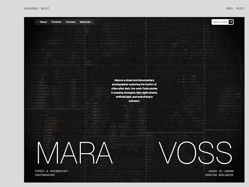
I tried experimenting a little with my previous design. I changed the fonts and background a bit. Which version do you like better?
22 voted
73%
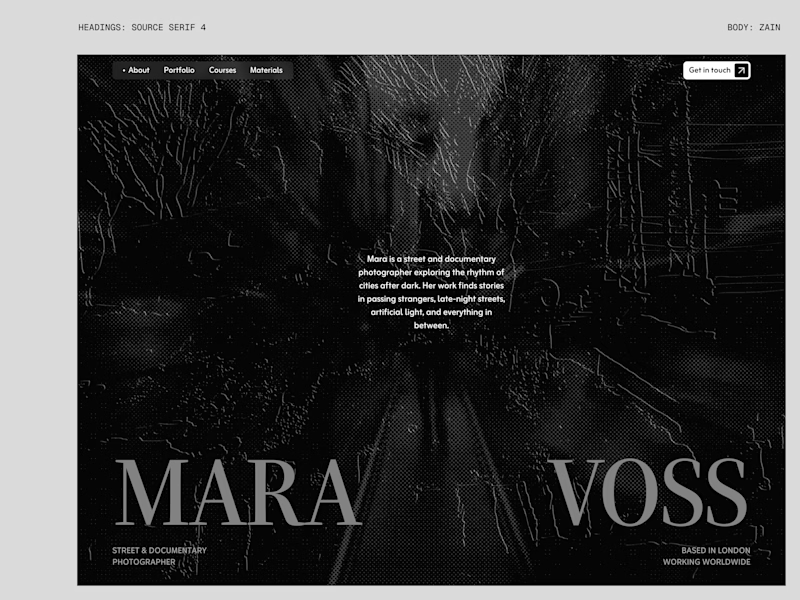
8 voted
27%
30 votes
Closed

New design for sure. The distressed texture in the type makes it feel like actual street photography lives inside the letters. The previous version is clean but this one has grit.