The network for creativity
Join 1.25M professional creatives like you
Connect with clients, get discovered, and run your business 100% commission-free
Creatives on Contra have earned over $150M and we are just getting started
Back to feedPost

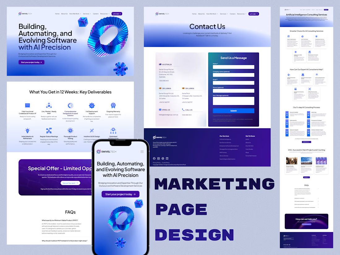
Marketing Landing Pages - Web Design
Redesigning marketing websites across 4 Swivel Group brands, working with the Lead UX Designer, marketing team, and co-founders.
Full Case Study : https://imalshakandamby.github.io/project-swivel.html
Problem:
Four disconnected brand sites had incomplete navigation, outdated UI, and no unified brand system, so visitors got a different experience on each one, with no clear path from landing to action.
Solution:
I rebuilt the navigation architecture, redesigned the visual language for an AI-forward positioning, mapped clear user journeys, established one design system across all four sites, and delivered fully responsive experiences.
Impact:
40% increase in lead conversion, workflow friction cut by 30% through embedded AI features, and 4x stronger brand consistency across all four sites.


The network for creativity
Join 1.25M professional creatives like you
Connect with clients, get discovered, and run your business 100% commission-free
Creatives on Contra have earned over $150M and we are just getting started







Related posts

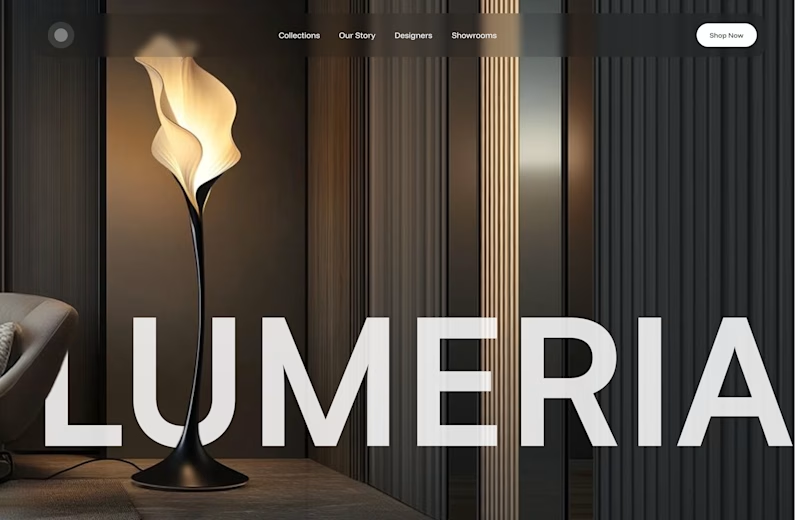
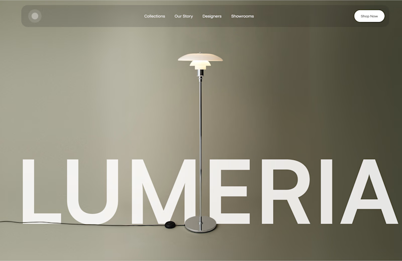
A little design exploration for practice ✨
This time, I’m working on a concept for a lighting brand.
Which direction do you prefer?
74 voted
70%
31 voted
30%
105 votes
Closed

Atmospheric, for a lighting brand it feels almost unfair not to show the product actually doing its job in a real room. The minimal version reads more like a furniture catalog to me. Is Lumeria leaning toward a specific price point or market that would push this one way or the other?



Amazing!

Made these animations with Claude for a B2B SaaS web design project.
Been experimenting with how AI can speed up the animation process while still keeping the interactions intentional and tied to the overall design.
Fun to see a simple idea turn into something that feels much more alive. ⚡


the interactions feel nicely intentional. did claude handle the motion logic too?