The network for creativity
Join 1.25M professional creatives like you
Connect with clients, get discovered, and run your business 100% commission-free
Creatives on Contra have earned over $150M and we are just getting started
Back to feedPost

Been working on this one for a while 🌿
ELVARA BOTANICALS
I wanted ELVARA to feel earthy, clean, simple and gender-neutral, while still having enough character to stand out as a skincare brand.
I worked on the visual direction, colour palette, typography and packaging for three products:
• Botanical Face Cleanser
• Hydrating Body Butter
• Daily Facial Oil
I kept the packaging system consistent across the whole product line, while using the colours and details to give each product its own identity.

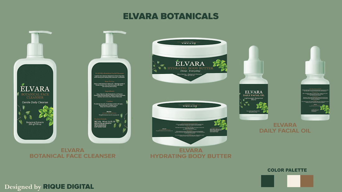
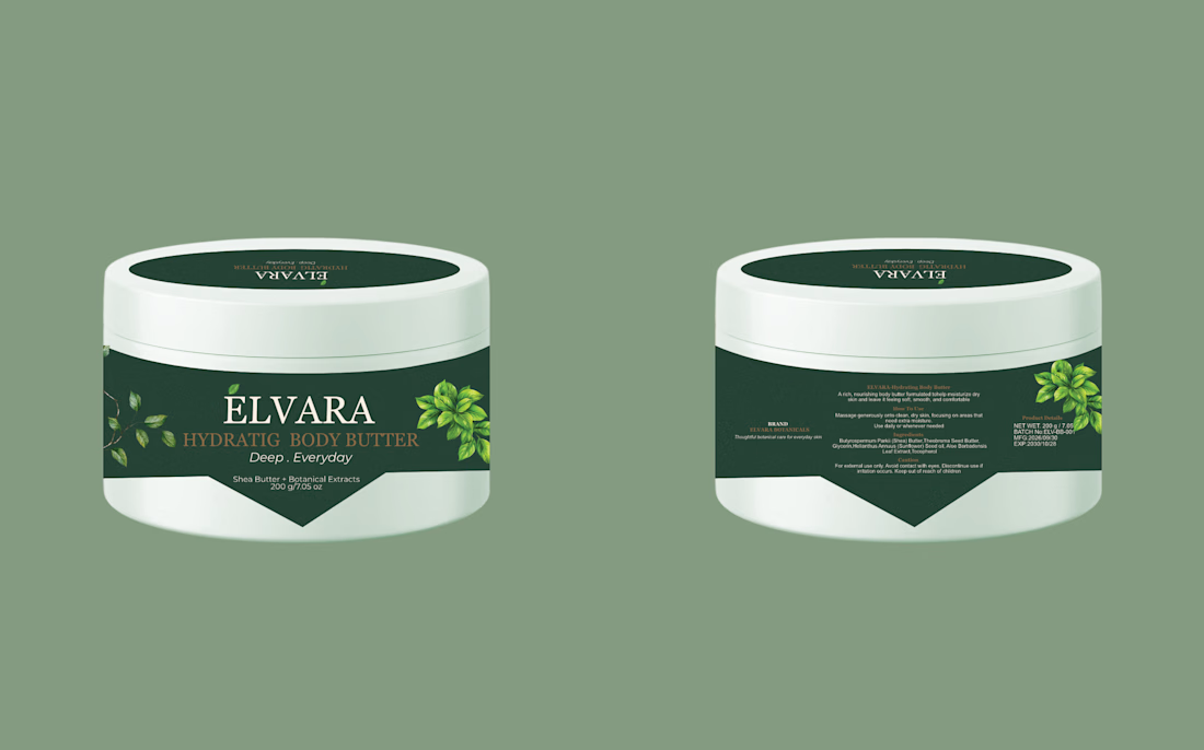
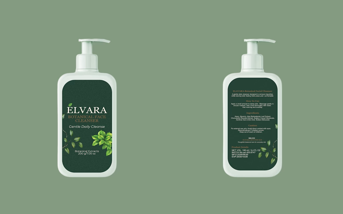
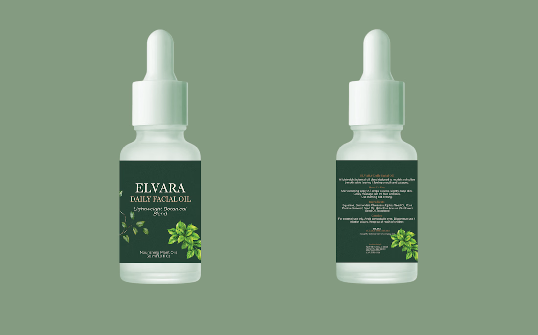

With one packaging system across a whole line, the risk is the three products blurring into each other on a shelf. Is the per-product identity carried mainly by the colour accents, or by the label details?

Like amazing 💯

Nice work!

Love how the system holds across the three products while each still has its own identity. One thought from designing for retail: test how the front panel reads as a tiny thumbnail on Amazon or Shopify. Earthy palettes can blend together at small sizes, so a stronger...
The network for creativity
Join 1.25M professional creatives like you
Connect with clients, get discovered, and run your business 100% commission-free
Creatives on Contra have earned over $150M and we are just getting started








Related posts

Brand New project🍓🍎🍒🫐
A colorful protein cereal bar brand for active young women. I designed the naming, logo, color system, packaging for five flavors, brandbook, social media posts and AI-generated product photography and video. The packaging was used as a reference in every image so the product looks exactly as designed.


That's really great motion graphics color palettes and visuals great packaging design ❤️❤️
Nice job Melina🔥



One letter. Eight personalities. 🔤
I explored the letter S in 8 different directions: soft and rounded, sharp and angular, bold and blocky, and fast like a bolt.
Same letter, same white-on-black treatment. The only thing that changes is the character.
Each mark could suit a different kind of brand, from tech and sports to fintech and lifestyle.
Which S would you pick, and what kind of brand would it belong to? Drop the number below. 👇
Looking for a logo mark or a full brand identity? My services are on my profile.
S letter designs is the best ❤️
Great job Shahwaiz🔥🔥

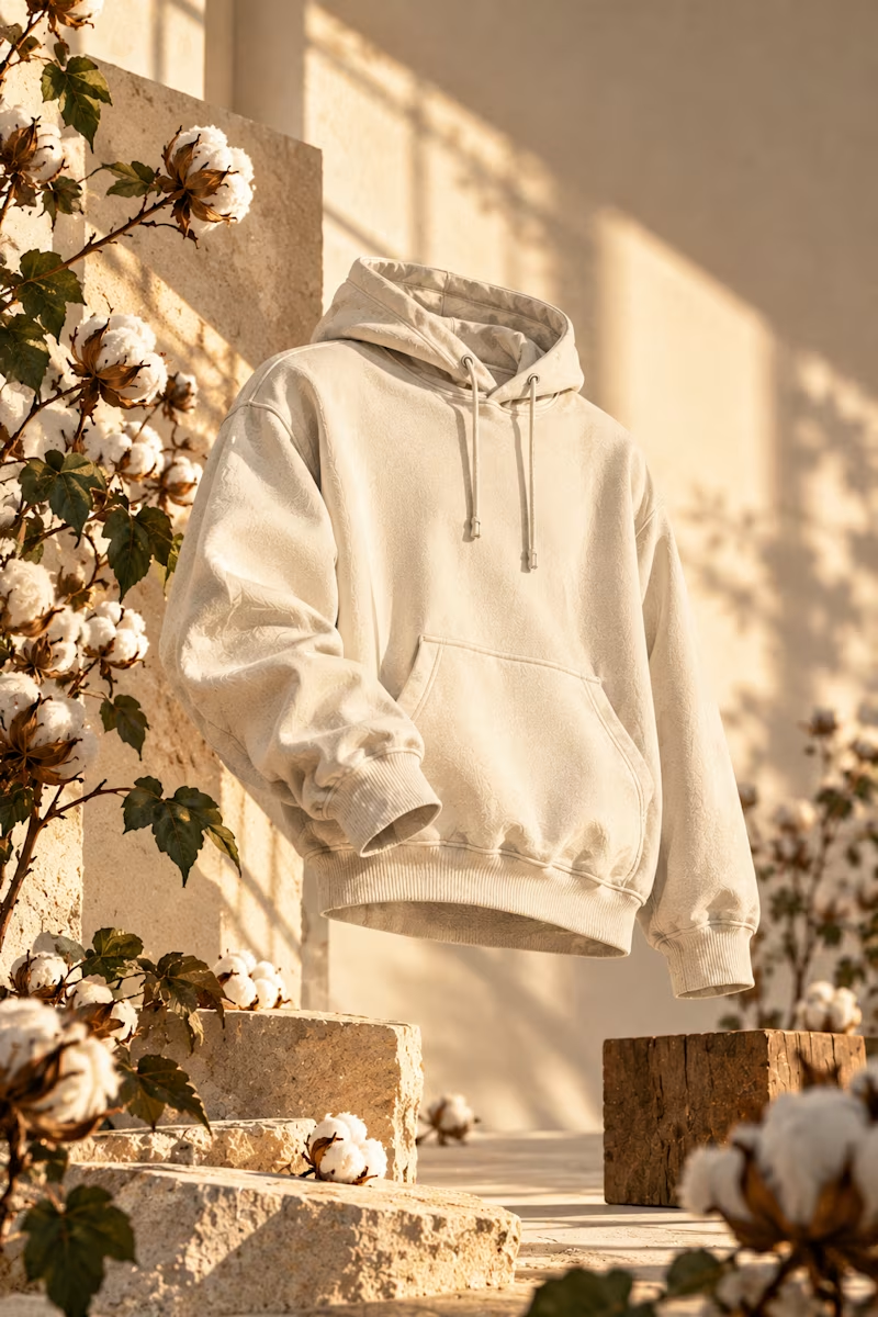
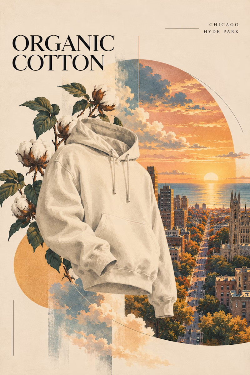
Two directions for an organic cotton apparel campaign. Which style works better?

6 voted
60%
4 voted
40%
10 votes
Closed
Sunlight studio is more stunning 🔥🔥
great job Mitchell❤️