The network for creativity
Join 1.25M professional creatives like you
Connect with clients, get discovered, and run your business 100% commission-free
Creatives on Contra have earned over $150M and we are just getting started
Back to feedPost


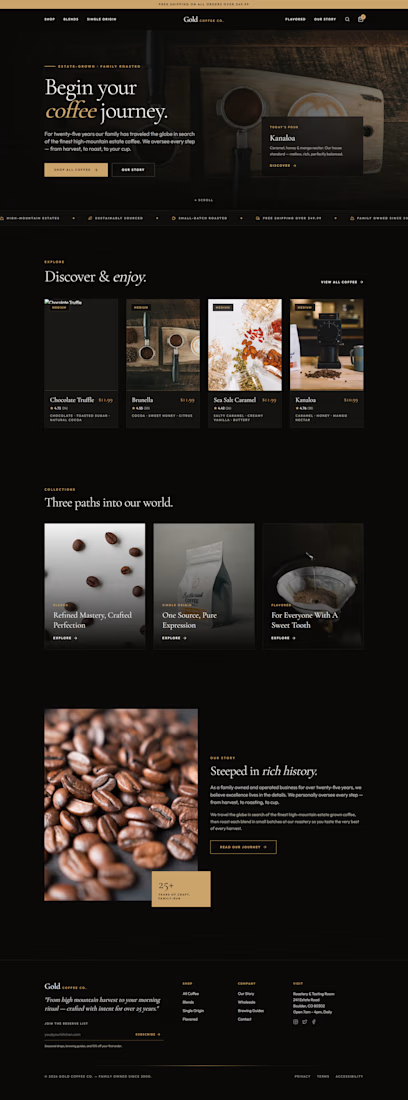
1. Pages to be Redesigned
We would like a complete website redesign covering all major pages, including:
Home Page
Shop / Products Page
Product Details Page
About Us Page
Cart Page
Checkout Page
Contact Us Page
A full multi-page redesign is preferred to create a strong retail-focused online shopping experience.
2. Design Style & Feel
The website should reflect a premium coffee brand with:
Warm and earthy color tones
Artisan coffee shop atmosphere
Modern and bold visual design
Clean, professional layouts
High-quality product presentation
Mobile-friendly and responsive design
The designer can suggest creative ideas while maintaining a premium coffee brand identity.
3. Functionality Requirements
The website should include working eCommerce functionality, such as:
Product listing and filtering
Product detail pages
Add-to-Cart functionality
Shopping Cart page
Cart drawer / mini cart
Checkout flow (demo or functional)
User-friendly navigation
Mobile-responsive experience
4. Product Data
For the design and development phase, product information can initially be hardcoded in the frontend. Dynamic backend integration can be added later if required.
5. Content & Brand Direction
The redesign should take inspiration from the existing Gold Coffee website while improving the overall user experience and visual appeal.
Please retain:
Brand identity and coffee-focused messaging
Company story and heritage (where applicable)
Core product categories
You may also take creative liberty to enhance content, layouts, imagery, and user experience while maintaining the premium coffee brand voice.


The network for creativity
Join 1.25M professional creatives like you
Connect with clients, get discovered, and run your business 100% commission-free
Creatives on Contra have earned over $150M and we are just getting started











Related posts



Your web sections always have such strong art direction. Great to see the brand carried right into the layout.

Every AI product apologizes for the wait. I designed the wait instead.
Latency: identity, interactive site and campaign built on Ma, the space that gives a thing its shape. The headline breathes in weight until the answer lands.
Design the pause.


Man, you’re superhuman; your consistency and quality are out of this world... congratulations on your work.

A few years ago I had the chance to take a course where one of the modules was taught by a designer I really admire, Joseph Berry.

The goal was to create a website for a product, in this case, a speaker. We went through the entire process, from receiving the brief to the very last detail, even modeling the product ourselves in 3D using Spline.
I learned so much, and also got to meet great designers. It’s amazing to see how each one has a different process, and having the chance to observe that and take a bit from each way of doing things to make it your own and develop a unique result really helps you grow a lot as a professional.
I’m sharing some frames from the project, hope you like them!

Great website design visuals I like the color palette ❤️❤️
Great job Ivan🎉🎉