The network for creativity
Join 1.25M professional creatives like you
Connect with clients, get discovered, and run your business 100% commission-free
Creatives on Contra have earned over $150M and we are just getting started
Back to feedPost

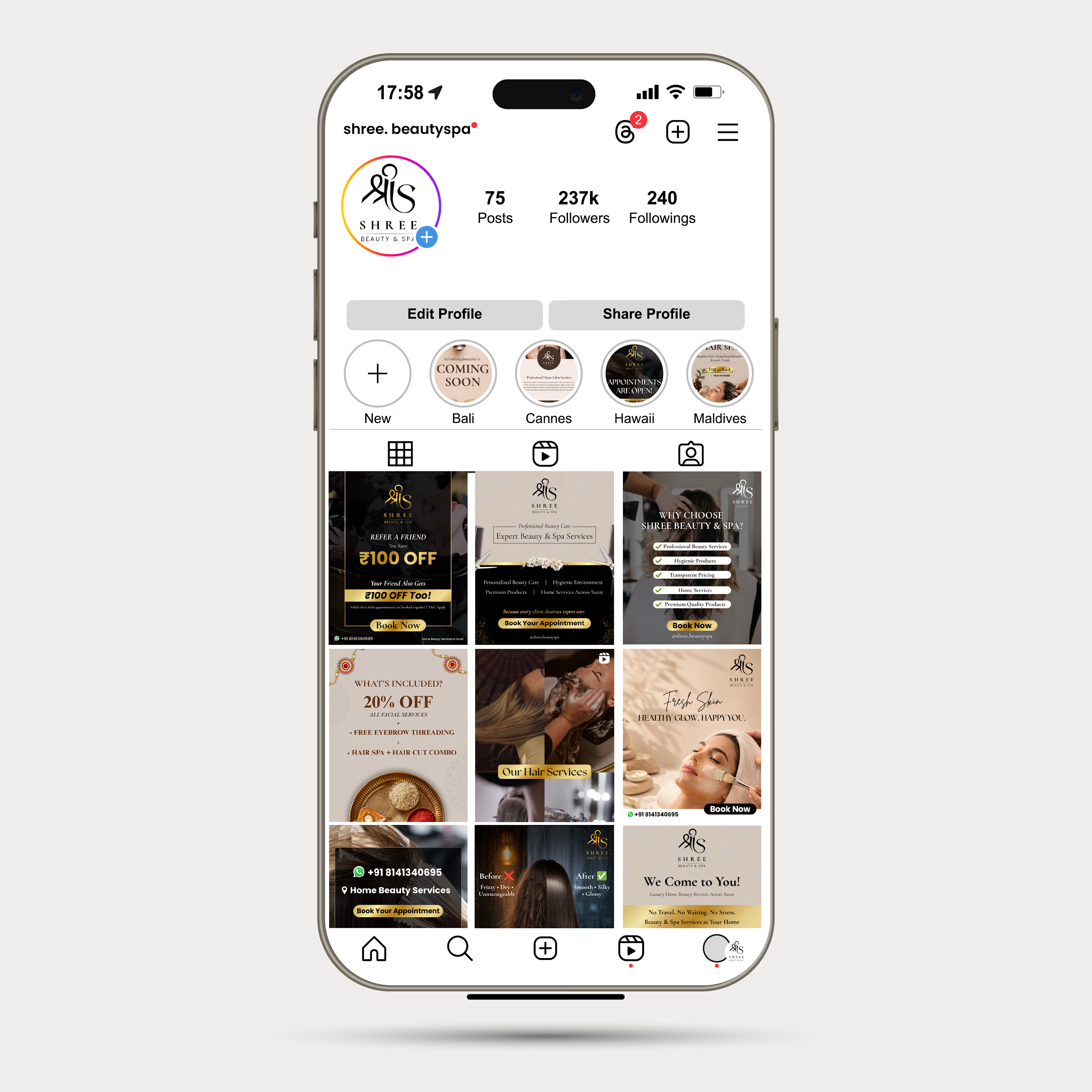
Created a cohesive Instagram presence for Shree Beauty & Spa with branded social media posts, promotional campaigns, and story designs.


The network for creativity
Join 1.25M professional creatives like you
Connect with clients, get discovered, and run your business 100% commission-free
Creatives on Contra have earned over $150M and we are just getting started







Related posts

Design Direction Poll!
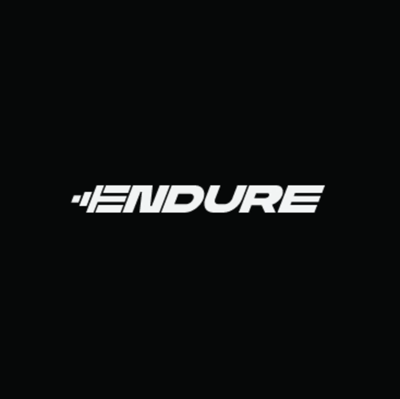
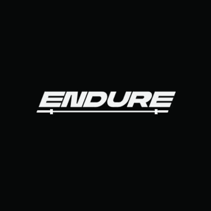
Two versions of the same Endure logo concept; same aggressive italic letterforms, same racing DNA. One detail changes the entire read.
Which version hits harder? 👇
14 voted
78%
4 voted
22%
18 votes
Closed



Took me a second to see the fold in the mark and now I can't unsee it, perfect for a dual-screen phone store. Was the slash always part of it or did it start as two plain stacked bars?

A cinematic sportswear campaign focused on performance, discipline, and pushing beyond limits, combining bold photography, dramatic lighting, product-focused compositions, and athletic storytelling.

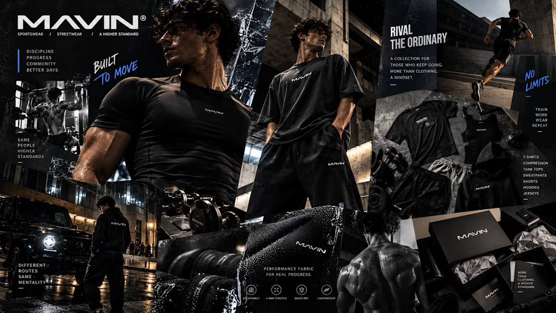

The lighting and composition give this campaign a strong sense of momentum. It feels disciplined and intense without becoming visually crowded. Was the athletic story planned first, or did it grow from the photography direction?