The network for creativity
Join 1.25M professional creatives like you
Connect with clients, get discovered, and run your business 100% commission-free
Creatives on Contra have earned over $150M and we are just getting started
Back to feedPost
Taste Test

Glimpses of micro-interactions we made for a new Framer CMS Website.
What do you think! Which one do you like more? 🔥

6 voted
60%
4 voted
40%
10 votes
Closed


the orange record looks so cool

interactive albums is great

Sick 🔥


I don't know which to pick but I will go for vinyl because the interactiveness looks unique
The network for creativity
Join 1.25M professional creatives like you
Connect with clients, get discovered, and run your business 100% commission-free
Creatives on Contra have earned over $150M and we are just getting started





Related posts

You leaned toward Atmospheric in my last taste test, so I took it beyond the hero.
Here’s the full homepage for the same fictional lighting studio, with two different scroll experiences: Fluid and Cinematic.
Which one makes you want to keep exploring?
Continuing from this post: https://contra.com/community/KacW2yxF-homepage-design-comparison-product-photography-vs
22 voted
46%
26 voted
54%
48 votes
Closed

I can't recognizable the difference but both of them are great 🎉🎉

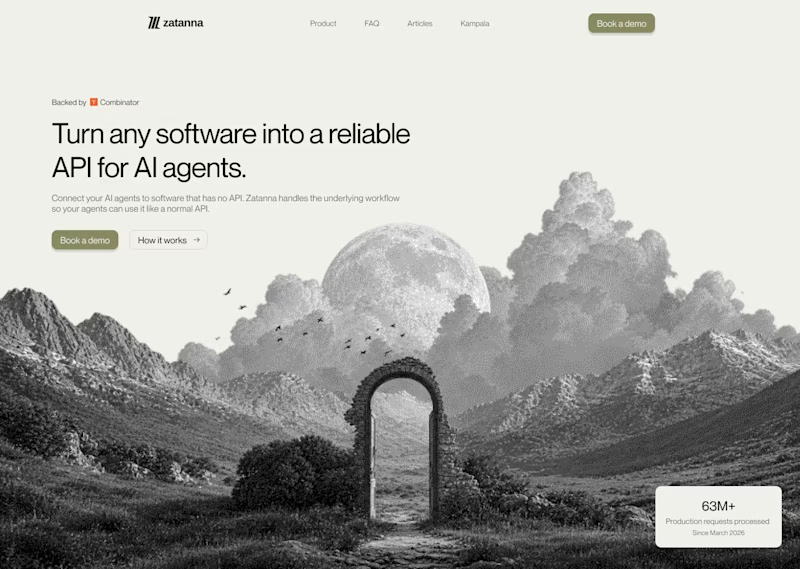
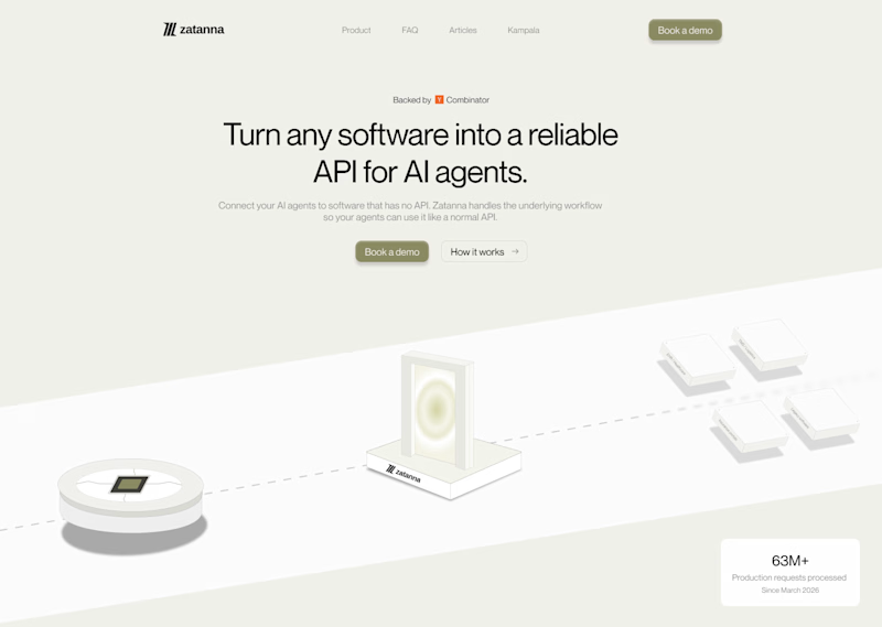
Which one brings more clarity to the hero section?
I was exploring a hero section concept for an AI product and tried two different visual directions.
Visual-led — focuses on explaining the idea through the interface/visual.
Isometric — uses a visual system to represent how the product works.
Both look good, but the real question isn't which one looks better.
Which one helps you understand the product faster?
That's something I always try to think about when designing hero sections — the visual should help explain the product, not just make the page look good.
Which one would you choose?
7 voted
58%
5 voted
42%
12 votes
Closed

The visual direction looks great, but I think Isometric does a better job of explaining the product.


Building a pet SaaS hero
Soft visuals, bold typography, and a clear conversion path, designed to make the product feel as friendly as the pets it helps
Built in Framer
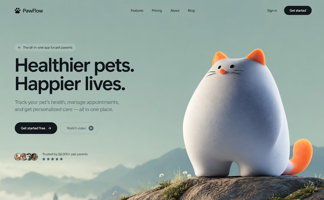

The dark CTA stands out against the soft sage background, even with the cat taking center stage. How are you handling the cat and headline on mobile: stacked or a tighter crop?