The network for creativity
Join 1.25M professional creatives like you
Connect with clients, get discovered, and run your business 100% commission-free
Creatives on Contra have earned over $150M and we are just getting started
Back to feedPost

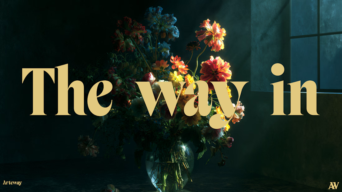
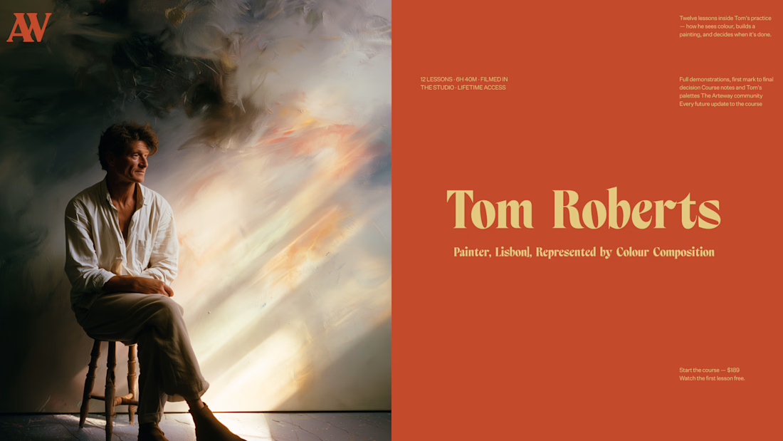
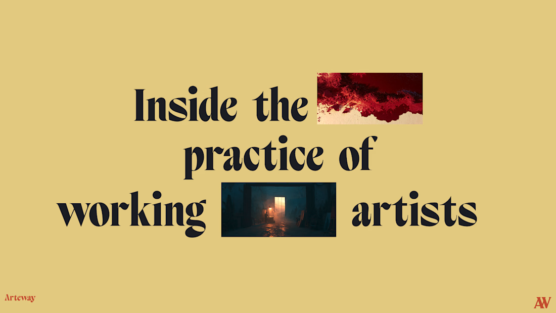
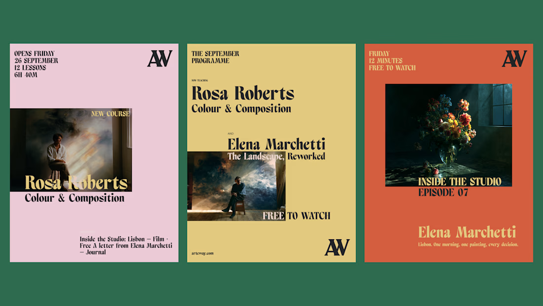

Nice work, If I may guess, rejected due to the typography?


From the look not even just typography but also the alignment of some texts box is not cool


Not at all, but just going with another concept that was suggested
oh ok cool

Hmm nice work still, would love to see the accepted concept
Will share when I can

Nice work
Thank you!

The muted rust/mustard/forest-green trio doing the unifying work is the interesting part here - it's what makes a floral macro shot, a moody portrait, and a magazine spread all read as one brand without leaning on a single logo mark.
Thank you!

Can't believe this was rejected... Excited to see what you come up with again

Client went with the second suggested direction

As a visual team, we know how tough it is when incredibly strong concepts like these hit the cutting room floor! The typography and mood here are fantastic. Definitely echo the others. would love to see the final accepted version!

maybe because of the typography
Nope, client went with the second concept

Beautiful balance of simplicity and uniqueness.

looks awesome 😍


rejected?? clients are wild

This is amazing

Outstanding work, I really like it! 🔥
Thank you!

I still think it looks good

Hands this best think I saw today
Thank you!

Why, it is so nice!
The network for creativity
Join 1.25M professional creatives like you
Connect with clients, get discovered, and run your business 100% commission-free
Creatives on Contra have earned over $150M and we are just getting started











Related posts

A little peek at the brand work we did for Elio Mortgage.
A warm, approachable identity full of warm vibrant colors paired with soft sun rising inspired gradients, inner glows and custom illustrations & more. Loved this direction!
Full case study coming soon, from process to final identity.
Plenty of logo explorations to share too!


That color palette takes the whole identity to a different level!! I loove it.

Brand Expressions -- Olivir



Thats so crazy!!!!!! Seeing this I feel we humans are still far better than AI

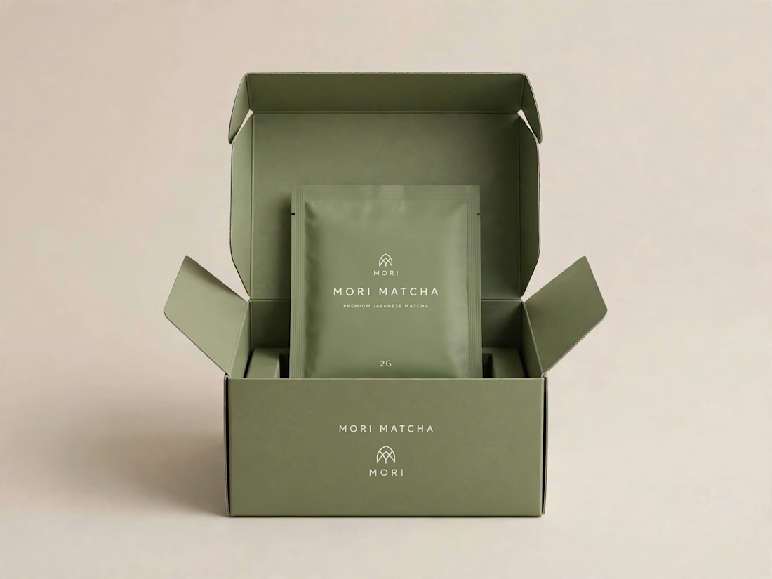
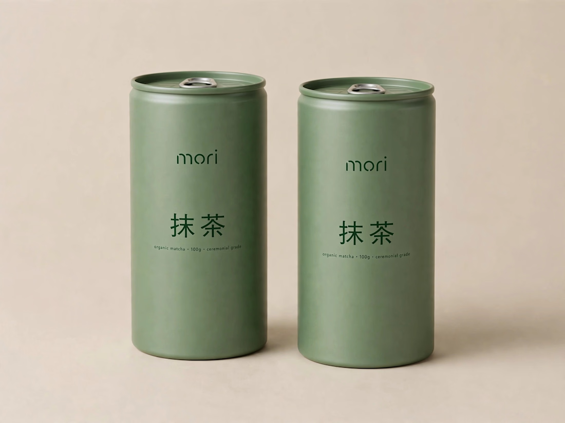
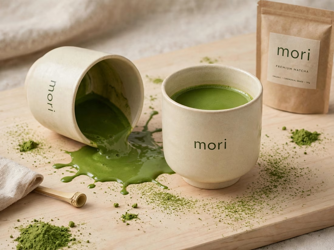
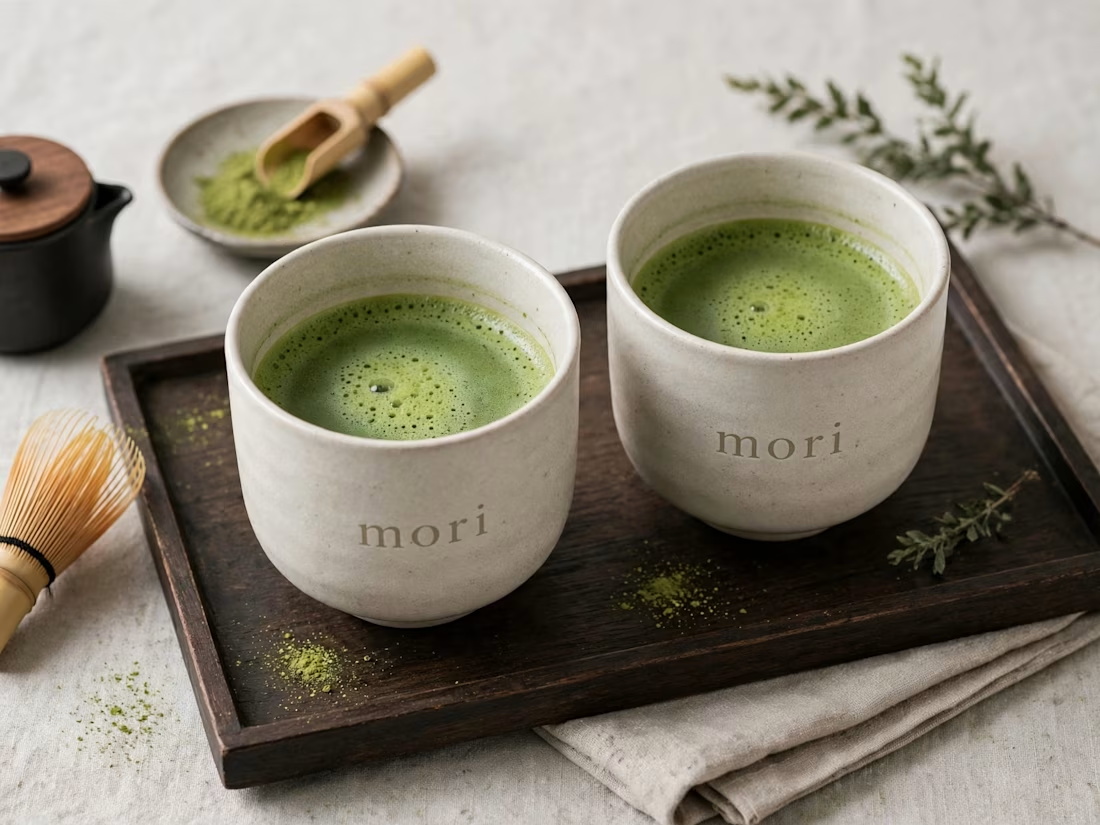
more visuals from my latest project — mori matcha 🍵
explored minimal Japanese packaging with earthy greens and calm typography.
focusing on premium ceramic cups and clean can design.
#branddesign #packagingdesign #visualidentity #brandstrategy #matcha #minimaldesign #japanesedesign #figma #mockup #branding