The network for creativity
Join 1.25M professional creatives like you
Connect with clients, get discovered, and run your business 100% commission-free
Creatives on Contra have earned over $150M and we are just getting started
Back to feedPost


The way the red and mustard palette carries from the storefront through the packaging and posters is really strong. It makes the brand feel like one system rather than separate pieces. How did you keep that bold colour working in the darker, moodier photography as well?

For this project, I focused on impactful yet quite desaturated colors. I used quite a lot of black and white imagery, with grainy texture to give it a vintage and art deco feel throughout. I tried keeping a good contrast between the colors used so there are no legibility issues
It was from the brief
The network for creativity
Join 1.25M professional creatives like you
Connect with clients, get discovered, and run your business 100% commission-free
Creatives on Contra have earned over $150M and we are just getting started


Related posts

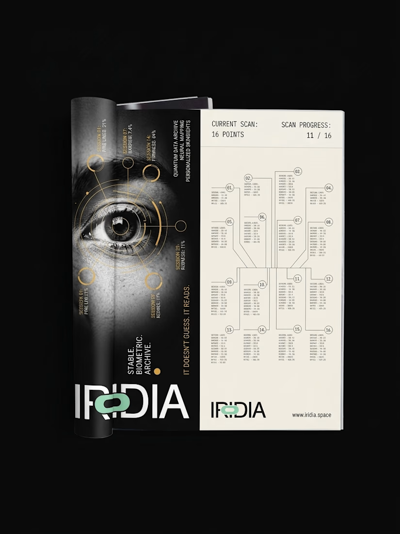
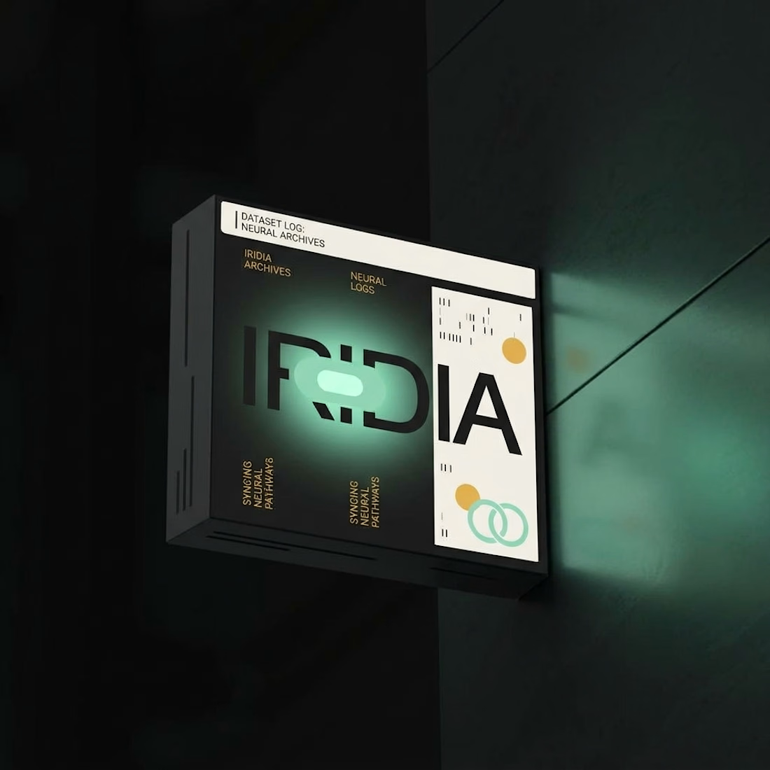
What happens when you pull one forgotten brand out of a folder full of them?
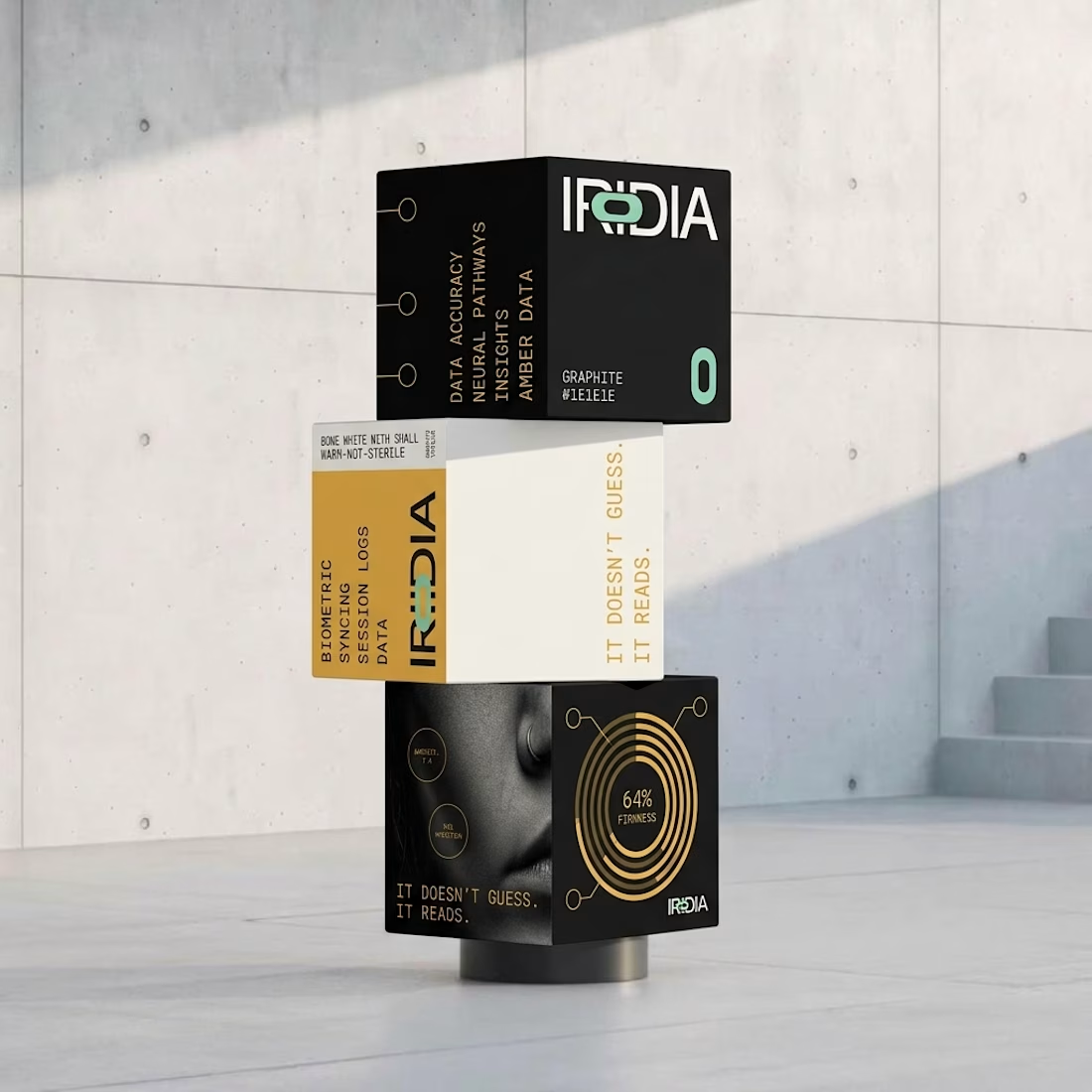
Iridia sat half finished next to the rest.
I locked the references and pushed it all the way to 10 campaigns, OOH, product and packaging.

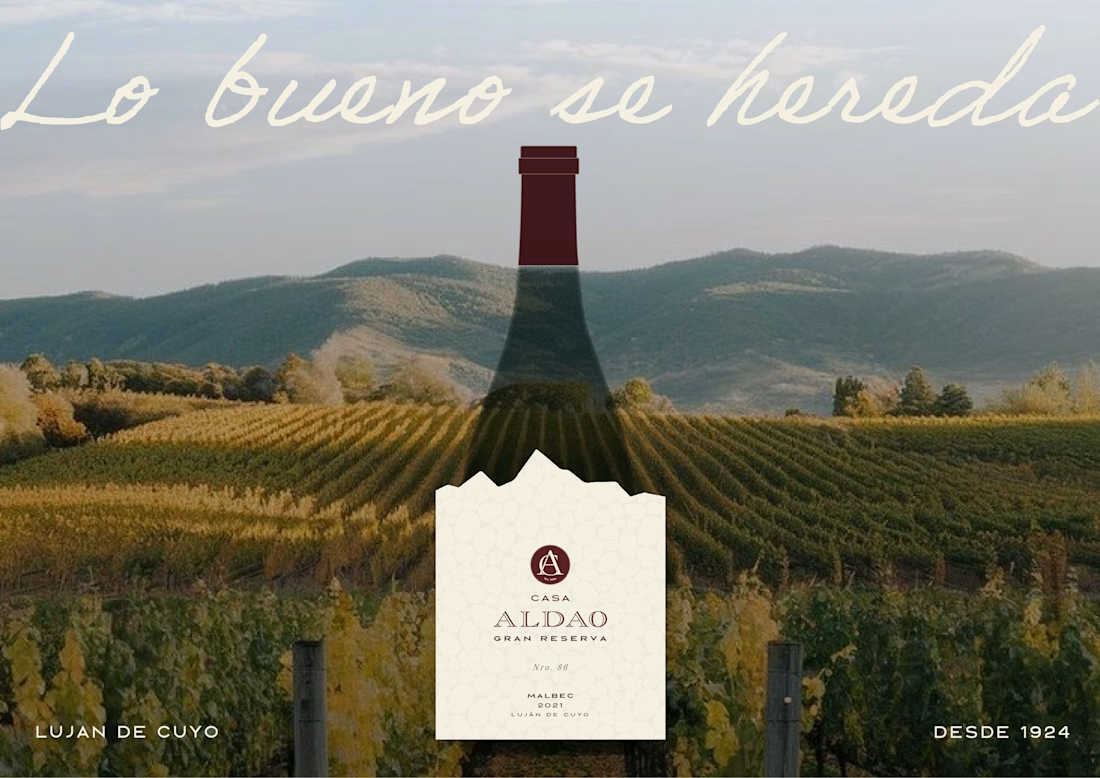
Label Design · Wine Branding · Malbec Gran Reserva · Mendoza


looks great