The network for creativity
Join 1.25M professional creatives like you
Connect with clients, get discovered, and run your business 100% commission-free
Creatives on Contra have earned over $150M and we are just getting started
Back to feedPost


Upgoating this..... Nice work.. keep it up
TS man!! :)

yeah same, had to!

really nice use of motion.

That bento card transition when the devices connect feels really satisfying, the little icons snapping into place. Was that timing something you dialed in over a bunch of iterations, or did it click pretty quickly?

This is cool


the little device icons floating around the U are so cute

really cool 😍

I Love this, this is Nice


bento never misses

Great work


Love this


Fantastic work🔥👏👏

This is clean ✨

Cool!

Great attention to detail!

this is really nice
The network for creativity
Join 1.25M professional creatives like you
Connect with clients, get discovered, and run your business 100% commission-free
Creatives on Contra have earned over $150M and we are just getting started

Challenges
View all


Related posts


Branding design and Framer Development for an AI real estate tool
See full Case study

amazing work!🚀

Which design feels more professional and trustworthy for a B2B company?
A recent website redesign for Ecoaera, a UK-based IT asset disposal company. We transformed their existing site into a modern B2B website with improved UX, stronger service pages, and SEO + AI optimisation.
1 voted
9%
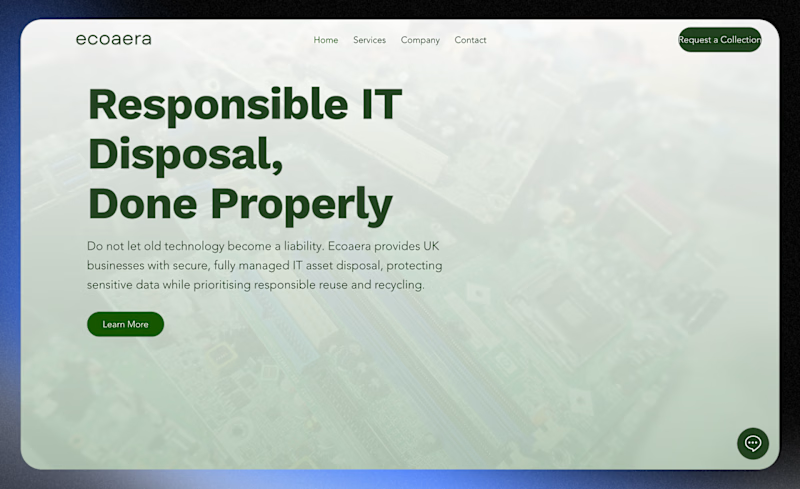
10 voted
91%
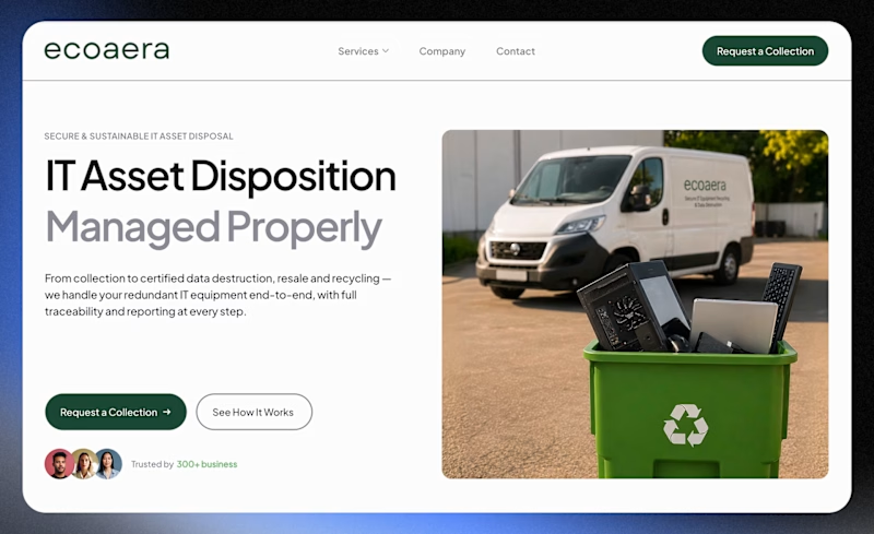
11 votes
Closed


Looks great !