The network for creativity
Join 1.25M professional creatives like you
Connect with clients, get discovered, and run your business 100% commission-free
Creatives on Contra have earned over $150M and we are just getting started
Back to feedPost


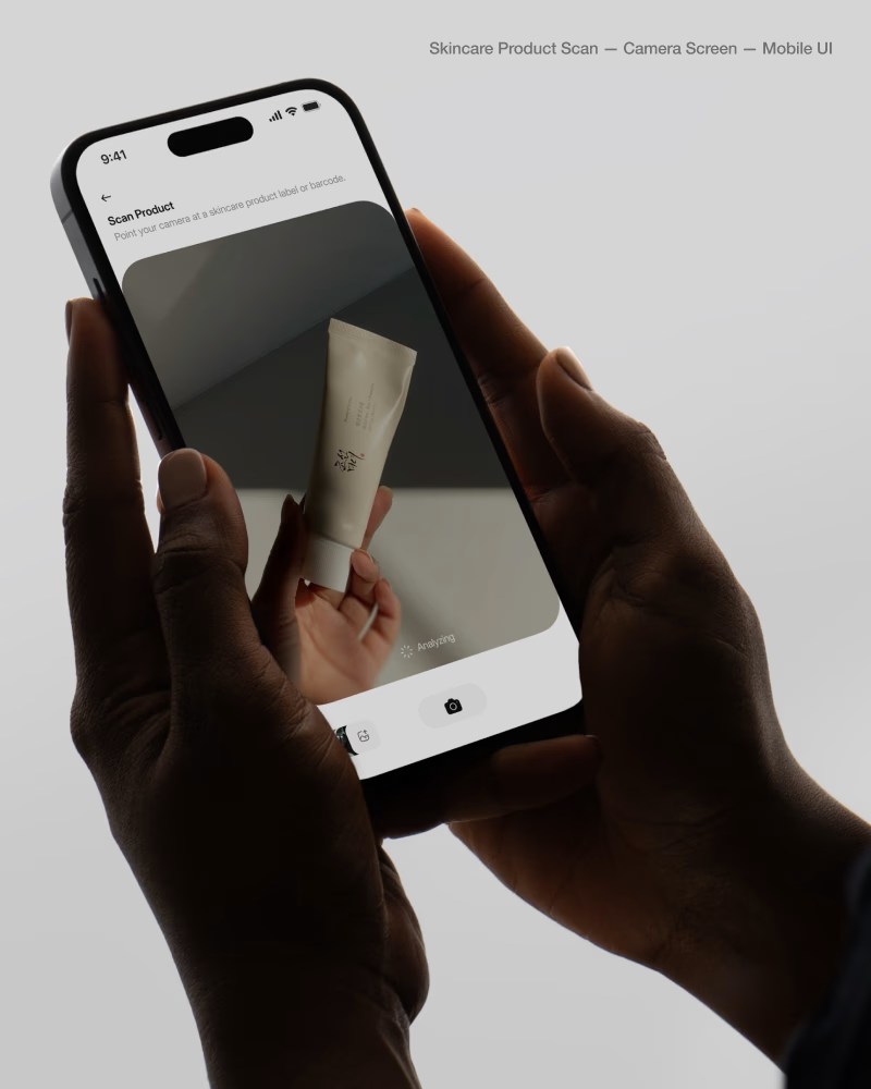
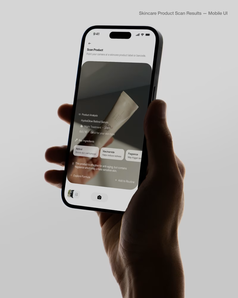

Nicely done, Samuel

Good work
The network for creativity
Join 1.25M professional creatives like you
Connect with clients, get discovered, and run your business 100% commission-free
Creatives on Contra have earned over $150M and we are just getting started

Challenges
View all


Related posts


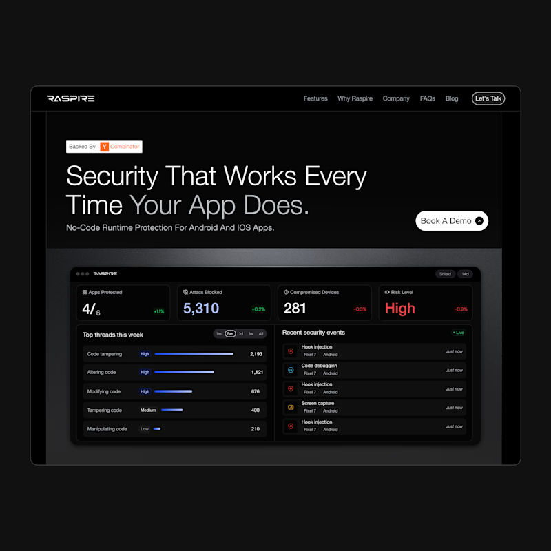
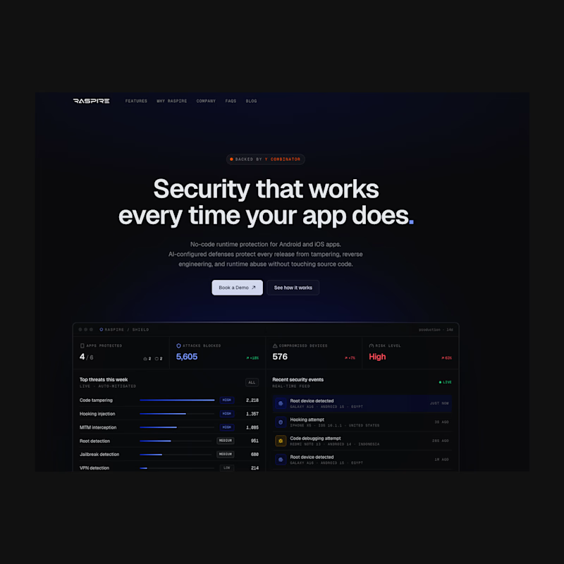

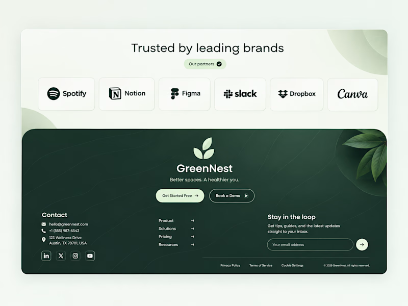
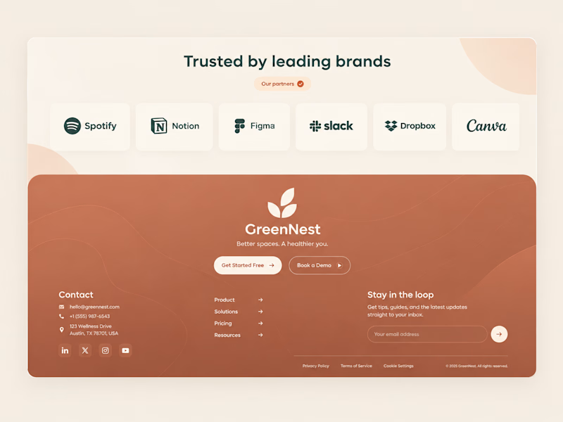
Both on-brand. Just two different sides of the same story.
Which color would make you trust "better spaces, a healthier you" more? 👇

44 voted
100%
0 voted
0%
44 votes
Closed


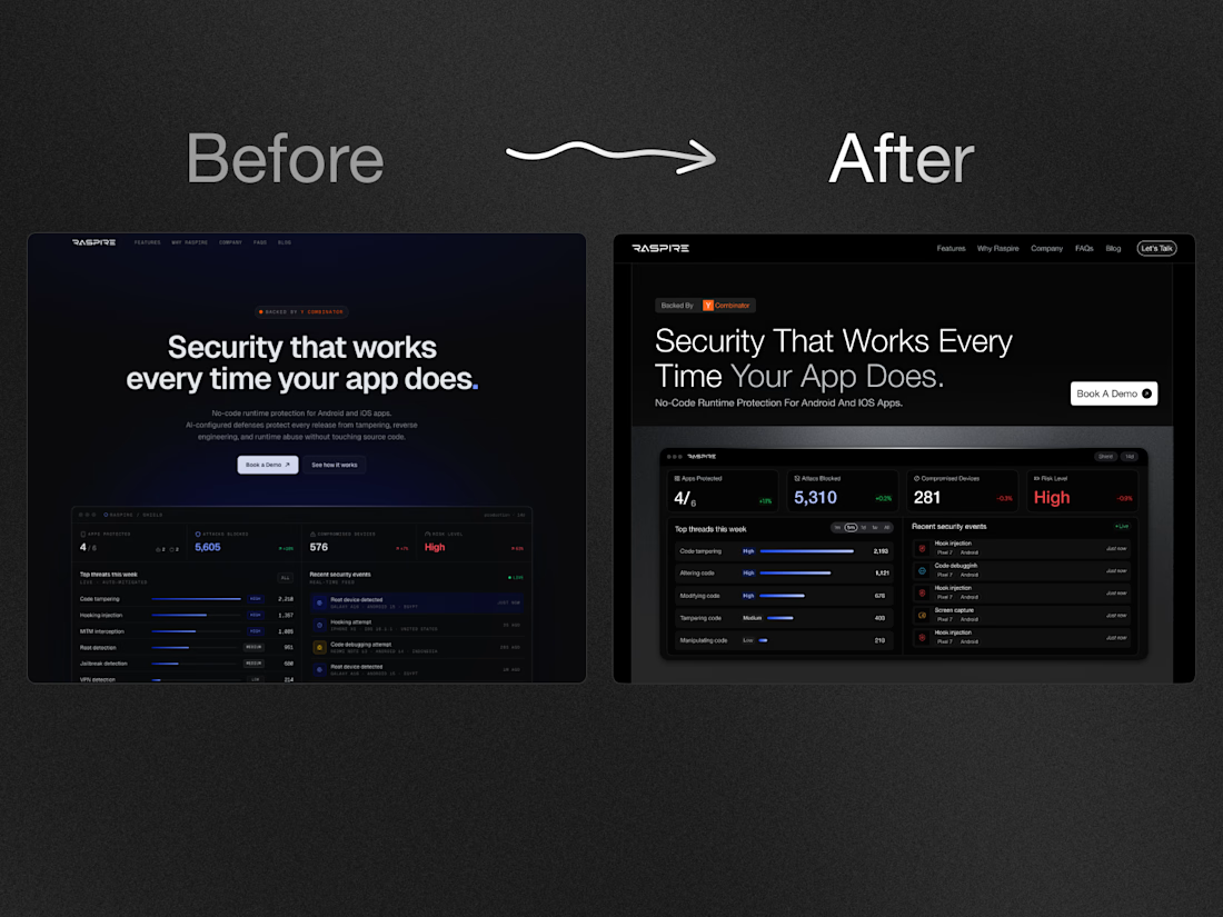
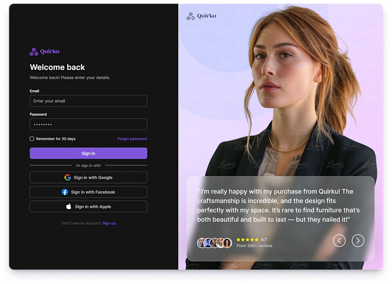
Which one works better for you — Light or Dark? 👀
11 voted
46%
13 voted
54%
24 votes
Closed

Both of them are great ❤️❤️