The network for creativity
Join 1.25M professional creatives like you
Connect with clients, get discovered, and run your business 100% commission-free
Creatives on Contra have earned over $150M and we are just getting started
Back to feedPost

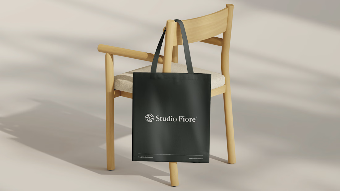
Studio Fiore is a conceptual creative studio specializing in experiential branding and spatial design for hospitality, cultural, and lifestyle brands. Its philosophy centers on transforming brand identities into meaningful environments where visual expression, materiality, and human experience come together.
The challenge was to create a distinctive visual identity that reflects the studio's multidisciplinary nature while remaining consistent across physical and digital applications.
Inspired by the Italian word Fiore, meaning flower, the identity is built around the concept of transforming feeling into form. The custom symbol originates from the letter F, rotated and repeated to create a refined floral structure. This distinctive mark becomes the foundation of a flexible visual system, extending into patterns, typography, printed materials, packaging, digital interfaces, and environmental applications.
The identity combines the expressive elegance of Canela with the contemporary clarity of Founders Grotesk. A restrained palette of warm ivory, deep olive, and muted sand reinforces the studio's connection to natural materials, thoughtful craftsmanship, and understated sophistication.
The result is a cohesive brand identity designed to communicate more than a visual signature. It expresses Studio Fiore's philosophy of creating experiences that can be seen, felt, and remembered.


The network for creativity
Join 1.25M professional creatives like you
Connect with clients, get discovered, and run your business 100% commission-free
Creatives on Contra have earned over $150M and we are just getting started





Related posts





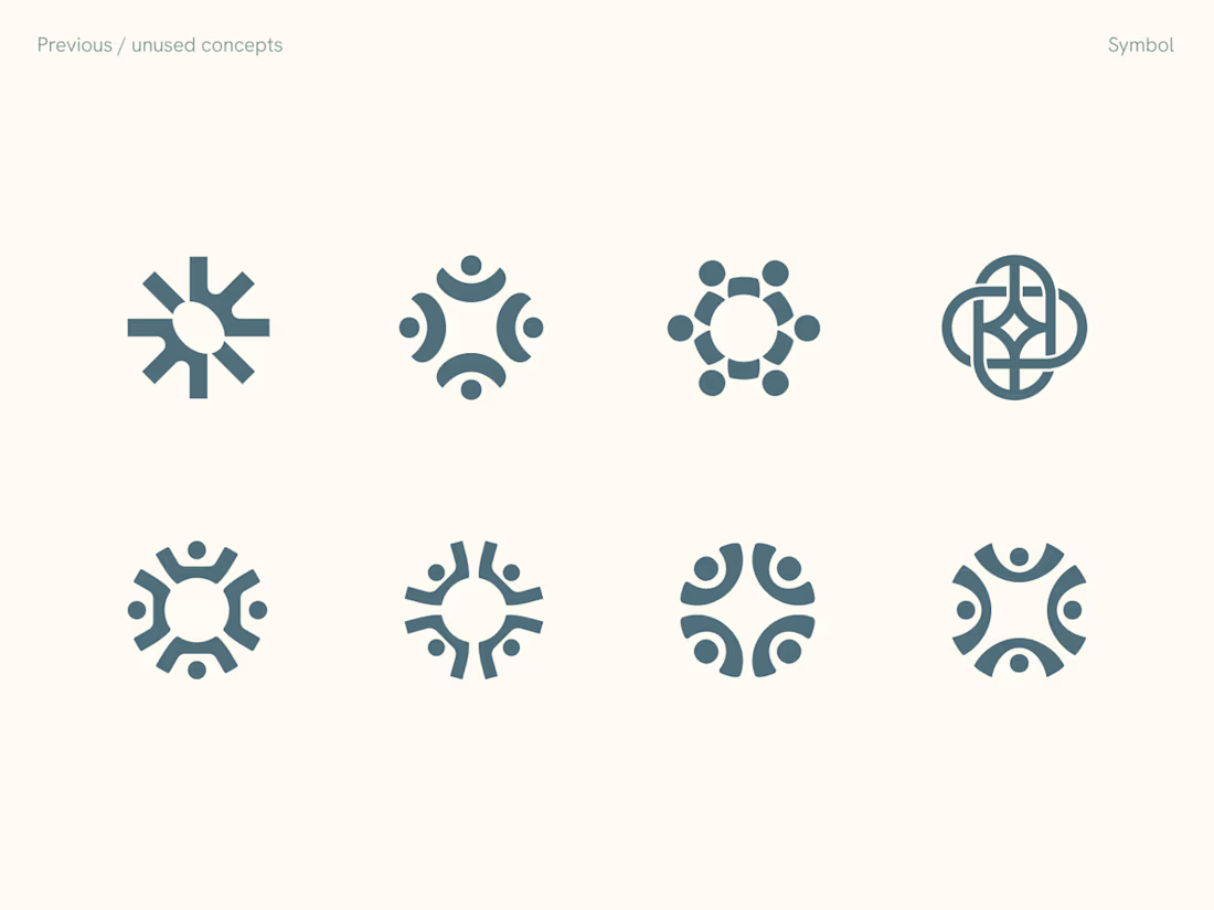
Rejected logo concepts exploring collaboration, shared expertise & working side by side

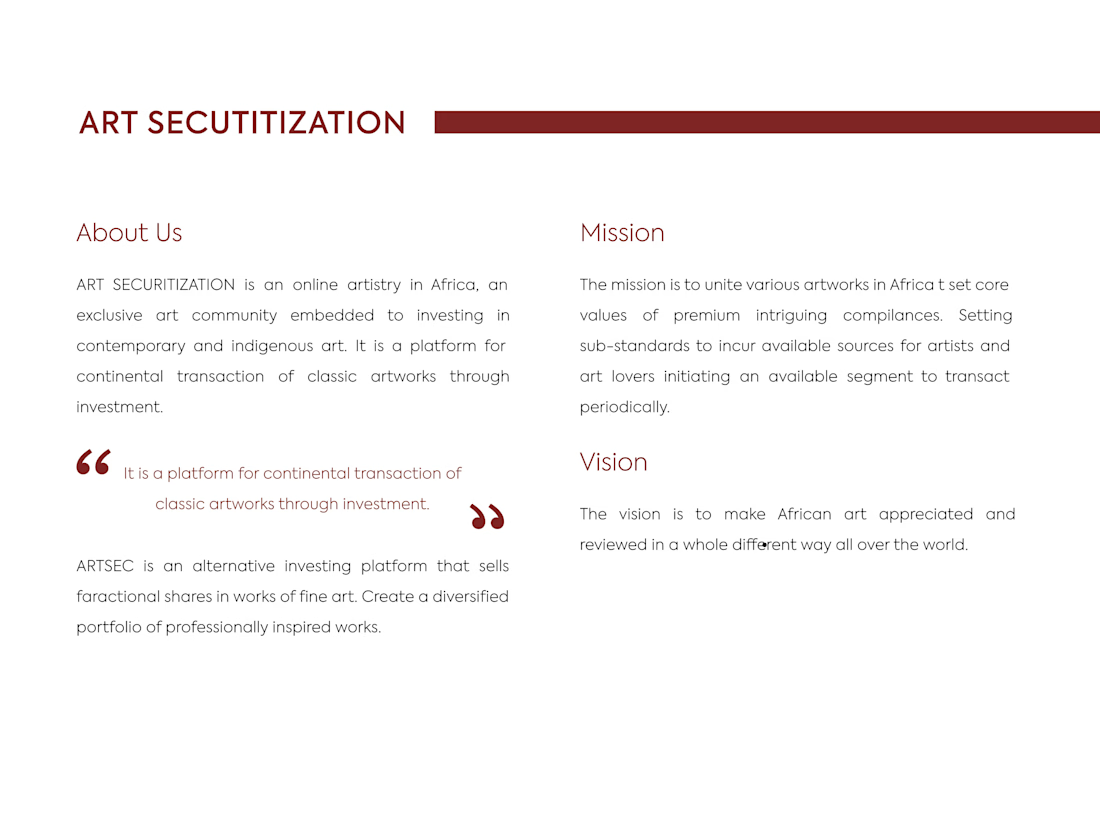
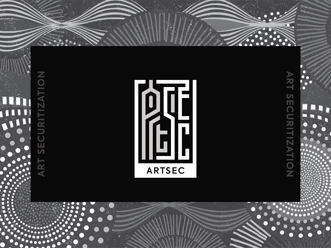
ARTSEC is an art investment platform focused on making African contemporary and indigenous art more accessible to collectors and investors.
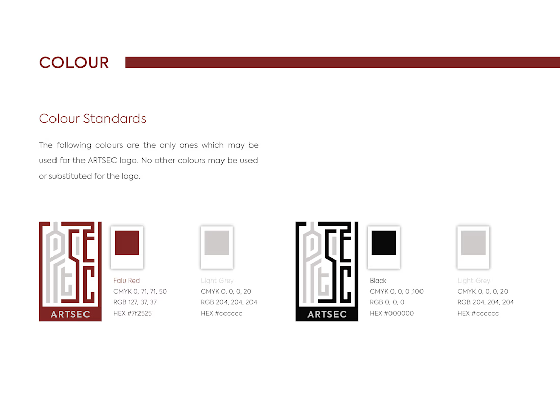
I developed a complete visual identity system for the brand, including the logo, colour palette, typography and usage guidelines.
The identity was designed to give ARTSEC a distinctive, consistent visual presence while reflecting its connection to African art and culture across print and digital applications.


Can't stop looking at this! 😍