The network for creativity
Join 1.25M professional creatives like you
Connect with clients, get discovered, and run your business 100% commission-free
Creatives on Contra have earned over $150M and we are just getting started
Back to feedPost


The network for creativity
Join 1.25M professional creatives like you
Connect with clients, get discovered, and run your business 100% commission-free
Creatives on Contra have earned over $150M and we are just getting started





Related posts

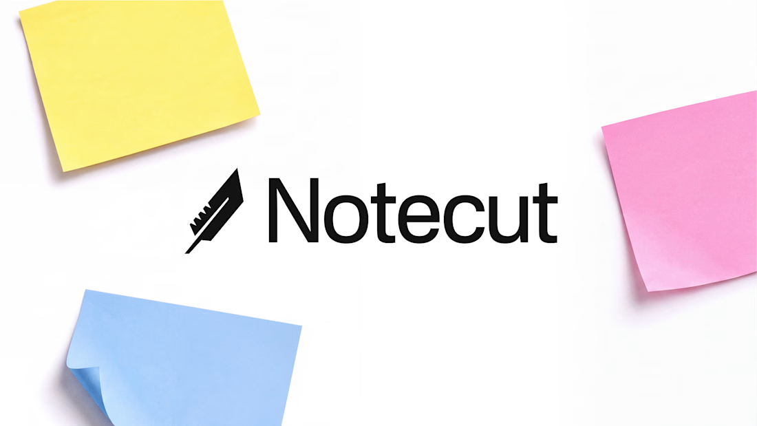
Logo I’m working on.
feather + knife



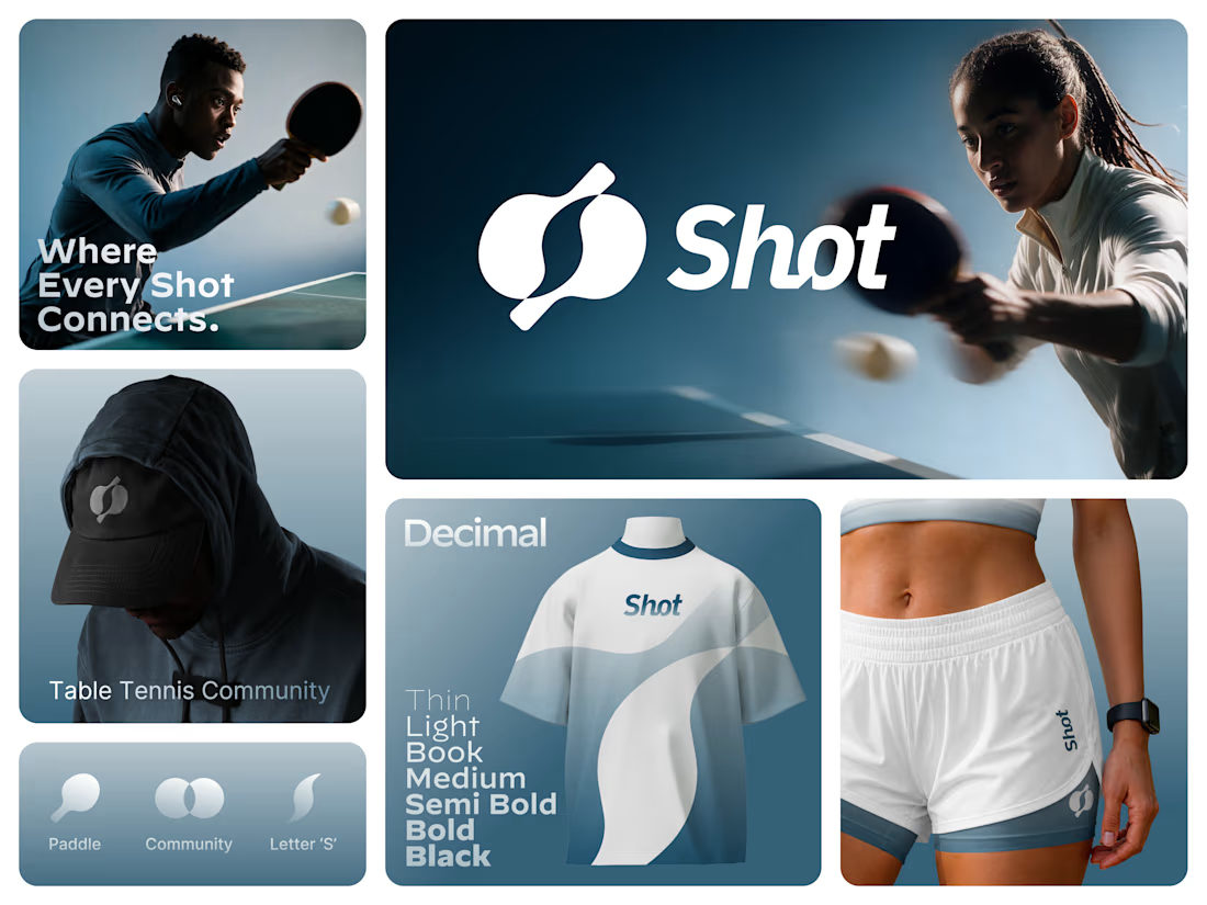
Introducing SHOT — a new identity for the table tennis community. 🏓
The SHOT logo brings together sport, connection, and community in one simple symbol. Two table tennis paddles come together to form the letter “S”, representing two players, every rally, and the shared energy of the game.
From the logo to the visual language, the identity is designed to feel bold, dynamic, modern, and connected.
SHOT — Where Every Shot Connects.

Really Nice Exploration.


Hey everyone! I’m Gustavo, a designer and founder of EGO LAB®, a creative studio focused on branding, visual identity, and graphic design.
I’m just getting started here on Contra and excited to connect with other creatives, discover new work, and share some of the projects we’ve been building.
I’ve just published Norvex®, a branding project created for a neurotechnology and cognitive research company based in Cambridge, Massachusetts.
Would love to hear your thoughts on the project, feel free to check it out, leave some love, and connect. Always happy to support great work from the community as well.


the norvex typography hits hard gustavo. SHARP identity.