The network for creativity
Join 1.25M professional creatives like you
Connect with clients, get discovered, and run your business 100% commission-free
Creatives on Contra have earned over $150M and we are just getting started
Back to feedPost

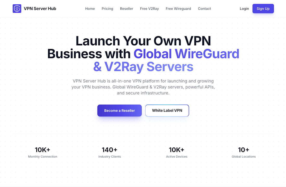
Introducing VPN Server Hub: My First Infrastructure SaaS Platform


The network for creativity
Join 1.25M professional creatives like you
Connect with clients, get discovered, and run your business 100% commission-free
Creatives on Contra have earned over $150M and we are just getting started




Related posts

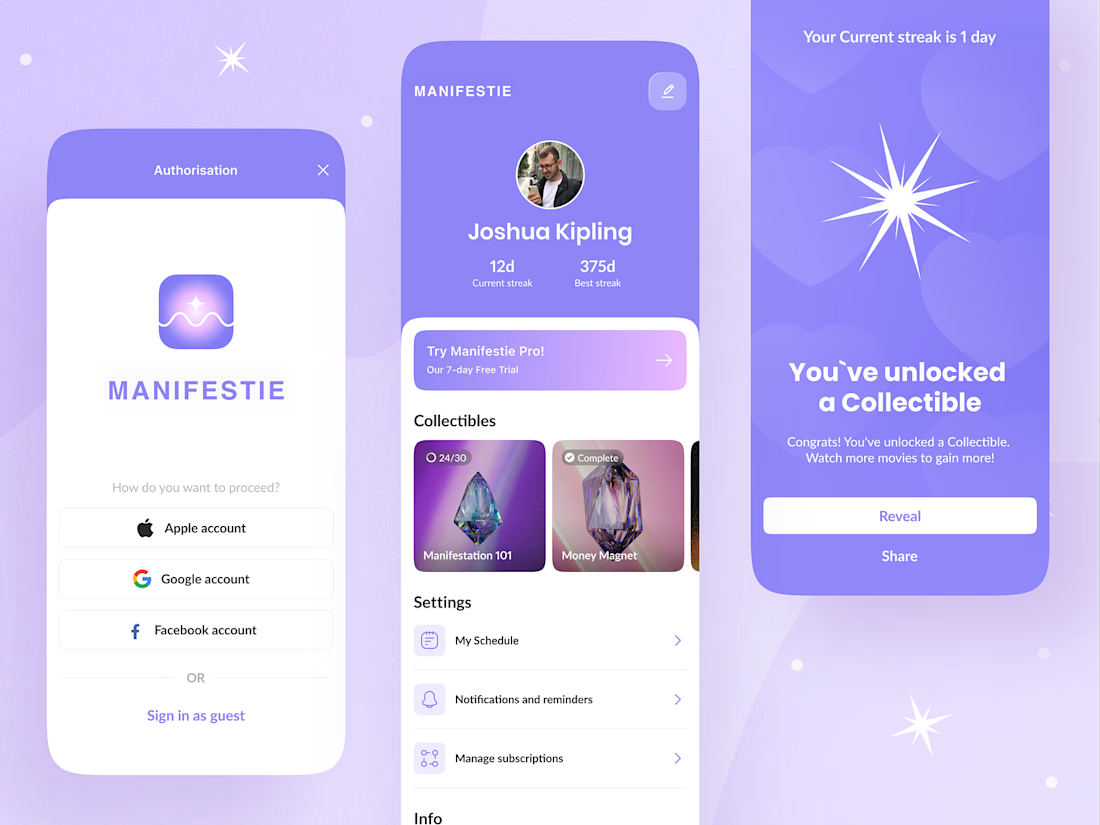
Manifestation apps have an audience problem most teams don't talk about: the same interface has to work for a teenager building a vision board and a retiree tracking daily affirmations. Design for one and you alienate the other.
For Manifestie, that meant treating the visual language as functional, not decorative. The color palette and animation aren't there to look calm they're there to lower the barrier to a daily habit that most people abandon within a week. Progress tracking and feature navigation had to stay simple enough that neither age group hits friction, while the aesthetic still signals "this is a space for reflection," not a productivity tool wearing soft colors.
The harder design question wasn't the interface it was building something that feels personal to two very different life stages without splitting into two products.
Anyone else designed for an audience that spans generations in one build? Curious how you handled the tone split. Check it out.

this is sooooo dreamy, i love the collectible aspect you've incorporated!

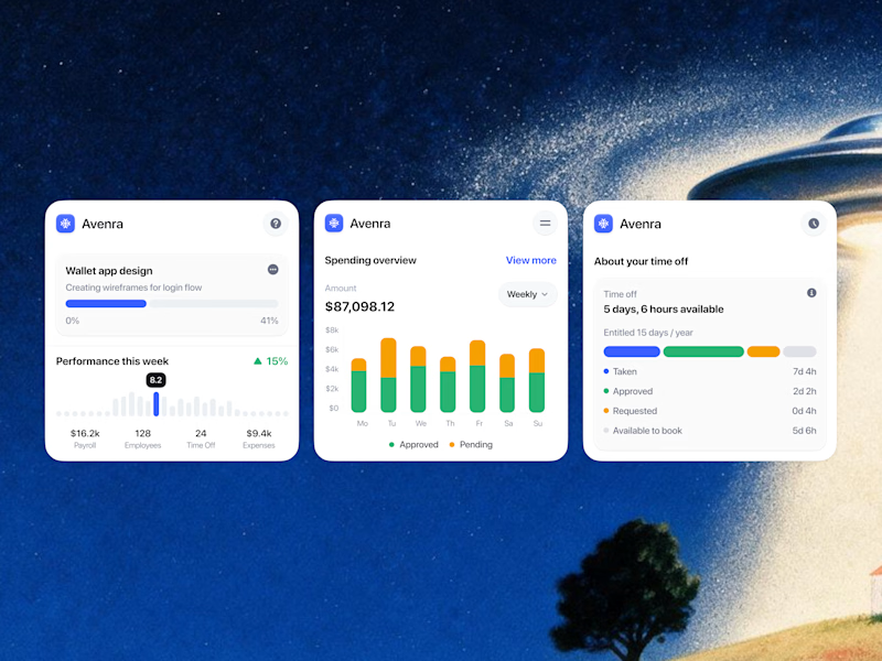
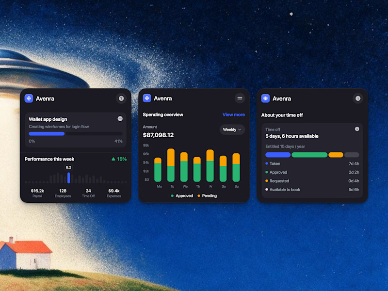
Which style wins for you? 🤔
We’re testing out two theme directions for Avenra’s dashboard component cards; featuring real-time spending breakdowns, project progress metrics, and time-off tracking.
Curious to hear your thoughts! 💬

8 voted
42%
11 voted
58%
19 votes
Closed

Energy communities need to manage a lot at once: consumption, generation, members, billing, reports, alerts, and operational changes.
Wattbank explores a clearer SaaS dashboard experience for energy community operators. The interface brings key metrics, energy balancing, participant distribution, billing, reporting, and insights into one workspace that is easy to scan and act on.
The goal was to move away from heavy energy software and create something more visual, human, and operationally useful.