The network for creativity
Join 1.25M professional creatives like you
Connect with clients, get discovered, and run your business 100% commission-free
Creatives on Contra have earned over $150M and we are just getting started
Back to feedPost

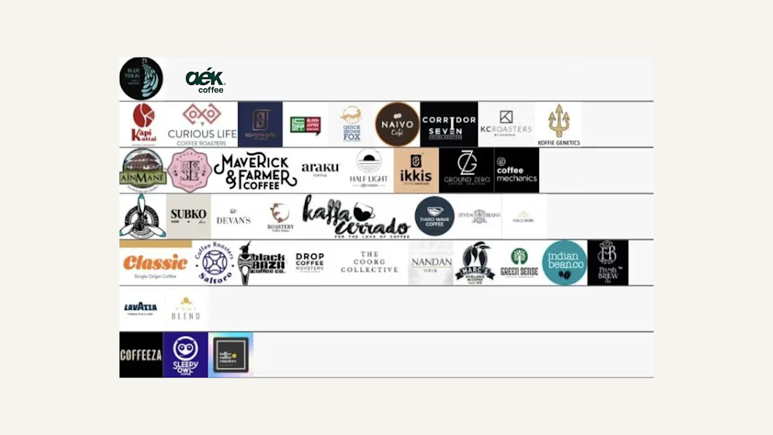
The client was already 99% convinced about the logo and overall brand direction. This slide was the little extra push that removed the last bit of doubt.
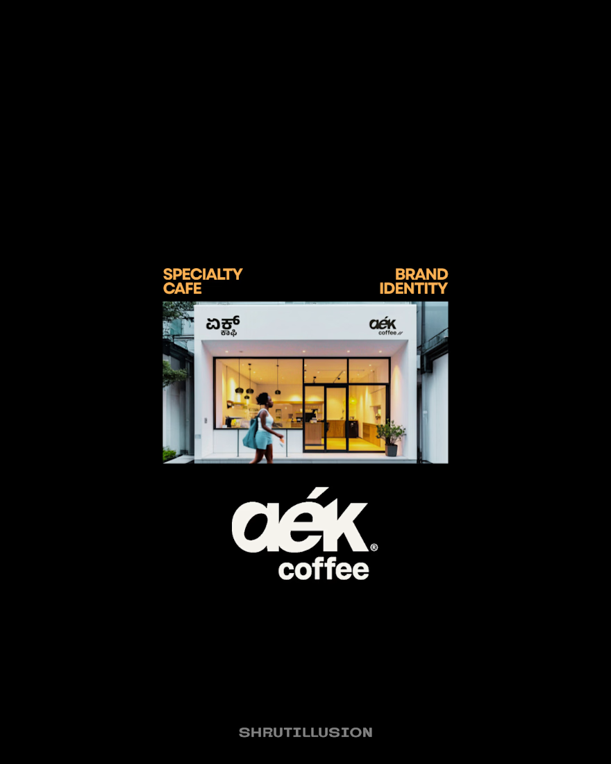
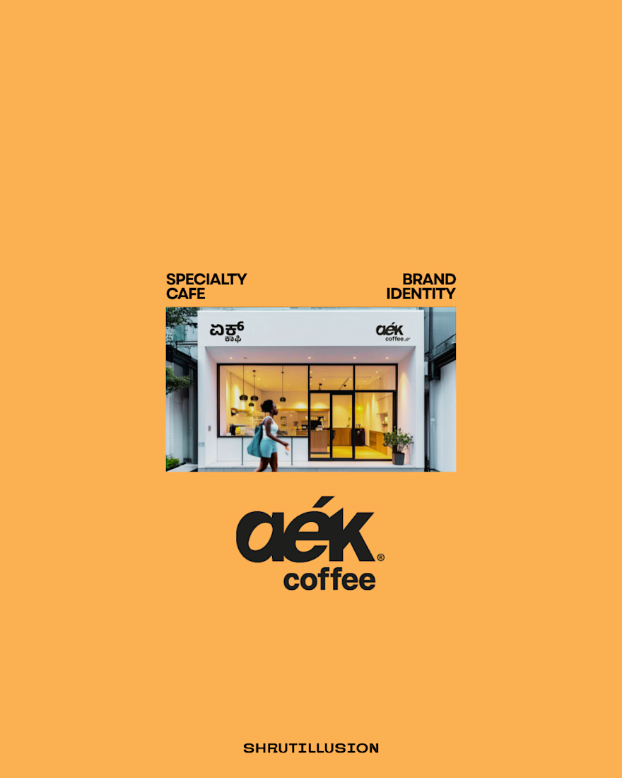
I placed the proposed specialty cafe - Aek's identity alongside existing coffee brands to show how it would actually sit within the category - helping them visualise the brand in the real market, along with the other presentation slides.
It was an instant yes!


The network for creativity
Join 1.25M professional creatives like you
Connect with clients, get discovered, and run your business 100% commission-free
Creatives on Contra have earned over $150M and we are just getting started

Challenges
View all


Related posts


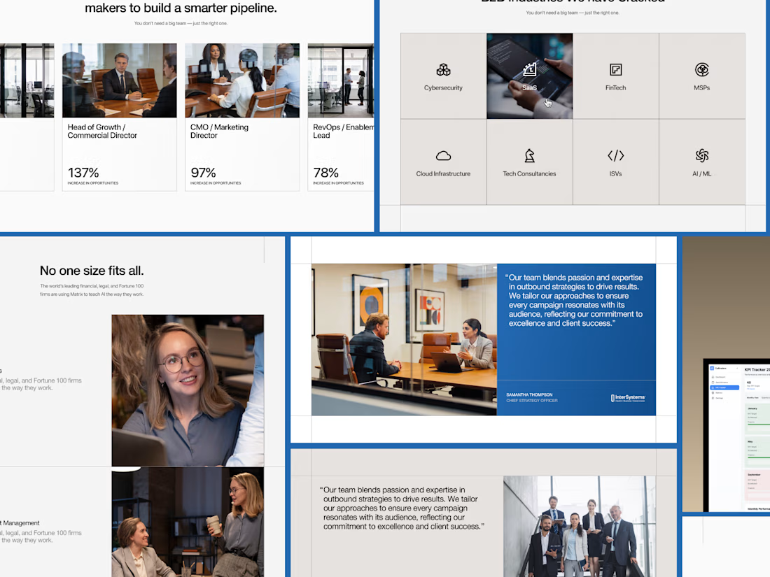
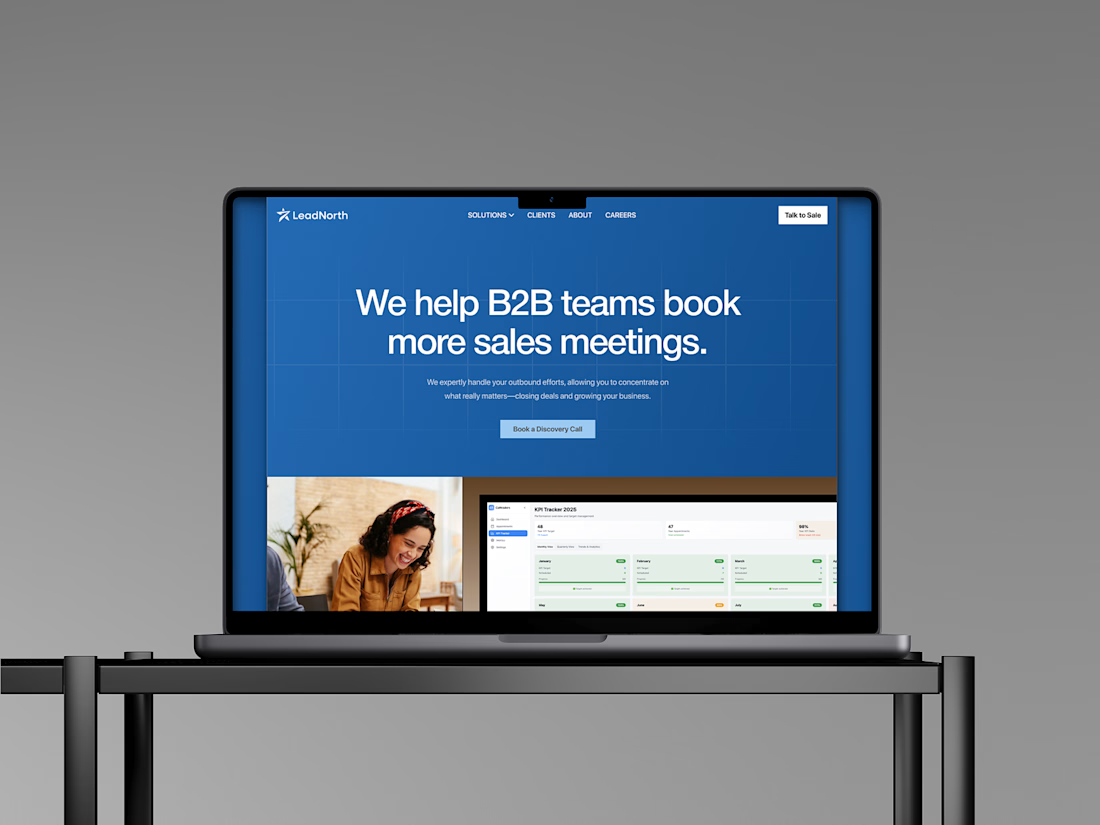
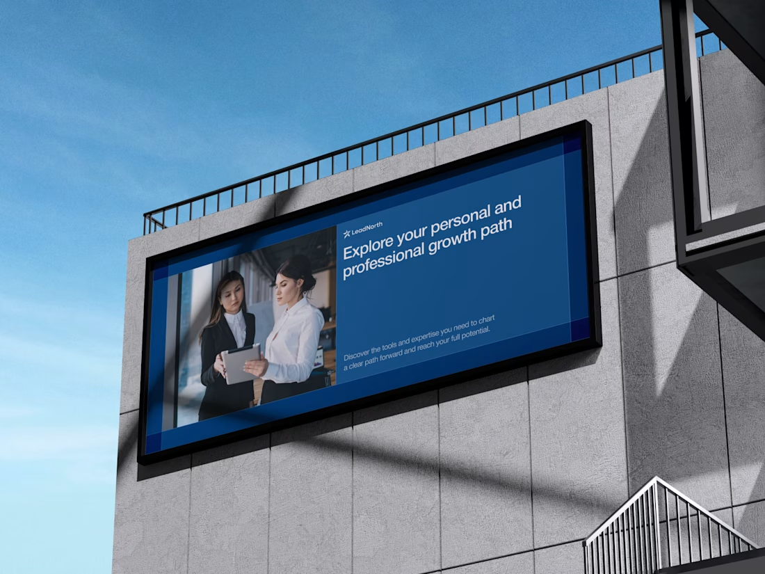
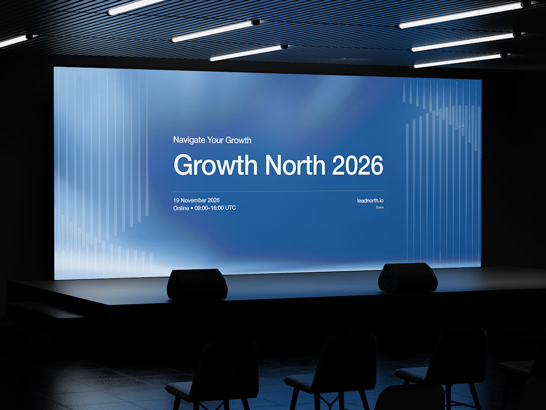


That saturated cobalt blue carries cleanly from the laptop hero onto the outdoor billboard and the Growth North 2026 stage screen.

Photorealistic 4K Sneaker Loop - Built for E-commerce Conversion
Goal: Create ad-ready product video that shows material detail.
How I did it:
PBR materials + HDRI lighting in Blender
8s seamless loop, 4K render
Post in After Effects
Result: 95% material accuracy, client ready for ads. Open for freelance product videos - DM me!
#3DRender #ProductVisualization #AIvideo


wow ,

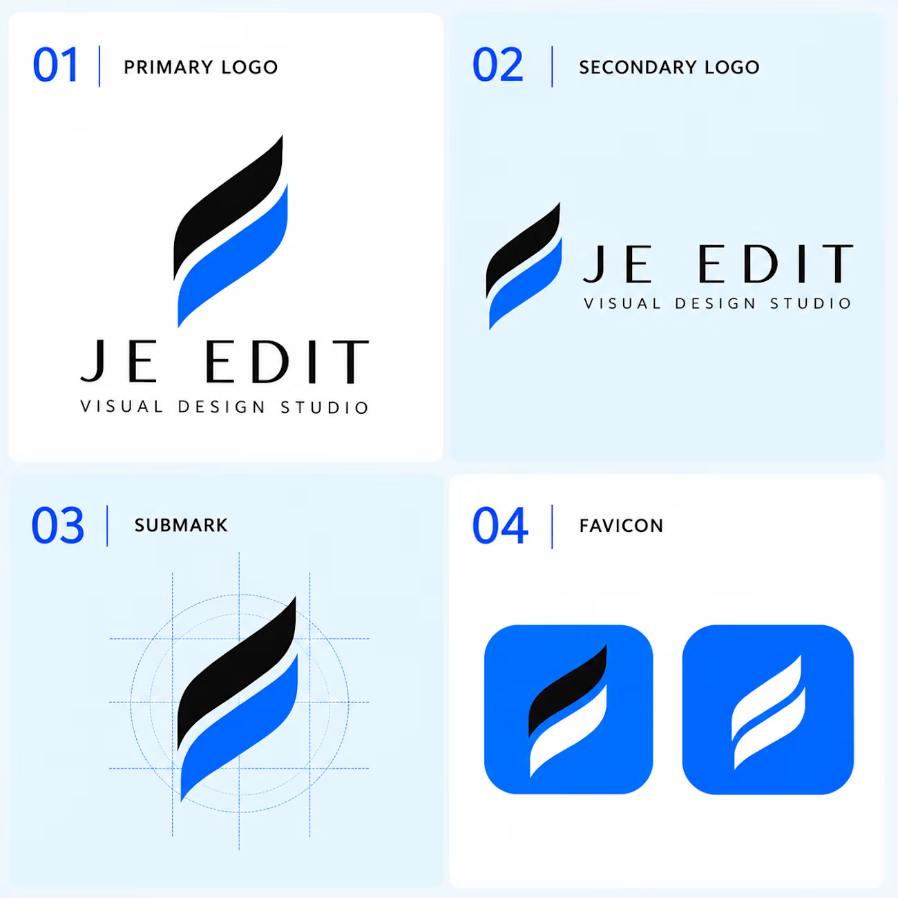
JE EDIT — Logo System & Visual Identity
Follow the design journey → @je_edit_
Instagram — @je_edit_
Your support through a follow, like, save or share helps JE EDIT grow.
A logo is not just a mark. It is the foundation of a visual system.
For JE EDIT — Visual Design Studio, I developed a flexible identity built around movement, precision, simplicity, and visual transformation.
The identity explores how a single visual idea can become a complete, consistent system across different brand touchpoints.
01 — Primary Logo
The core brand signature for the strongest and most recognizable presentation.
02 — Secondary Logo
A horizontal configuration created for wider layouts and communication applications.
03 — Submark
The symbol reduced to its essential form and supported by a structured construction system.
04 — Favicon
A compact expression designed to maintain recognition at small digital sizes.
Design Philosophy
The objective was not simply to create a logo, but to build a visual foundation that can adapt, scale and remain recognizable across different environments.
One symbol.
Multiple applications.
One consistent identity.
Designed & developed by JE EDIT — Visual Design Studio.