The network for creativity
Join 1.25M professional creatives like you
Connect with clients, get discovered, and run your business 100% commission-free
Creatives on Contra have earned over $150M and we are just getting started
Back to feedPost
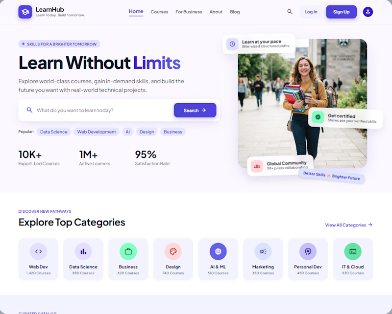
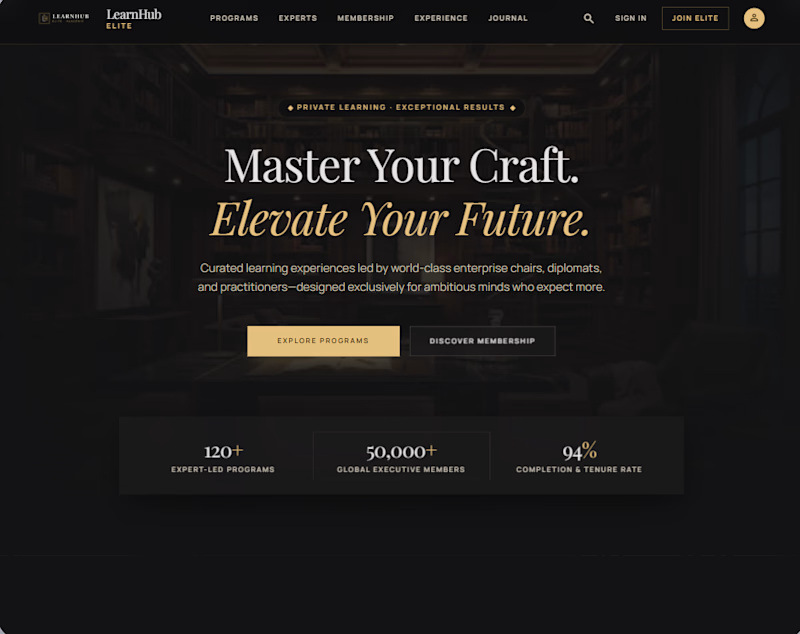
Taste Test

Which design would you choose for an e-learning platform? 👀
Option A: Clean, modern & user-friendly
Option B: Premium, dark & luxury-focused
1 voted
100%
0 voted
0%
1 vote
Closed
The network for creativity
Join 1.25M professional creatives like you
Connect with clients, get discovered, and run your business 100% commission-free
Creatives on Contra have earned over $150M and we are just getting started





Related posts


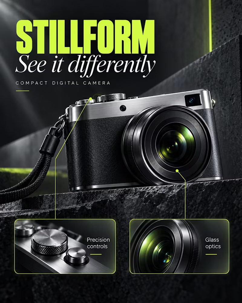
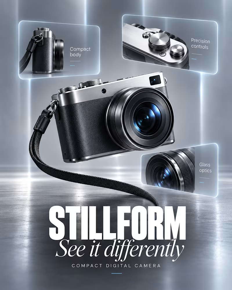
Which layout would you run?
The first sits on wet black stone, acid green display type at the top, two call out panels along the bottom edged in the same green, light raking from the left.
The second floats against brushed silver, three glass panels around it holding the detail shots, the wordmark large in white across the base.
One sells a tool. The other sells a specification.
👇 #productdesign #layoutdesign #brandconcept
6 voted
75%
2 voted
25%
8 votes
Closed

Night Spec feels more powerful 🎉🎉🔥🔥
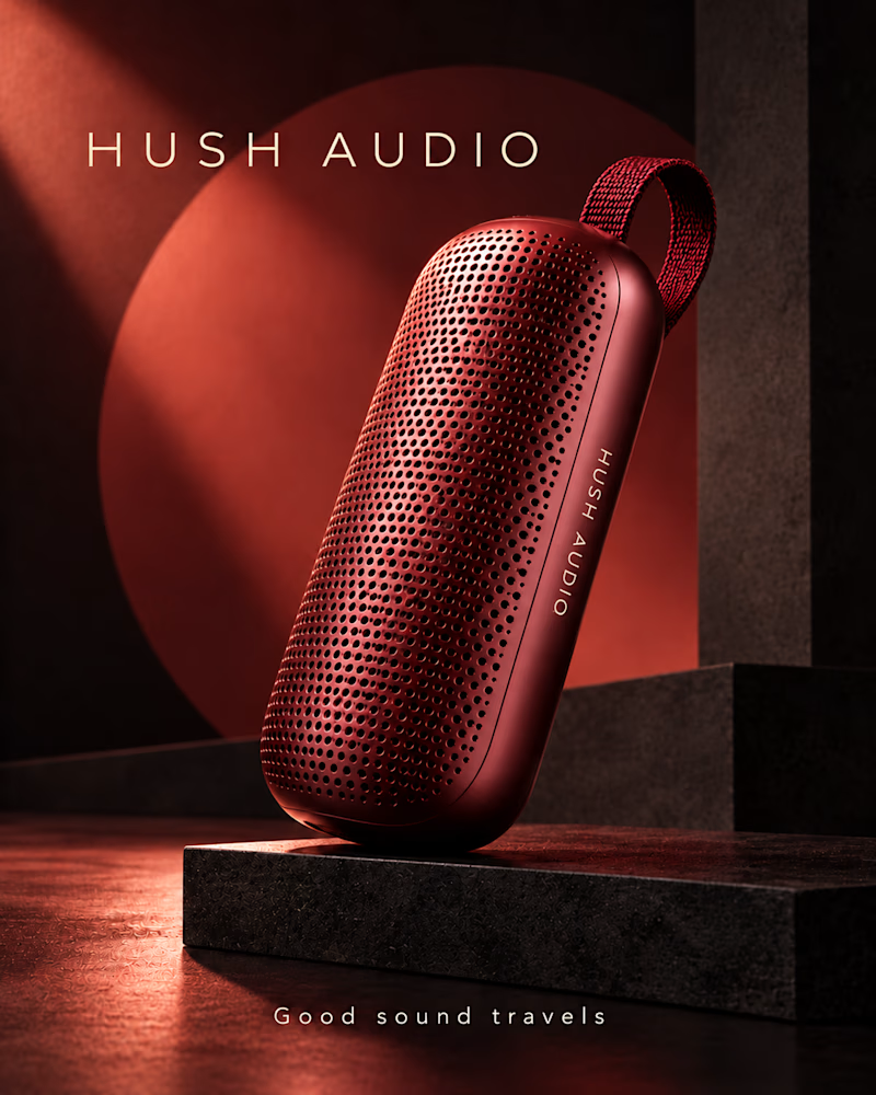
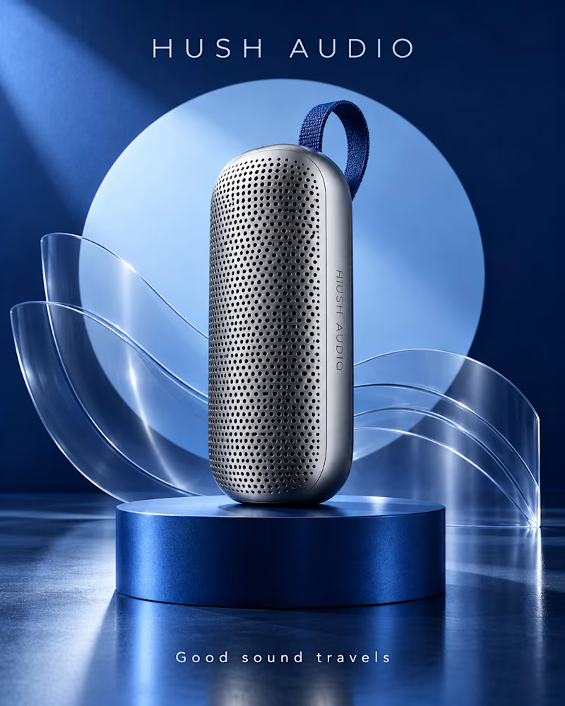
Which one would you build the launch around?
The first is the speaker in deep red on black stone, a single beam cutting down from the left, a red disc glowing behind it, everything else in shadow.
The second is brushed silver on a navy riser, curved acrylic ribbons behind, a pale blue disc, light spread evenly across the floor.
One sells the sound. The other sells the engineering.
👇 #productdesign #brandconcept #productphotography
7 voted
78%
2 voted
22%
9 votes
Closed

Like the Ember option, which one is your pick?

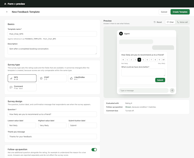
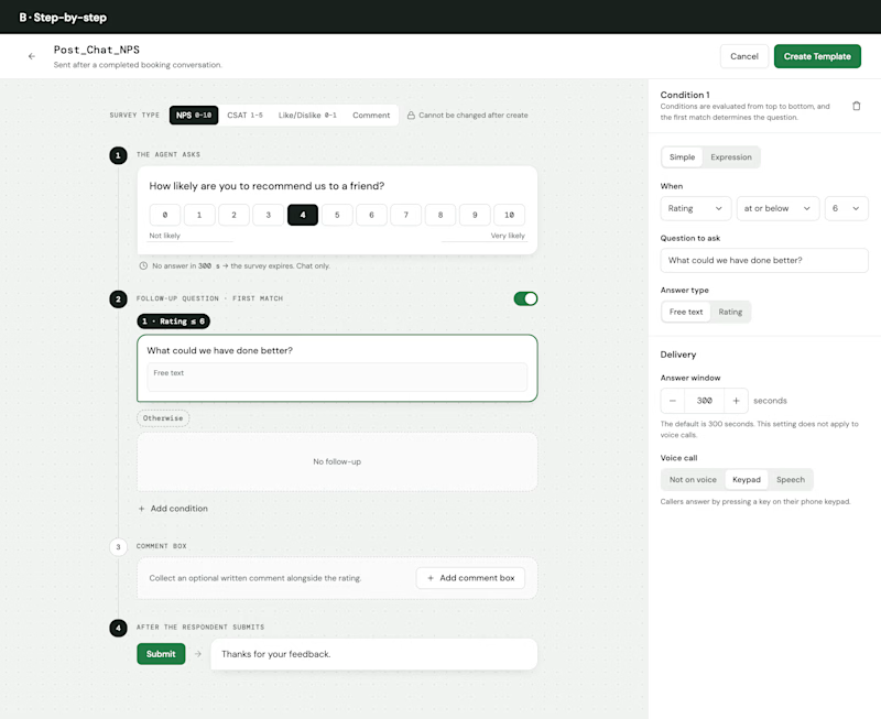
Designing a feedback survey builder, and I'd love your take.
The idea: define a survey once (NPS, CSAT, Like/Dislike or a comment), ask a follow-up question based on the score, and reuse it across AI agents.
A · Form + preview: one form, section by section, with a live chat preview beside it.
B · Step-by-step: the survey laid out as the steps a respondent goes through, edited in place, with the selected step's settings on the side.
Which one would you rather build a survey in, and why? What would you change in either?
#productdesign #uxdesign #saas
1 voted
20%
4 voted
80%
5 votes
Closed

Step by step. A follow-up that appears after the score feels closer to how people actually answer.