The network for creativity
Join 1.25M professional creatives like you
Connect with clients, get discovered, and run your business 100% commission-free
Creatives on Contra have earned over $150M and we are just getting started
Back to feedPost

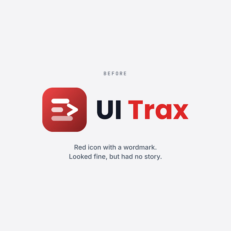
Amna posted our logo before and after, and this one is close to my heart because I designed it.
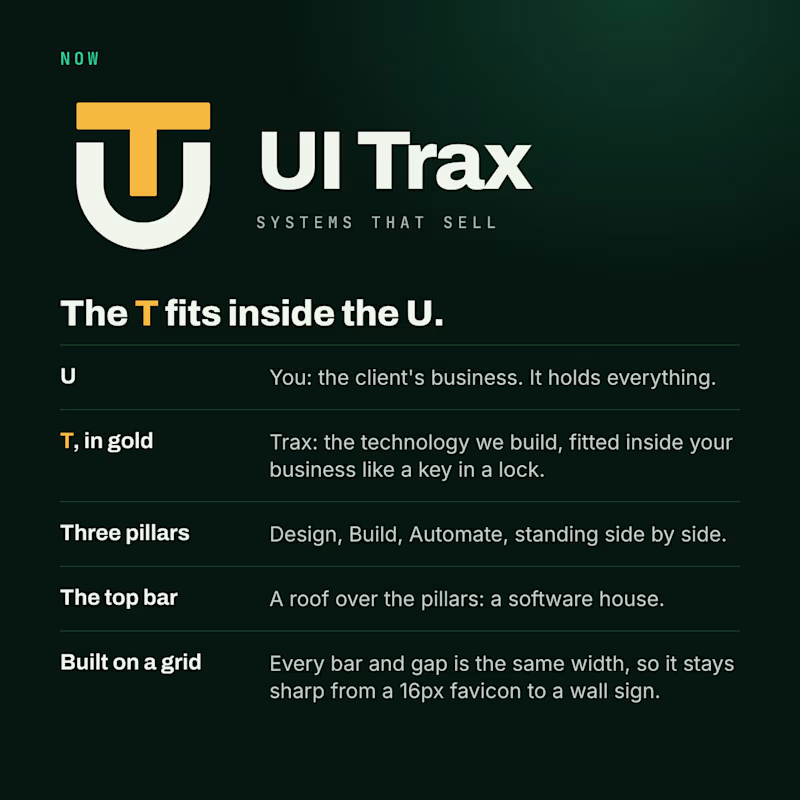
The U is you, the client's business. The gold T is Trax, the technology we fit inside it like a key in a lock. Three pillars, Design, Build and Automate, sit under one roof: a software house.
The old logo looked fine but had no story. Which one would you trust with your project? Vote on her post and tell us why.
#LogoDesign #Branding #BeforeAndAfter #UITrax

We redesigned the UI Trax logo, and this time every part has a meaning.
The U is you, the client's business. The gold T is Trax, the technology we fit inside it like a key in a lock. The three pillars are Design, Build and Automate. The top bar is a roof over them: a software...
3 votes
Ends in 1d
The network for creativity
Join 1.25M professional creatives like you
Connect with clients, get discovered, and run your business 100% commission-free
Creatives on Contra have earned over $150M and we are just getting started



Related posts


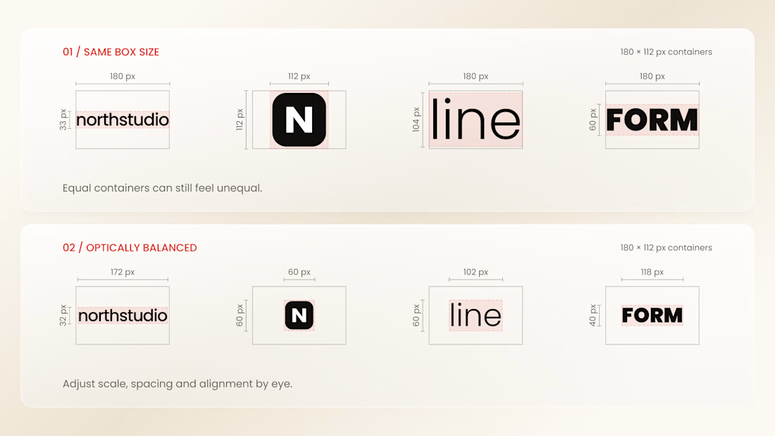
Why do logos look uneven even when they have the same size?
Every logo has a different shape, proportion, and visual weight. A wide wordmark can appear smaller than a compact symbol, while a bold logo may dominate a thinner one - even when their dimensions are technically identical.
That’s why logo sections shouldn’t be aligned by numbers alone.
Adjusting each logo optically, using a consistent visual area, balanced spacing, and a shared baseline helps every brand feel equally represented.
The goal isn’t to make every logo exactly the same size.
It’s to make them feel equally important.
Because visual consistency is based on perception, not just pixels.


Thanks for the information you shared

working on a case study for my latest project - brand identity for Coral Pay.
need your help choosing the best cover video for it:
35 voted
23%
118 voted
77%
153 votes
Closed

Lilac looks amazing with the 3D shining.

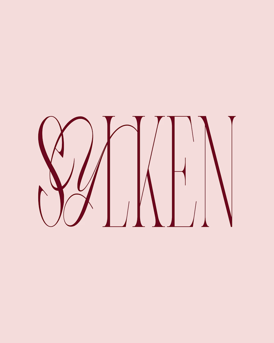
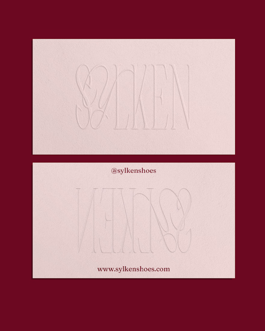
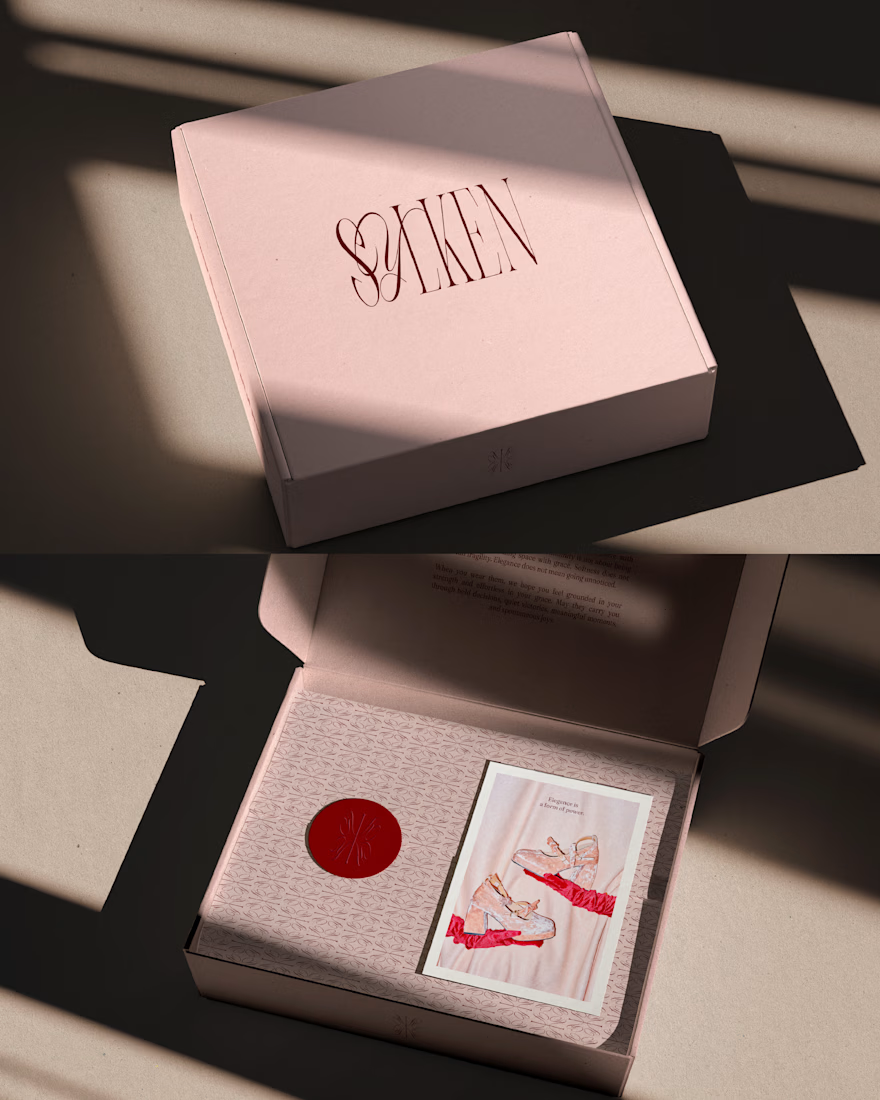
Sylken is a feminine silk footwear brand built around the balance between elegance, softness and confidence. The visual identity explores a contemporary interpretation of femininity, combining romantic elements with a refined and distinctive brand personality.
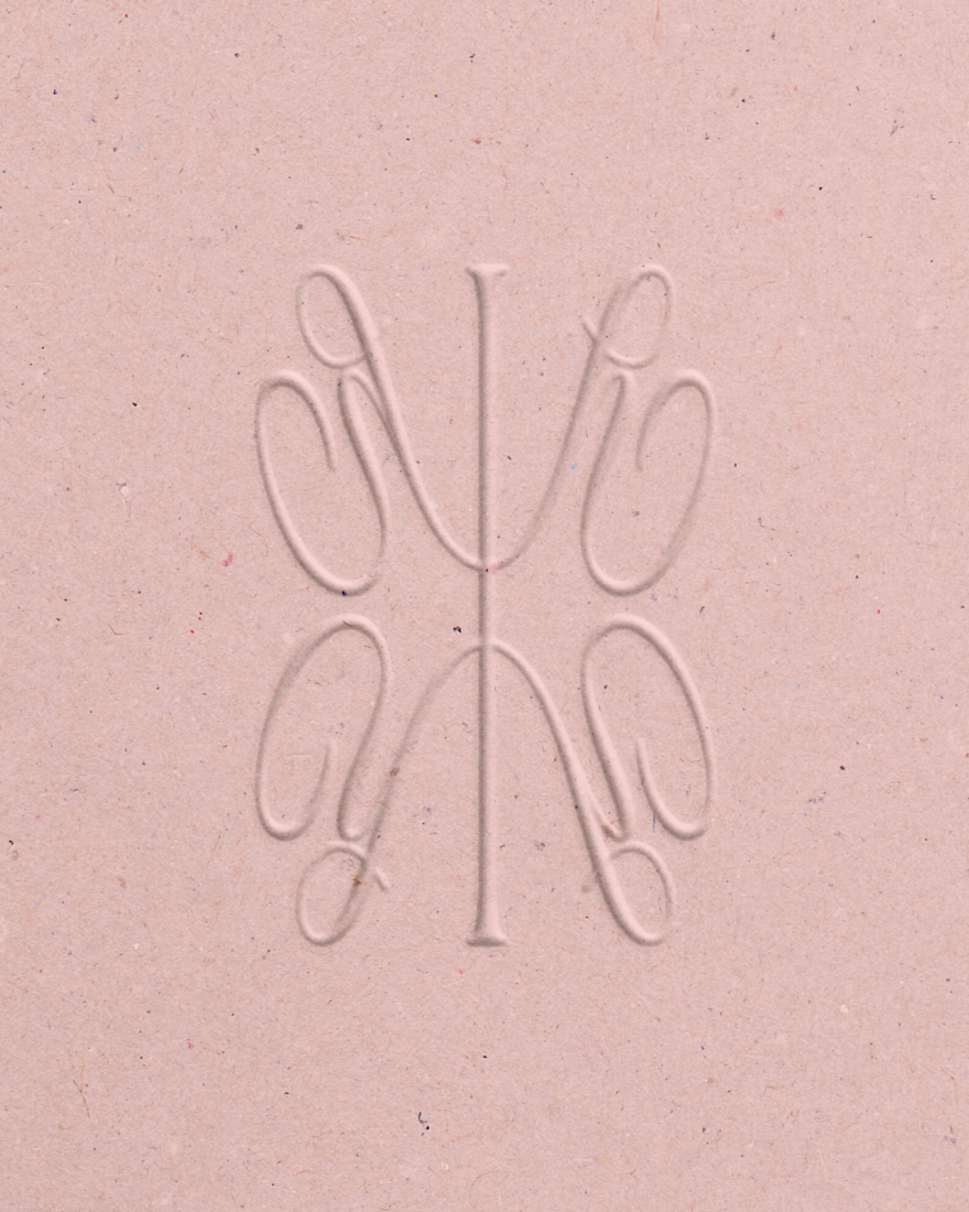
A palette of soft pink and rich red brings together warmth and sophistication, while the logo pairs classic serif typography with delicate handwritten details for a more personal touch. A custom brand symbol extends the identity beyond the wordmark, creating a recognisable visual element that reinforces the brand's character across its applications.

Wonderful work!