The network for creativity
Join 1.25M professional creatives like you
Connect with clients, get discovered, and run your business 100% commission-free
Creatives on Contra have earned over $150M and we are just getting started
Back to feedPost

Color for Geometric R Letter SaaS Logo
A feedback loop only works if people believe their message actually landed. So this mark needed a color that feels honest and easy to trust, not flashy.
Sky blue felt right. It's the color of a message sent, a notification landed, a loop closing the way it's supposed to.
I tested it two ways: one with sky blue on navy and navy on sky blue. Because a real SaaS brand has to hold its ground no matter which side it's standing on.
Next up: the full logo reveal, mark and wordmark together. Part of my ongoing SaaS and tech startup logofolio.
This mark hasn't found its startup yet. Yours could be next. Available for sale. DM to claim it.
Building a SaaS or technology startup?
Helping SaaS startups build memorable, scalable, and investor-ready brands.
Available for SaaS & Tech Startup Projects.

The network for creativity
Join 1.25M professional creatives like you
Connect with clients, get discovered, and run your business 100% commission-free
Creatives on Contra have earned over $150M and we are just getting started






Related posts


The sharp V pops against that vivid gradient.

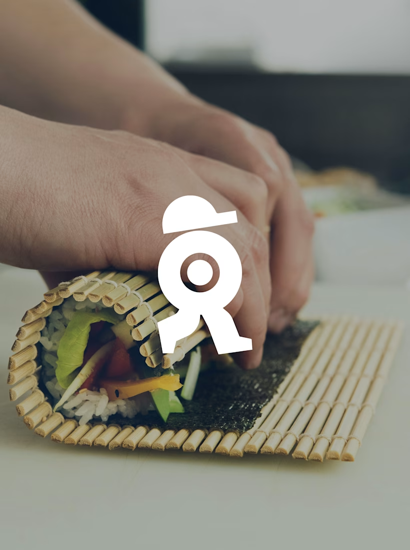
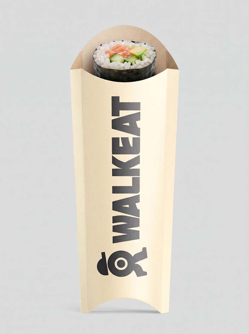
A sushi roll with a life of its own.
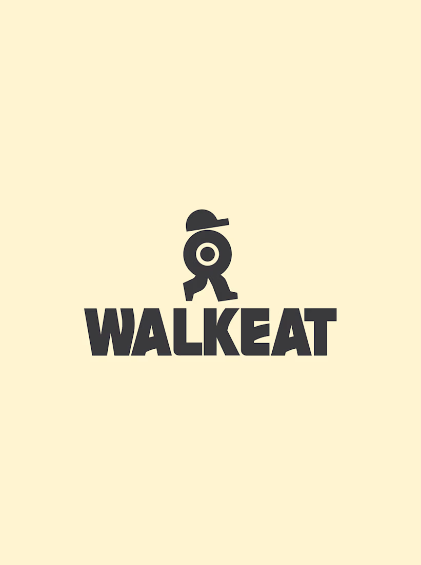
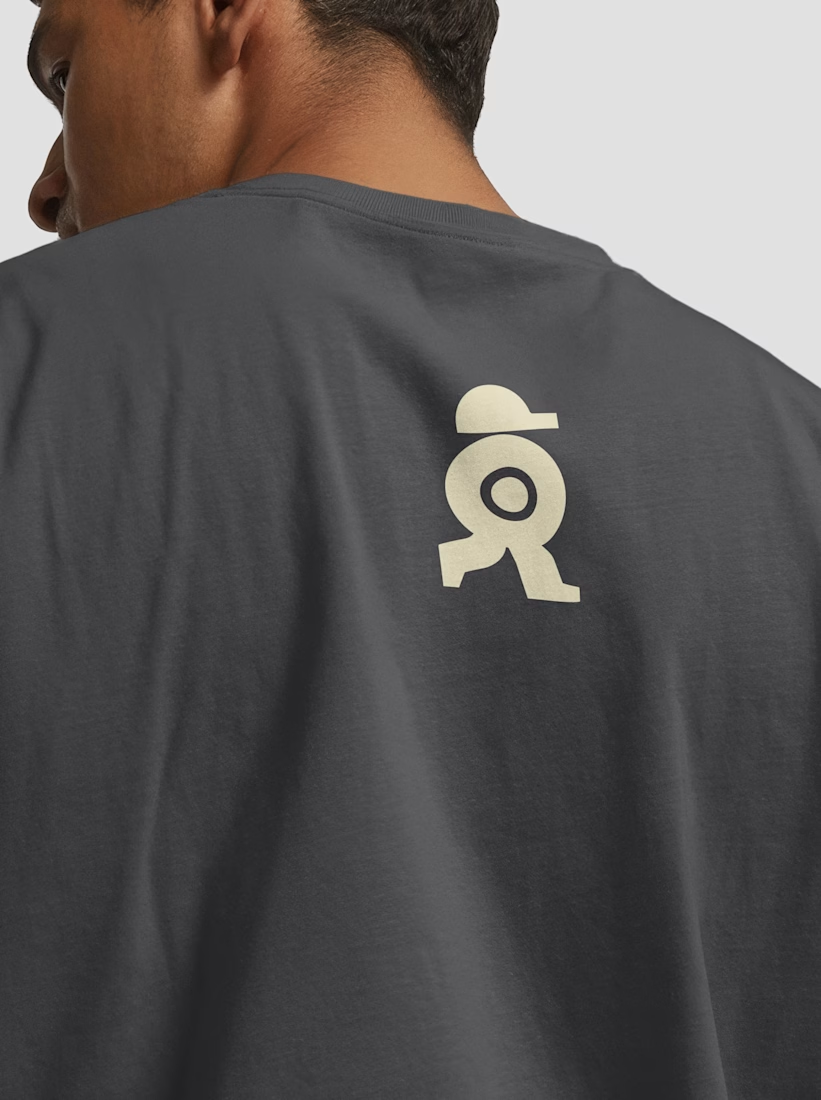
The WALKEAT identity transforms the shape of a sushi roll into a walking character. Its circular center references the cross-section of the roll, while the cap and legs bring movement and personality to the figure.
The custom-designed wordmark reinforces this concept through subtle modifications to the W, A, and E, creating a visual connection between typography and symbol.
A simple, playful and contemporary identity that communicates the product without relying on literal Japanese imagery or an overly cartoonish character.



Great work!!

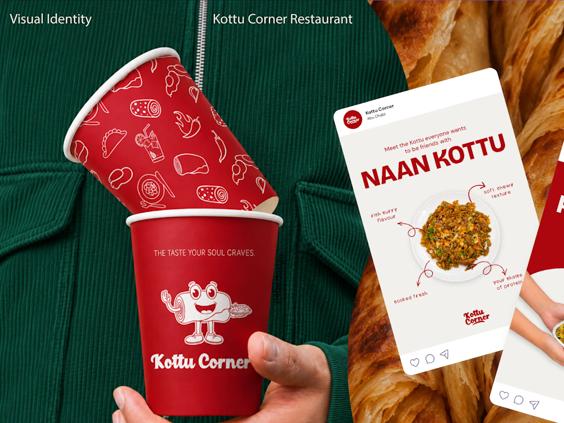
What if your business already has a logo, but nothing else that makes it recognizable as a brand?
That was the starting point for my recent branding project for Kottu Corner, a restaurant in the UAE.
They came to me with an existing logo, but without a complete visual identity to support it.
Redesigning the logo simply for the sake of change wouldn't have been a smart business decision. With the brand preparing for a major transformation, the existing logo was the one familiar element customers could still recognize. Changing it alongside everything else would risk losing that connection and making the brand feel unfamiliar to the very people who already knew and trusted it.
Instead, I focused on developing a cohesive brand identity around it, guided by the restaurant's audience, business goals, and plans for future franchise growth.
From brand strategy and visual direction to packaging, merchandise, and other brand touchpoints, the goal was to create an identity that feels recognizable, consistent, and true to the business.
Because sometimes, good branding isn't about changing what already exists. It's about building on it.
Explore the full case study! ❤️


Cool work!!