The network for creativity
Join 1.25M professional creatives like you
Connect with clients, get discovered, and run your business 100% commission-free
Creatives on Contra have earned over $150M and we are just getting started


The network for creativity
Join 1.25M professional creatives like you
Connect with clients, get discovered, and run your business 100% commission-free
Creatives on Contra have earned over $150M and we are just getting started

Challenges
View all


Related posts


Recent product update video for a client

Really curious about your process here. Did you start with a storyboard or go straight into motion?

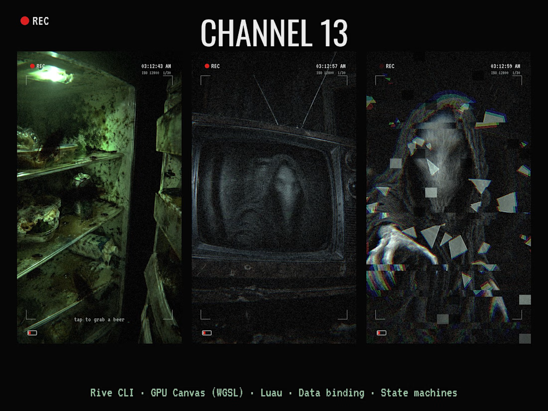
CHANNEL 13 📺👁️ A found-footage horror scene you play through smart glasses.
You open a moldy fridge full of roaches, grab a warm beer, sink into a ruined couch and turn on an old CRT. Every zap, something hooded and faceless gets a little closer in the static. On channel 13 it rushes the glass… and then it comes out. 🎧 Sound on.
How I built it:
• Rive CLI: the whole scene is written in RML with a coding agent (Claude Code), built and checked with rive --verify / inspect / screenshot, then pushed to the Rive editor
• GPU Canvas (WGSL): two shaders. A smart-glasses lens pass over the whole frame (fisheye, chromatic split, low-light grain, light-buzz flicker, digital glitch) and a cursed CRT shader (B/W analog snow, scanlines, rolling bar, vertical-hold slips, the figure bulging the glass, procedural spider-web cracks, power-off collapse)
• Luau scripting: story timing and "dread" level, channels and subliminal flashes, flying glass shards
• Data binding: one Story view model shared across artboards, a Broadcast view model driving the TV
• State machines: beat timelines, roach and bulb loops, 13 channels, all sound cues
• Audio: 22 sound effects, zero music. Fridge hum, buzzing bulb, roaches, footsteps, CRT whine, whispers, heartbeat, screamer, shattering glass
Uses both the CLI and GPU Canvas.



Should I go for left or right? Focusing on updating and finishing up my portfolio... and then I came across this crossroads. Another alternative is to make them switchable themes through a toggle, but I still need to decide which should be the default.
27 voted
75%
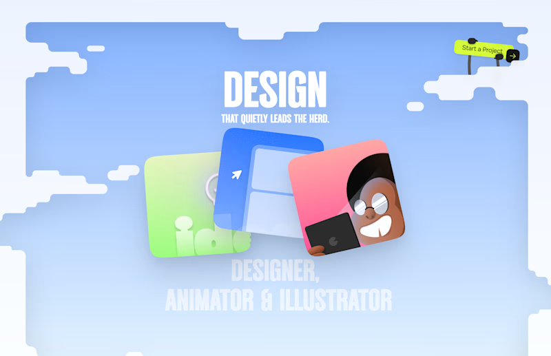
9 voted
25%
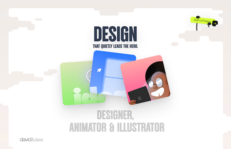
36 votes
Closed

Left is better because the text is readable, the overall blue background is not flashing to the eyes as compared to the right one.
For the top right button " Start a project ", you can add some animation so that it stands out and encourage users to click on it.