The network for creativity
Join 1.25M professional creatives like you
Connect with clients, get discovered, and run your business 100% commission-free
Creatives on Contra have earned over $150M and we are just getting started
Back to feedPost
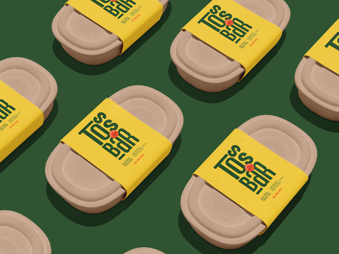
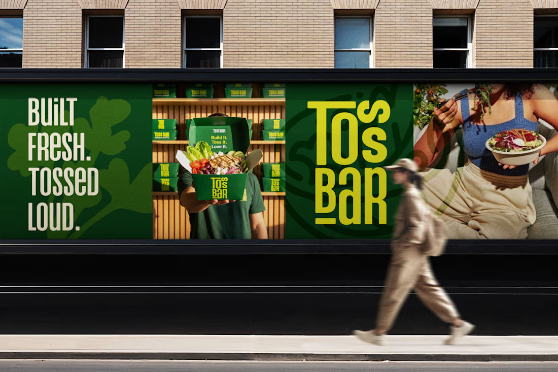
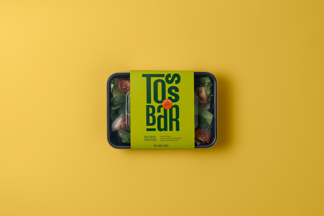
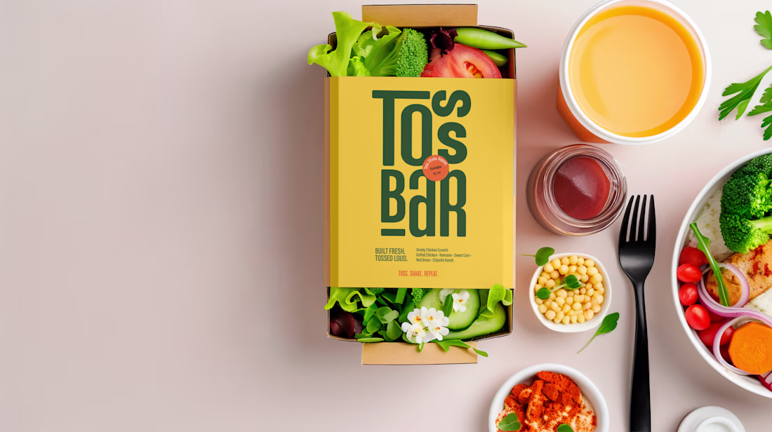
Designed a bold, high-energy identity for a salad concept called Toss Bar.
The idea was simple: healthy food, but make it loud.
Visually, I focused on Bold green tones for freshness
, High-impact yellow for appetite & visibility, Condensed stacked typography for memorability
, Strong color blocking for maximum brand recall
The result is a brand that feels confident, energetic, and modern not soft or generic.
As fellow creatives, I’d love to know does the tagline system strengthen the brand voice?
Share your view in the comments 👇✨
Love the grid consistency here very clean execution.
Thank you saber 😊
Amazing work!!
Thank you ☺️ ☺️
Amazing ork
Thanks 😊 😊
cool work
Thank you Eashin😊
really cool🙌
Thank you 😊 😍
Perfect branding that people cannot ignore, I loved the colors
Ohh Thank you so much 🙌 😊
Awesome!
Thank you Akin 😊
The network for creativity
Join 1.25M professional creatives like you
Connect with clients, get discovered, and run your business 100% commission-free
Creatives on Contra have earned over $150M and we are just getting started
Related posts
So good! Love the logo pacement on the last illustration, beautiful!
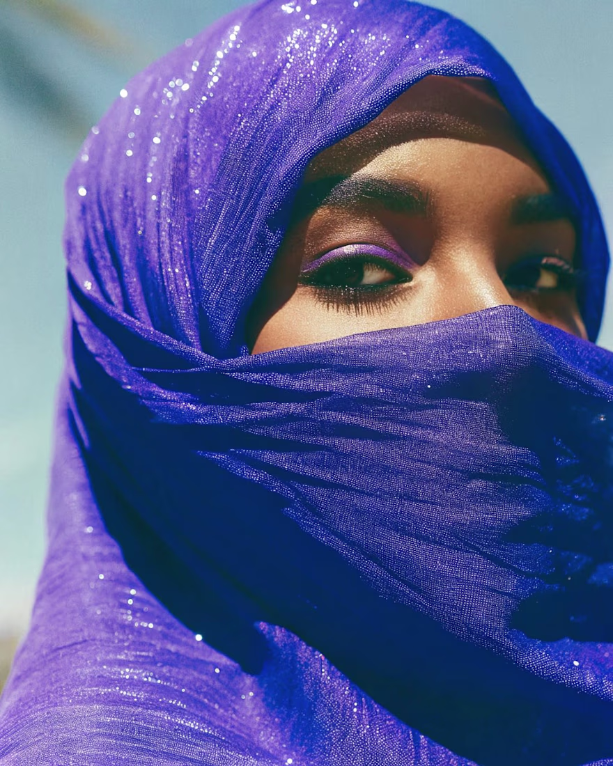
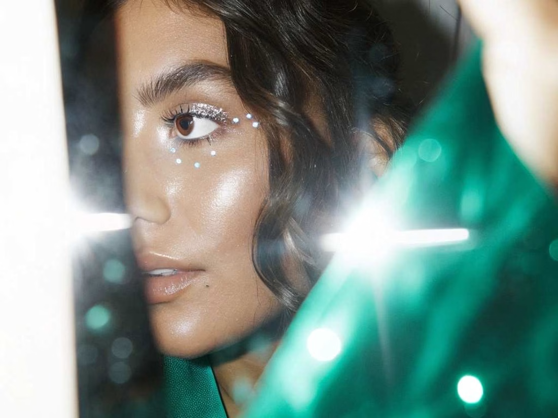
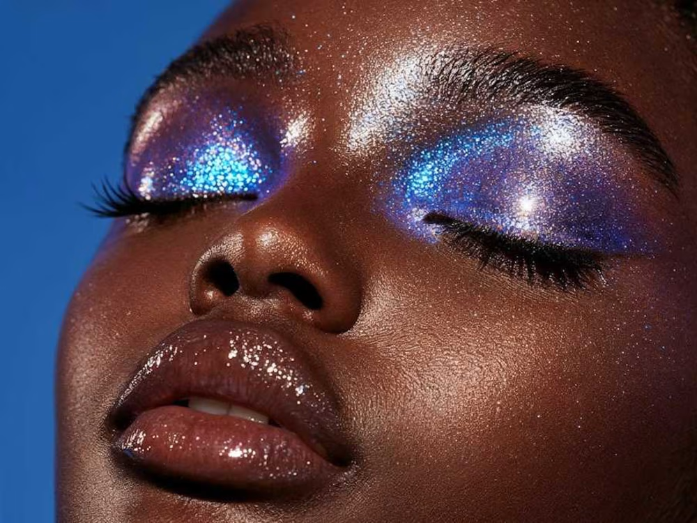
A self-initiated AI beauty editorial exploring color, texture and light as the new makeup. Three portraits move from veiled cobalt to dewy daylight to high-glitter close-up, each leaning into hyperreal skin and pigment that traditional photography rarely captures in one shoot. Built using a stack of, Weavy Ai and Higgsfield with Lummi for refinement, then color-graded for an editorial print feel. Created as a personal study for beauty brands and magazines exploring AI-generated campaign imagery.
So good!
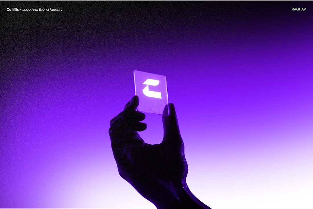
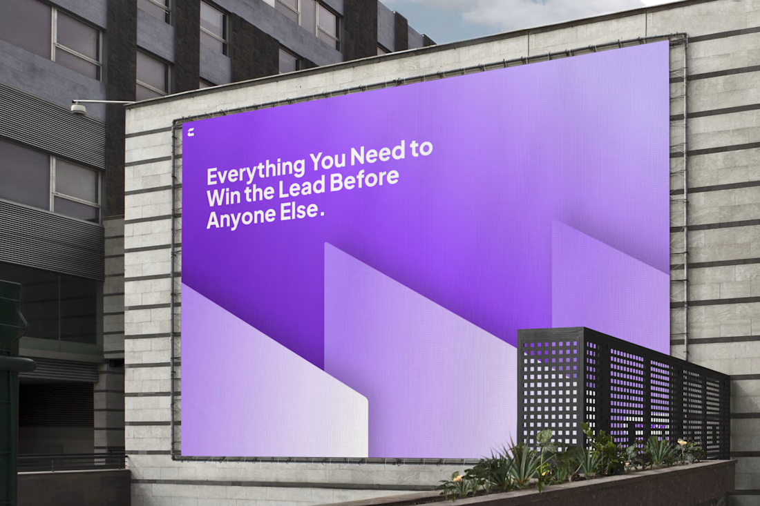
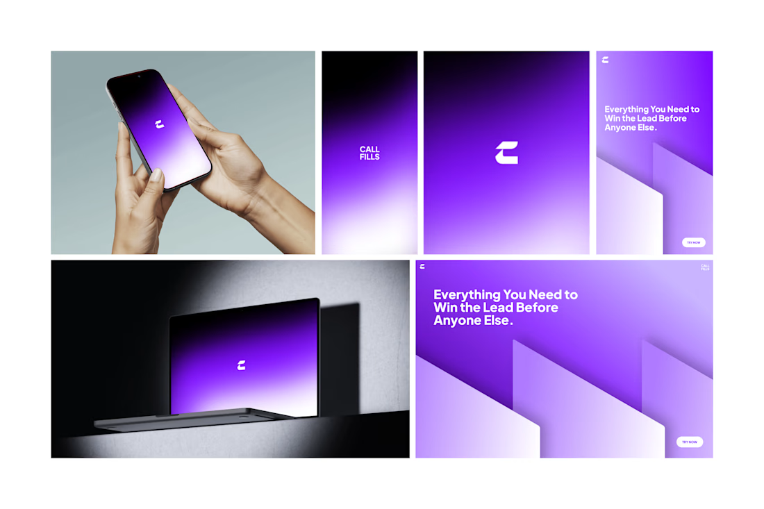
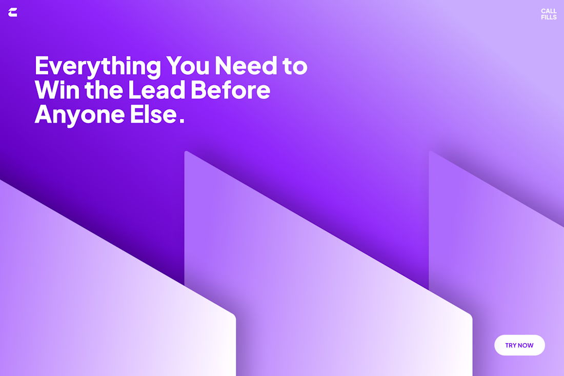
Just finished another branding project - CALLFILLS
AI lead generation SAAS product that can generate instant leads by navigating through fresh posts in major social media platforms.
Designing this was a great challenge as the client needed "c" to be highlighted as the logo, and even choosing a brand color was hectic cause the client only needed " blue". We gave it a try, and here we are with the full top-notch brand identity.
Design and Strategy by Raghav :)
Trending
Runway
AI video generation is exploding. What are you dreaming up in Runway?
Contra University
Learn from expert creatives how to earn more using next-gen AI tools.
creativeaiflow
Creative AI workflows are evolving. What tools do you use, and what are their strengths and weaknesses?
portfolioreview
The best portfolios tell a story, not just show a grid. Share yours for feedback.
freelancerlife
Freelancer life is wins, pivots, and everything in between. What’s yours right now?