The network for creativity
Join 1.25M professional creatives like you
Connect with clients, get discovered, and run your business 100% commission-free
Creatives on Contra have earned over $150M and we are just getting started
Back to feedPost

Not all design starts with a blank canvas.
Sometimes it starts with a question:
“What doesn’t feel right?”
This design was no different.
A product with potential… but a label that wasn’t telling the story.
So I stopped. Observed. Asked the right questions.
Who is it for?
What does it need to say in the first 3 seconds?
And perhaps most importantly… how does it need to feel when it’s picked up?
And then it was all about the details:
– The hierarchy that makes it easy to follow your eye
– The colors that communicate before the words ever do
– The balance of compliant and creative
It’s what makes someone pick your product without even realising why.
If you’re creating something and it needs to make a statement,
you know where to find me ✨
#LabelDesign #PackagingDesign #GraphicDesignIndia #CreativeProcess #DesignStory #BrandingMatters #ContraDesigner #FreelanceDesigner #ProductPackaging #VisualIdentity #DesignThinking #StartupBranding


The network for creativity
Join 1.25M professional creatives like you
Connect with clients, get discovered, and run your business 100% commission-free
Creatives on Contra have earned over $150M and we are just getting started











Related posts

Pulse Athletics... Branding & App design✨
Check it out
#app #sport #productdesign #uiuxdesign #uidesigner #uxdesigner #pulse #branding #brandidentity #brandstrategy #brandguidelines #logo #homepage


That's really stunning app design🔥🔥🔥
Great job Ziva🎉🎉🎉

A natural and premium packaging concept inspired by the purity of wildflower honey and the beauty of nature. The design combines warm honey tones, textured paper, bold typography, and a clean label layout to create an authentic, handcrafted feel.

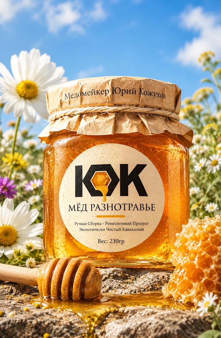

The honey drop sitting inside the O of the wordmark is a delightful detail, Umar. Textured paper plus that bold type really sells the handcrafted feel. This would stand out beautifully on a shelf.

Same design. Which palette? 👀
You picked your favorite preview last time. This time, I’m putting the colors to the vote.
One body-care packaging concept, with the same typography and composition:
A · Rose Cream, Strawberry Sorbet + Plum Jelly
B · Lime Mousse, Coconut Cream + Plum Jelly
Which would you choose and what does it make you feel about the brand?
Both palettes use colors and matching ingredient textures from DCS 654, my library of 654 dessert-inspired colors.
Take a closer look: dcs.mariya.design
7 voted
44%
9 voted
56%
16 votes
Closed
B is absolutely stunning 🎉🎉🎉🎉
Great job Mariya❤️


