The network for creativity
Join 1.25M professional creatives like you
Connect with clients, get discovered, and run your business 100% commission-free
Creatives on Contra have earned over $150M and we are just getting started
Back to feedPost

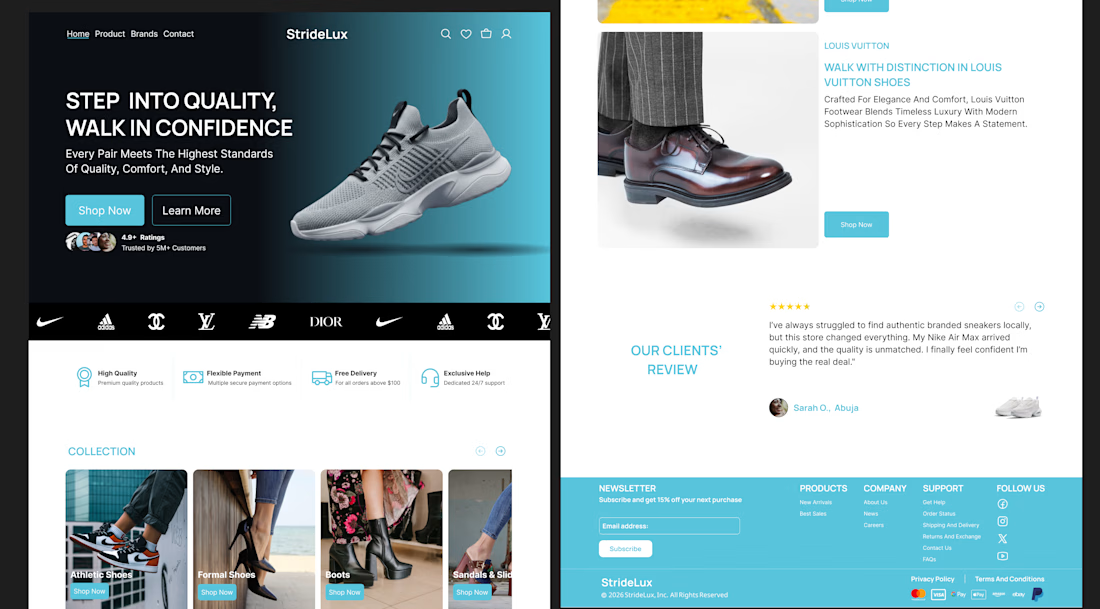
Early on, I thought strong UI came from flashy visuals. Turns out, the real difference is in three basics: colour, layout, and typography.
Colour guides attention and sets the tone. Good contrast builds clarity and trust. Bad colour choices create instant confusion.
Layout is how a screen breathes. Spacing and hierarchy help people know where to look without thinking. When layout is off, everything feels harder.
Typography shapes both readability and personality. The right type makes an interface feel calm and confident. The wrong one quietly hurts the experience.
Master these three, and even simple designs feel polished.
Which one do you find hardest to get right?


The network for creativity
Join 1.25M professional creatives like you
Connect with clients, get discovered, and run your business 100% commission-free
Creatives on Contra have earned over $150M and we are just getting started
Related posts

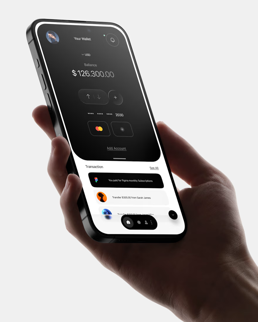
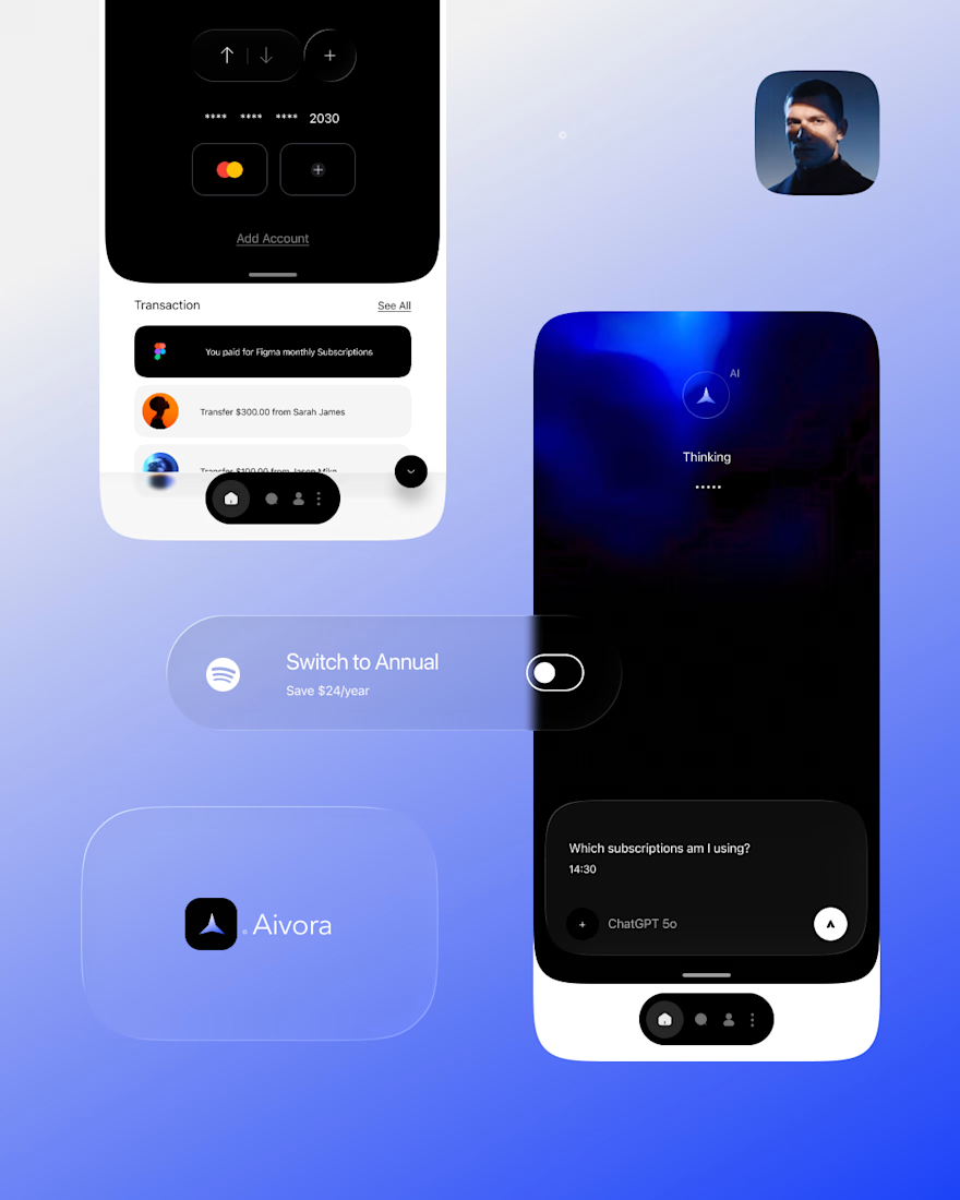
Exploring a new AI finance wallet concept.
The idea was to design a clean, distraction-free interface where balance, payments and transactions are immediately visible. Dark UI, large typography and minimal components to keep the focus on the numbers.
Built as a mobile UI concept focused on clarity, hierarchy and smooth interaction.


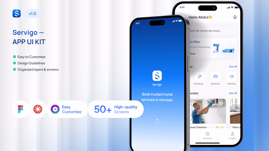
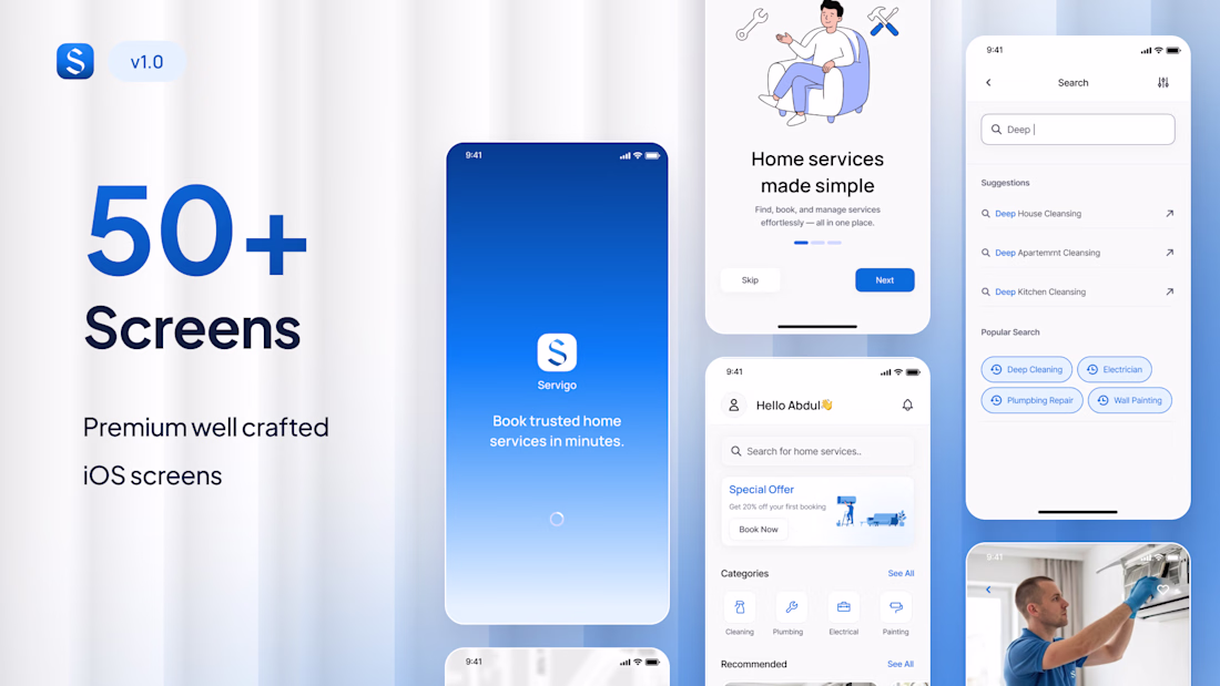
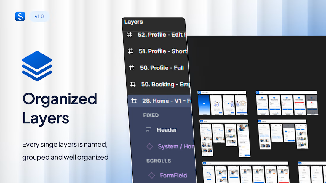
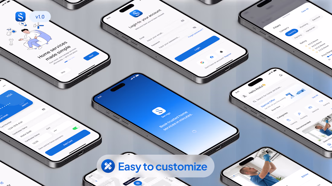
Servigo: On-Demand Service App UI Kit
Building a service booking app from scratch takes weeks. I designed Servigo to cut that time in half.
Servigo is a premium Figma UI kit built specifically for handyman and on-demand service platforms. I focused heavily on solving the biggest problem in this niche: creating a booking flow that actually converts, while keeping the interface clean to build user trust.
The details:
• 50+ ready-to-use mobile screens
• 750+ organized Figma components
• Built with Auto-Layout & strict Design System
You can grab the source file to speed up your own MVP, or hire me to customize this exact flow for your specific brand.
Building something similar? Let's chat.
ui8 : https://ui8.net/berchandraa/products/servigo--home-services-app-ui-kit

Good work

AI isn’t replacing designers. It’s exposing average design.
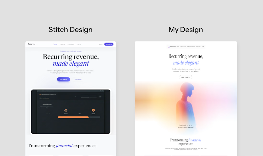
Tried Google Stitch vs my design. Yes, it generates Fast but it still can't match the design level.
Good layout. Fast. But side by side… the difference shows.
Good ≠ Thoughtful. AI follows patterns.
Designers make decisions.
AI generates.
Designers refine.
Still not over for designers.
Not even close.
What are your thoughts on it?👇


AI can't bring creativity, it looks more like a template than actual design.


Trending


Figma Make
Go from idea to prototype in minutes. What are you designing?
aivideo
AI video tools are moving at warp speed. Which ones are you experimenting with?
illustration
Handcrafted illustration is bubbling up across the web. What are you drawing lately?
aidesignflow
AI tools are redefining design work. What's your current workflow?
freelancerlife
Freelancer life is wins, pivots, and everything in between. What’s yours right now?