The network for creativity
Join 1.25M professional creatives like you
Connect with clients, get discovered, and run your business 100% commission-free
Creatives on Contra have earned over $150M and we are just getting started


The network for creativity
Join 1.25M professional creatives like you
Connect with clients, get discovered, and run your business 100% commission-free
Creatives on Contra have earned over $150M and we are just getting started







Related posts

Brand identity work for WesoftAI



Still waiting to hear back from @Contra HQ
So I did what any designer would do: I made the card myself 😂
Brushed metal. Laser-engraved logo. Holographic Mastercard rings. Full 360° spin. I'm going to keep polishing this until the real one shows up in my mailbox. Your move, Contra 👀
(Concept / fan design, not an official Contra product..Yet 🙌 )


“Okay, this looks WAY too good 🔥 Contra needs to make this real 👀”

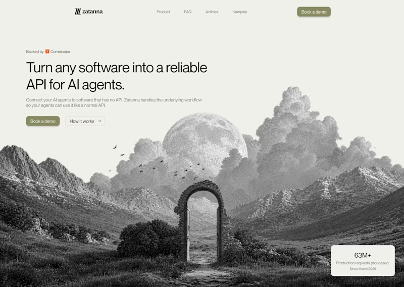
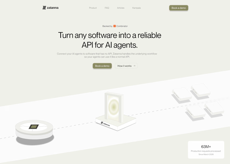
Which one brings more clarity to the hero section?
I was exploring a hero section concept for an AI product and tried two different visual directions.
Visual-led — focuses on explaining the idea through the interface/visual.
Isometric — uses a visual system to represent how the product works.
Both look good, but the real question isn't which one looks better.
Which one helps you understand the product faster?
That's something I always try to think about when designing hero sections — the visual should help explain the product, not just make the page look good.
Which one would you choose?
7 voted
58%
5 voted
42%
12 votes
Closed

The visual direction looks great, but I think Isometric does a better job of explaining the product.