The network for creativity
Join 1.25M professional creatives like you
Connect with clients, get discovered, and run your business 100% commission-free
Creatives on Contra have earned over $150M and we are just getting started
Back to feedPost

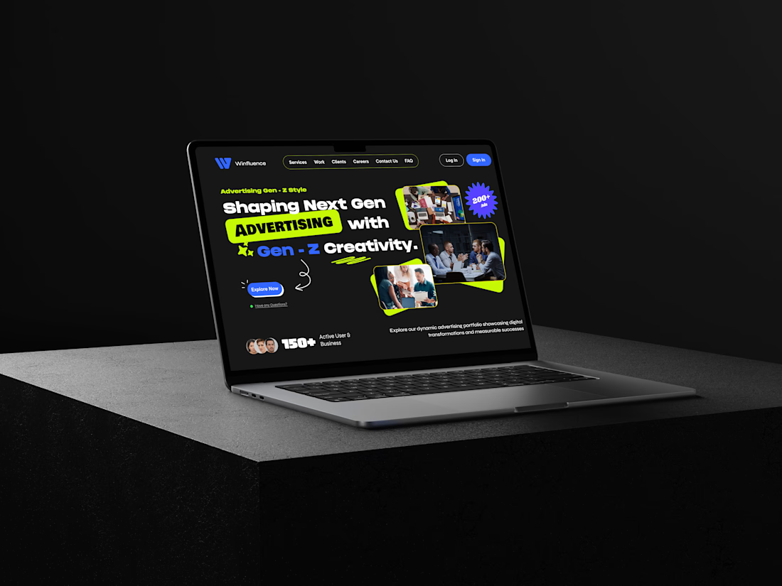
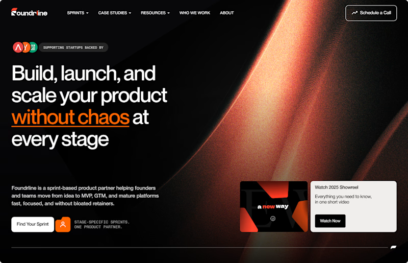
🚀 Gen-Z Advertising Website UI Concept is Live!
🔗 Website design link : https://lnkd.in/duXMSGDr
✅ Key Features:
Bold, Gen-Z–inspired visual identity
High-contrast dark UI with vibrant accent colors
Strong typography hierarchy for instant message clarity
Dynamic layouts combining imagery, cards, and CTAs
Designed in Figma with a conversion-focused mindset
🎯 Why this design matters:
Gen-Z audiences demand fast, bold, and authentic digital experiences.
This design speaks their language through modern visuals, energy, and clarity.
It’s built to capture attention instantly and guide users toward action without friction.
📌 Looking to stand out online? I help brands and startups design modern, high-impact websites and landing pages that connect with their audience and drive real results.


The network for creativity
Join 1.25M professional creatives like you
Connect with clients, get discovered, and run your business 100% commission-free
Creatives on Contra have earned over $150M and we are just getting started

Challenges
View all


Related posts

Day 10/30 of my hero section challenge.
Today: Ofelia, a spa in Bali.
→ The wordmark sits at eye level, spanning the full width, cutting across the middle of the space. Here the type claims the room, and because the interior is symmetrical and calm, it can take the weight.
→ A high-contrast serif against soft plaster. The architecture is all curves and matte texture, so the type brings the only sharp edges in the frame. Contrast without adding a single element.
10 down, 20 to go. A third of the way.
Template by Hariom, adapted and customized by me. Interior imagery generated with AI.


Contrast without adding a single element is such a clean way to put it. With 20 more of these to go, are you locking the typographic approach per venue type, or is Ofelia's centered serif going to be the constant across the whole 30?

More visuals from the rejected brand direction I shared earlier.
Really good to see this direction resonating with so many of you. It was one of our favourite explorations to build, from the narrative behind it to the visual world that brought it to life.
Great work doesn’t always make the final cut, and sometimes the reason has little to do with the quality of the direction.
Curious why this one was rejected? I’ve shared the story in the first comment✨


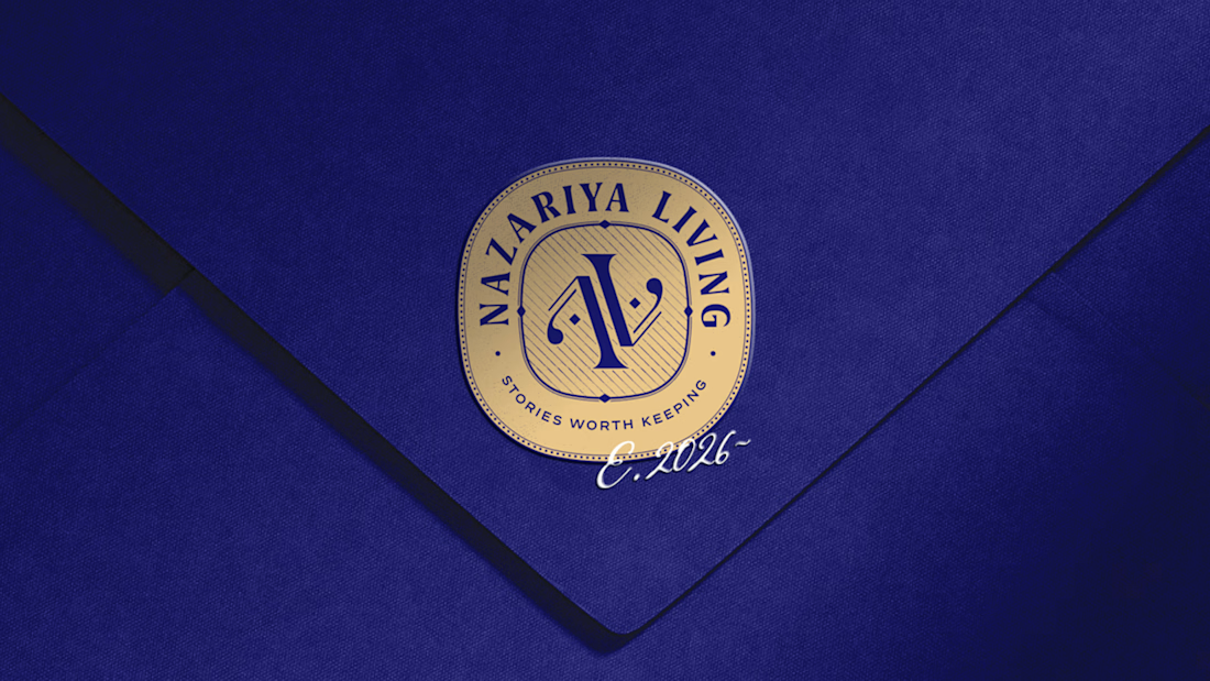
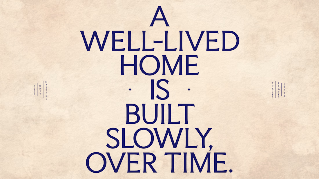
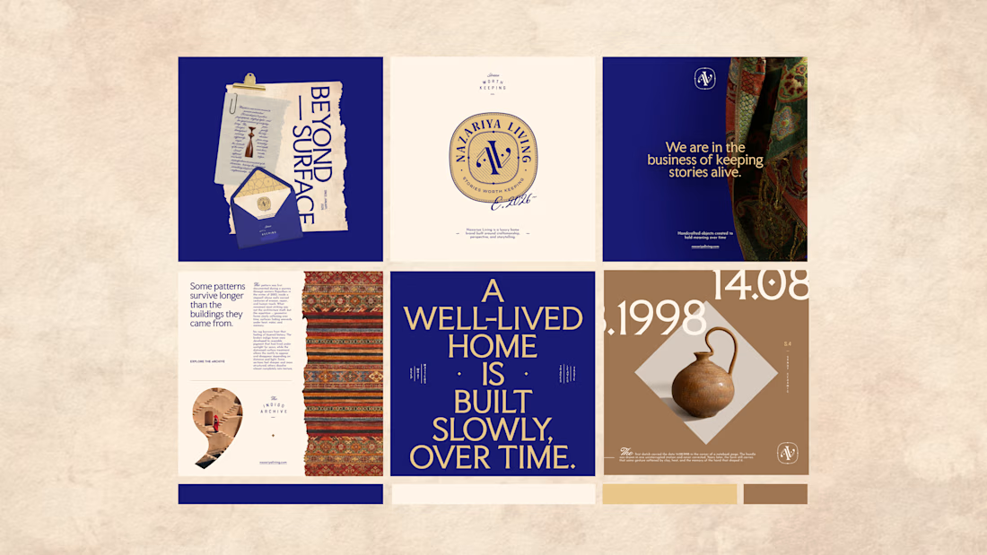
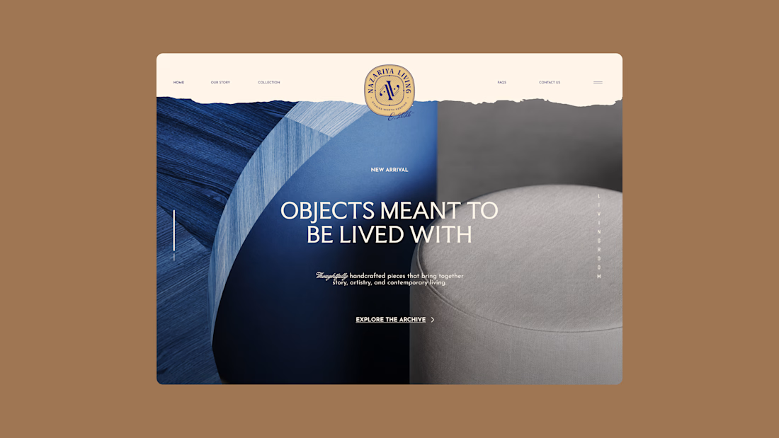
Nazariya Living is a premium carpet and home décor brand shaped by craftsmanship, culture and the stories objects carry into our homes.
This direction brought that idea to life through a seal-inspired logo, archival textures, unexpected colours and editorial typography, creating...

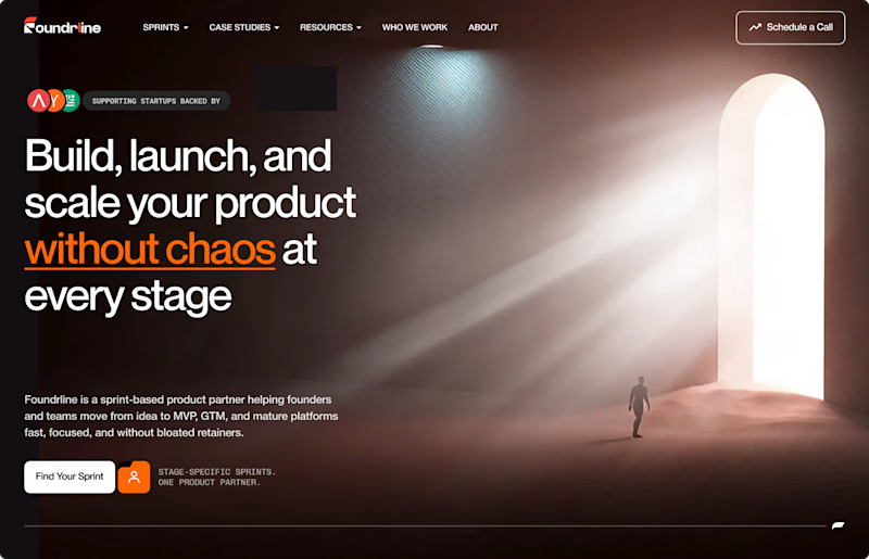

The path someone needs to follow for light to scale. Perfect!