The network for creativity
Join 1.25M professional creatives like you
Connect with clients, get discovered, and run your business 100% commission-free
Creatives on Contra have earned over $150M and we are just getting started
Back to feedPost

Rebranding & Website Design
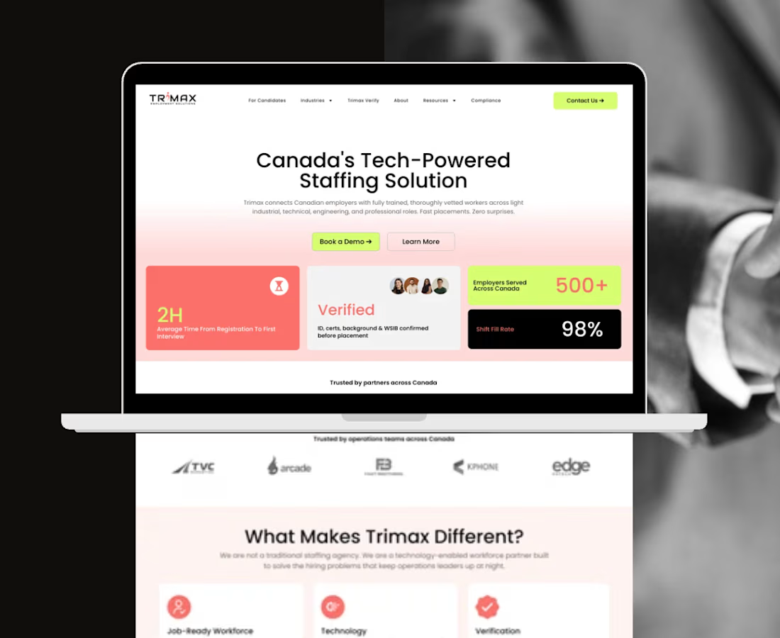
Brief: Trimax served two distinct audiences: employers and candidates but the previous brand and website lacked clear differentiation between them. The challenge was to create a visual identity and digital experience that could better guide users while maintaining a cohesive and recognizable brand.
Approach: The rebrand leveraged color as a functional design tool rather than a purely aesthetic element. Distinct color identities were assigned to employers and candidates, creating clearer audience pathways and stronger content hierarchy. This strategy was carried through into the website redesign, where the visual system informed navigation, user journeys, and content organization. Supporting accent and neutral tones ensured consistency and scalability across both digital and marketing touchpoints.
Impact:
- Improved clarity between employer and candidate communications.
- Created more intuitive user journeys through the redesigned website.
- Strengthened visual hierarchy and content organization across digital touchpoints.
- Transformed color from a branding element into a navigation and communication tool.

The network for creativity
Join 1.25M professional creatives like you
Connect with clients, get discovered, and run your business 100% commission-free
Creatives on Contra have earned over $150M and we are just getting started











Related posts

Brand Expressions -- Olivir




Thats so crazy!!!!!! Seeing this I feel we humans are still far better than AI

A logo is not a brand identity.
It’s the signature at the bottom of the letter.
Most founders start by asking for a logo.
What they need is a system that still looks like them on day 100.
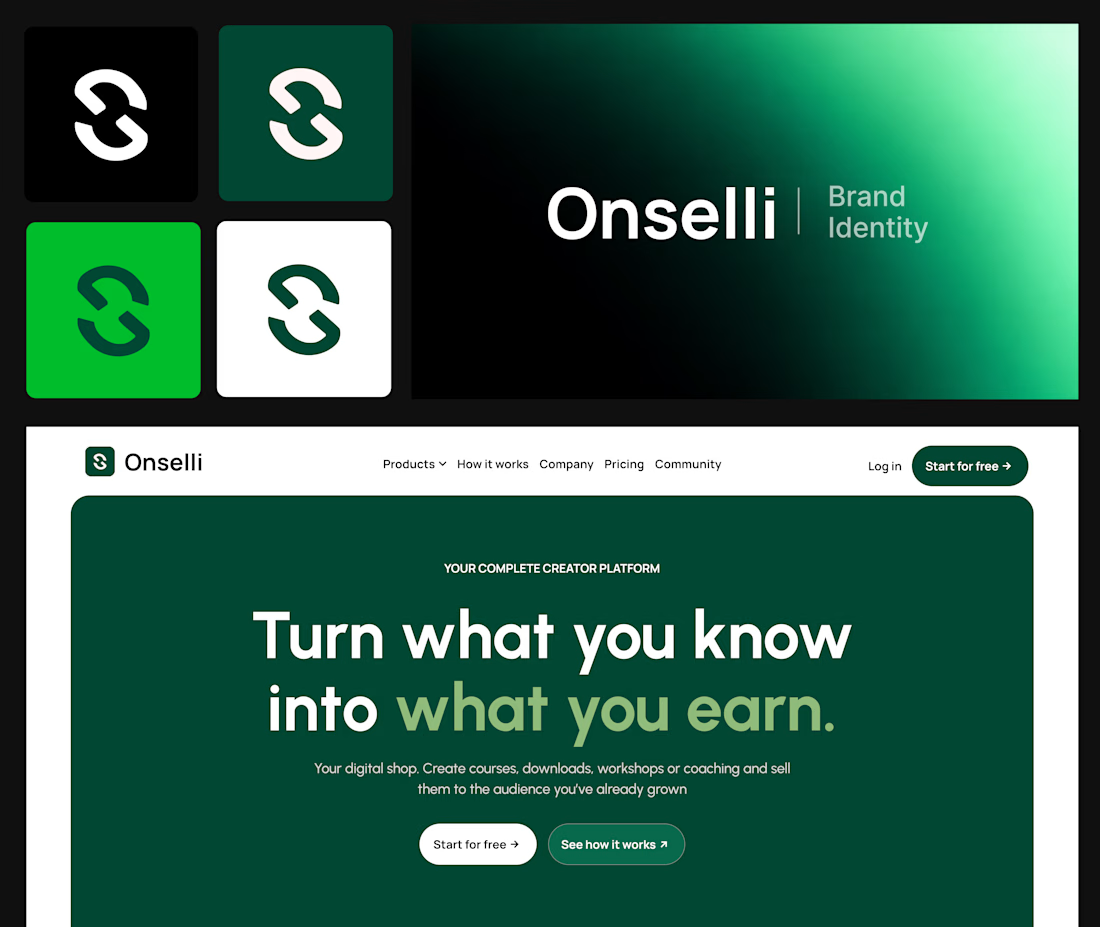
Here’s what sits behind the Onselli mark 👇
- A mark that holds on any background
- A style guide, with a color system where every color has a job and type with a point of view
- The brand principles, with the logo use cases on socials, mockups, or any surfaces.
- Components that match: buttons, cards, hero, forms, etc...
- Social creatives and copy that sells the product: “Turn what you know into what you earn.”
- A live website that carries all of it
Skip one and the whole thing starts to look like a template.
A logo gets you noticed.
A system gets you trusted.
Which of the 6 is your brand missing?
Drop the number below, and I’ll tell you how I’d fix it.
Know a founder who thinks branding is a logo?
Repost ♻️ and save them an expensive redo.
I’m Daniel, a Design Engineer. I craft premium web, motion, product design, and brand identities for startups.
Follow for more breakdowns like this, or DM me “identity” if you’re building something.

Great job Daniel 🎉🎉

Here we go, check the full case study, I think you will love it! 🎃


Love this! 🎃 The pumpkin concept for Renesia is super creative - perfectly matches the Pumpkin Seed Oil story. Clean work in Illustrator & Figma!