
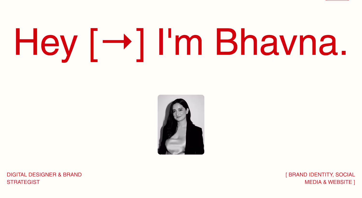
Bhavna Singh
Crafting brands with user experience in mind
Ready for work
Bhavna is ready for their next project!
Rebranding & Website Design
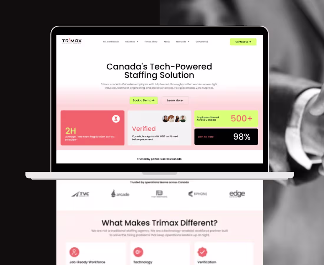
Brief: Trimax served two distinct audiences: employers and candidates but the previous brand and website lacked clear differentiation between them. The challenge was to create a visual identity and digital experience that could better guide users while maintaining a cohesive and recognizable brand.
Approach: The rebrand leveraged color as a functional design tool rather than a purely aesthetic element. Distinct color identities were assigned to employers and candidates, creating clearer audience pathways and stronger content hierarchy. This strategy was carried through into the website redesign, where the visual system informed navigation, user journeys, and content organization. Supporting accent and neutral tones ensured consistency and scalability across both digital and marketing touchpoints.
Impact:
- Improved clarity between employer and candidate communications.
- Created more intuitive user journeys through the redesigned website.
- Strengthened visual hierarchy and content organization across digital touchpoints.
- Transformed color from a branding element into a navigation and communication tool.
0
25
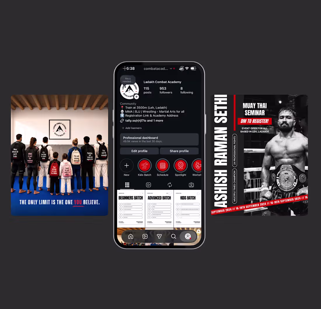
Social Media Strategy, Design & Management
0
69

Event & Brand Experience
0
77
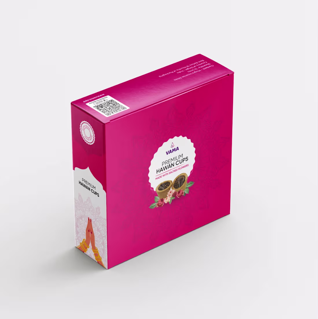
Packaging Design
0
85
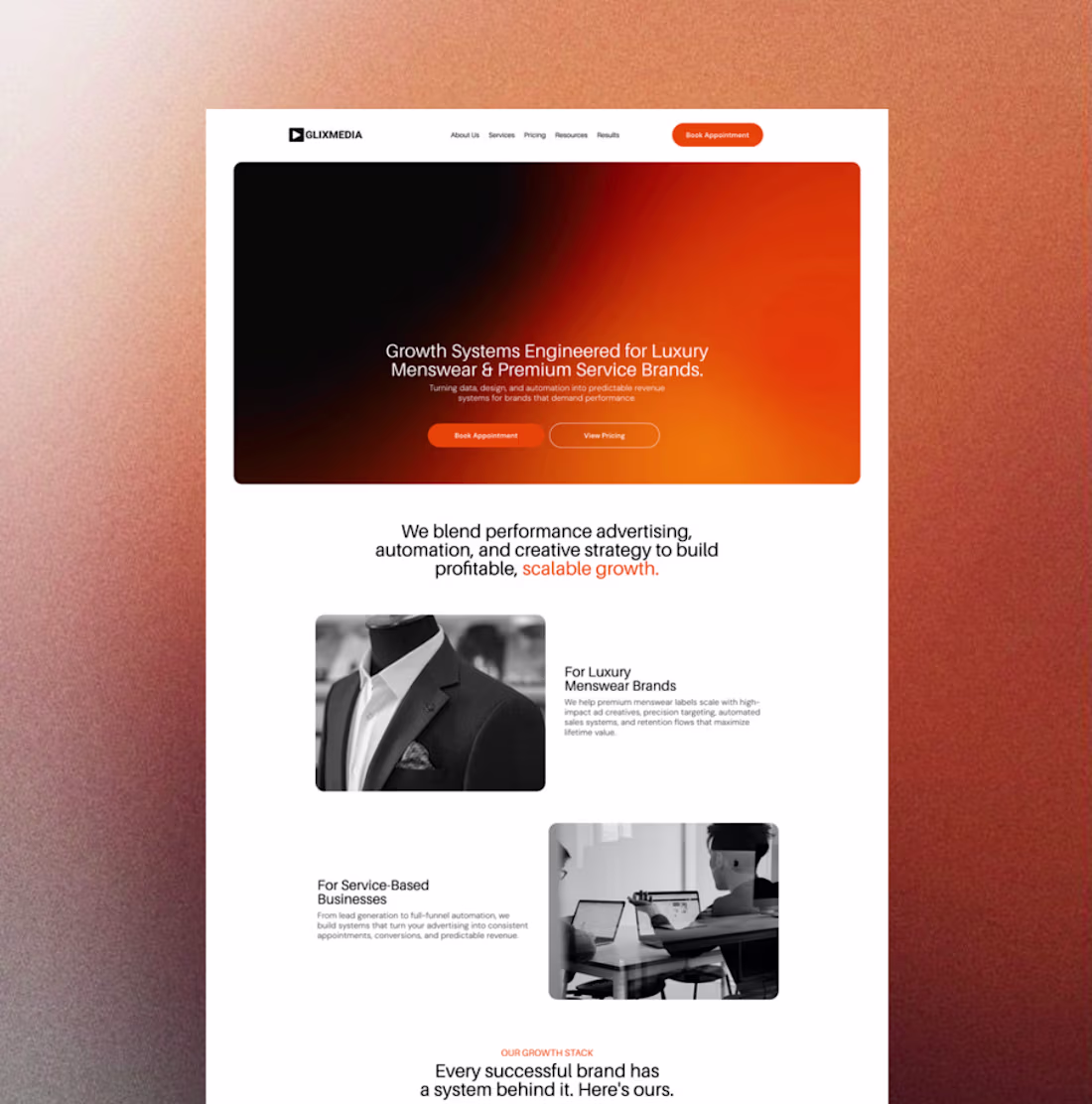
Glixmedia Website Design
0
92