The network for creativity
Join 1.25M professional creatives like you
Connect with clients, get discovered, and run your business 100% commission-free
Creatives on Contra have earned over $150M and we are just getting started
Back to feedPost

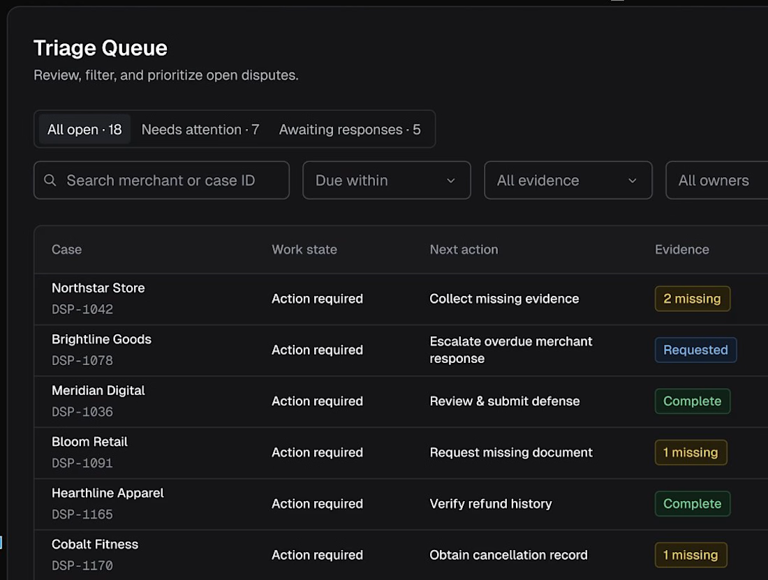
The hardest part of designing a dispute queue wasn't the table.
It was making the next action obvious.
For Ledgery, I'm testing a layout that puts work state, next action, and evidence status side by side.
Less guessing. Clearer priorities.

The network for creativity
Join 1.25M professional creatives like you
Connect with clients, get discovered, and run your business 100% commission-free
Creatives on Contra have earned over $150M and we are just getting started








Related posts

Built something that isn’t client work for a change.
Flowkidz. Short games that teach kids design, websites, AI, code and internet safety.


Fresh case study 🚀🚀🚀
Brand identity for Peak, an all-in-one website builder for WordPress that I design and build. A four-letter mark, a warm paper-and-ember palette and one system that runs from the favicon to the packaging.

A four-letter mark that has to hold from favicon to packaging is a tough constraint. Did you draw one letterform first and build the other three from it, or design them together as a set from the start?

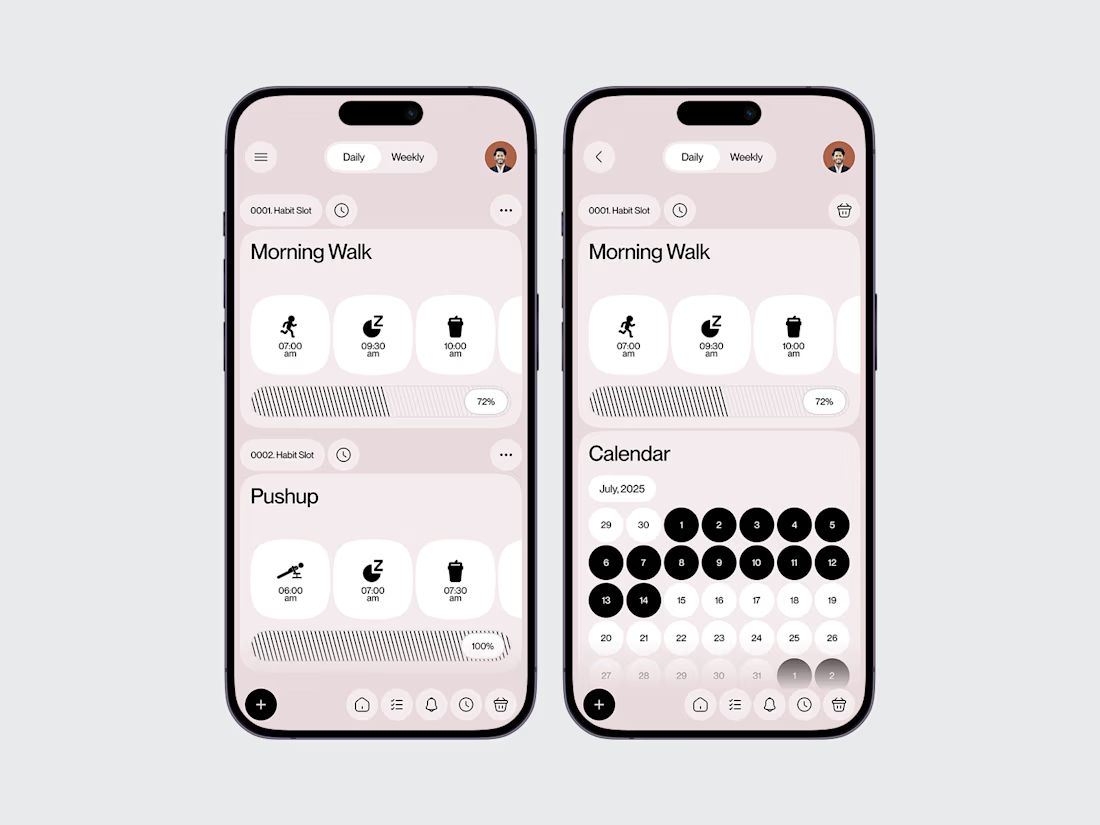
Habit Tracker Mobile App — UI/UX Design
A mobile app design concept focused on making daily habit tracking clear, approachable, and easy to maintain.
The experience centres on the everyday actions that help users build routines and understand their progress over time.
Design focus:
Daily habit tracking and check-ins
Progress visibility
Clear information hierarchy
Simple, intuitive mobile interactions
A user experience built around consistency
The goal is to make habit tracking feel like a natural part of the day rather than another item on the to-do list.
Need a thoughtful mobile experience for your next product?
Explore WaxyWeb at www.waxyweb.com

Awesome


