The network for creativity
Join 1.25M professional creatives like you
Connect with clients, get discovered, and run your business 100% commission-free
Creatives on Contra have earned over $150M and we are just getting started
Back to feedPost


Thanks Ciro!

Really clean and minimal execution. The flat design feels intentional, and the loading animation complements it nicely.
I worked with a similar flat visual language in a recent packaging and branding project too.
https://on.contra.com/GdHdLk
on.contra.com
Crafting the Cocoa Sisters: Premium Brand Design Success
Connect with next-gen talent and tools to get work underway. Hire more independents. Start more projects. Get more creative.

The network for creativity
Join 1.25M professional creatives like you
Connect with clients, get discovered, and run your business 100% commission-free
Creatives on Contra have earned over $150M and we are just getting started









Related posts

15 seconds of smooth UI, editorial layouts, and micro-interactions.
Kept the micro-interactions snappy, typography expressive, and transitions buttery smooth.
Rate this UI animation from 1 to 10 in the comments, or tell me what you’d improve! 😉


Solid 10/10 bro! 🔥 Micro-interactions are super snappy and transitions are buttery smooth indeed. Editorial layout game is strong. Keep it up!

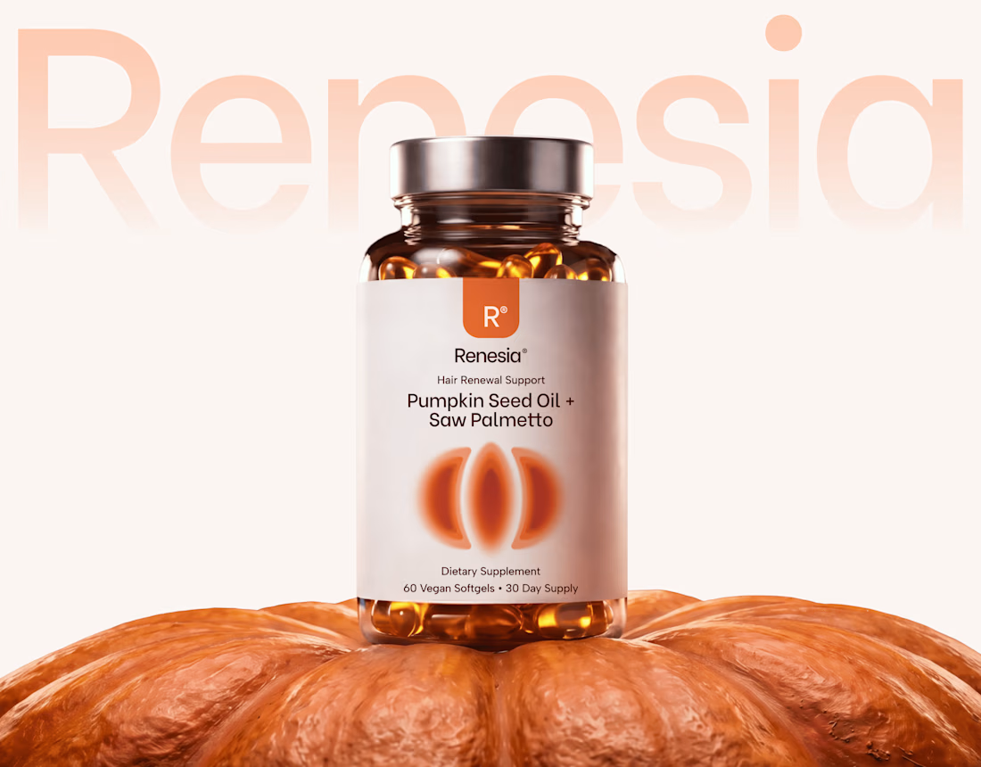
Here we go, check the full case study, I think you will love it! 🎃


Love this! 🎃 The pumpkin concept for Renesia is super creative - perfectly matches the Pumpkin Seed Oil story. Clean work in Illustrator & Figma!


SES AI is a battery technology company accelerating the energy transition through AI-powered material discovery, battery development, manufacturing, and management.
SES AI approached us with a website redesign driven by its new “All-in on AI” strategy. As AI became central to the company’s work across safety, manufacturing, and science, the existing website still focused primarily on its battery-hardware side. We redesigned the experience to clearly communicate the three AI pillars, while making the website simpler, more direct, and easier to navigate.

This looks insane. The robotic arm with the battery cell is such a strong visual. Love how clean you kept it despite it being AI heavy.