The network for creativity
Join 1.25M professional creatives like you
Connect with clients, get discovered, and run your business 100% commission-free
Creatives on Contra have earned over $150M and we are just getting started
Back to feedPost

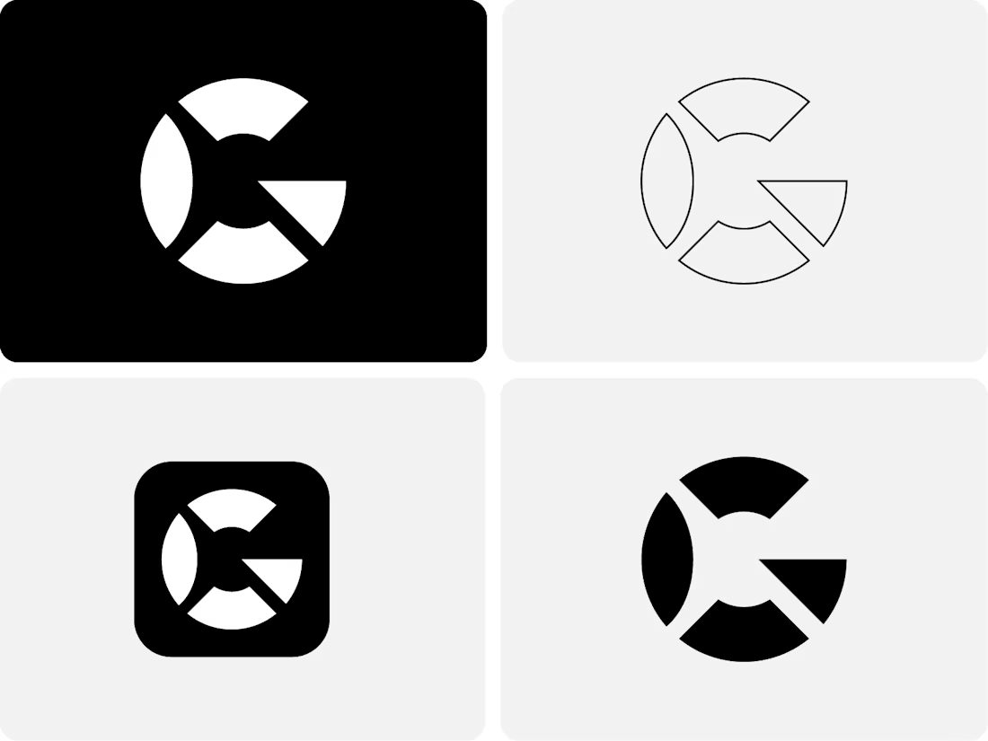
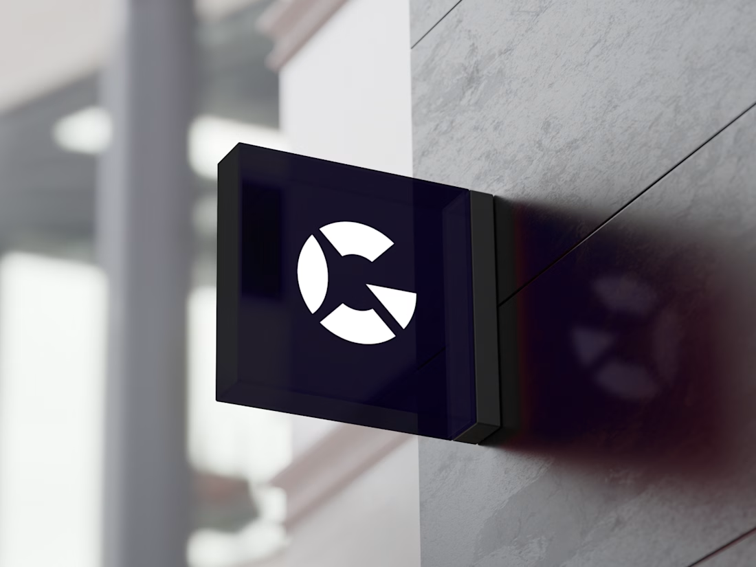
Letter G Logo
This exclusive, unused logo is now available for purchase.
You’ll receive unlimited free revisions, all high-quality logo files, a brand style guide, and full copyright ownership documentation.
This logo will be sold only once and will never be resold.
If you’re interested, send me a DM and we can discuss the next steps.
© 2026 Logomast. All rights reserved.
Designed by Khairul Islam.

The network for creativity
Join 1.25M professional creatives like you
Connect with clients, get discovered, and run your business 100% commission-free
Creatives on Contra have earned over $150M and we are just getting started





Related posts

Top 1% on Contra. 🎉
A little milestone, but a reminder that showing up and doing good work consistently actually pays off.
If you're just starting out and wondering if it's worth it: it is. Keep going.
Thanks to all my clients and everyone here who's been so supportive.

That's Legendary bro congrats 🔥🔥🔥🔥

A personal identity experiment for Super Intelligence.
The symbol combines a star and the letters SI into one compact mark.
Logo design + motion.


Excellent use of geometry in the logomark!


Mockups are great, but when presenting a visual identity to clients, we always include a slide explaining the thinking behind the logomark and connecting it back to the strategy.
It makes feedback and further revisions so much smoother too