The network for creativity
Join 1.25M professional creatives like you
Connect with clients, get discovered, and run your business 100% commission-free
Creatives on Contra have earned over $150M and we are just getting started
Back to feedPost


Mockups are great, but when presenting a visual identity to clients, we always include a slide explaining the thinking behind the logomark and connecting it back to the strategy.
It makes feedback and further revisions so much smoother too
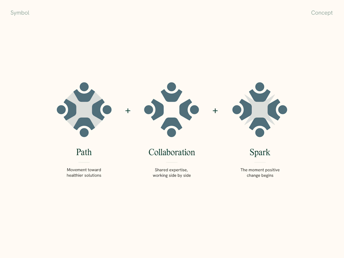

That slide also gives clients a shared vocabulary for feedback, so the conversation moves from "I don't like it" to "does it serve the positioning". Do you show it before the mockups or after?

This is so clean and well executed! Love the attention to detail ✨
Outstanding creativity!

We started adding a real-world stress test slide — the identity mocked into a tiny favicon, a loud packaging box, and a one-colour print — and it changed every conversation. Clients stop judging the logo as a picture and start evaluating it as a system. That one slide alone cut our revision rounds almost in half.


Great concept Aryna
The network for creativity
Join 1.25M professional creatives like you
Connect with clients, get discovered, and run your business 100% commission-free
Creatives on Contra have earned over $150M and we are just getting started






Related posts


Creating 2 concepts for a project, this is the first one.
I’m really enjoying the process!
Right now, we’re defining the strategy and visual direction, which will later serve as the foundation for developing the final brand identity.

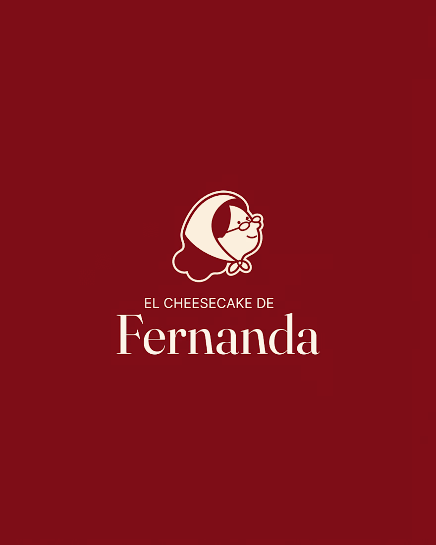
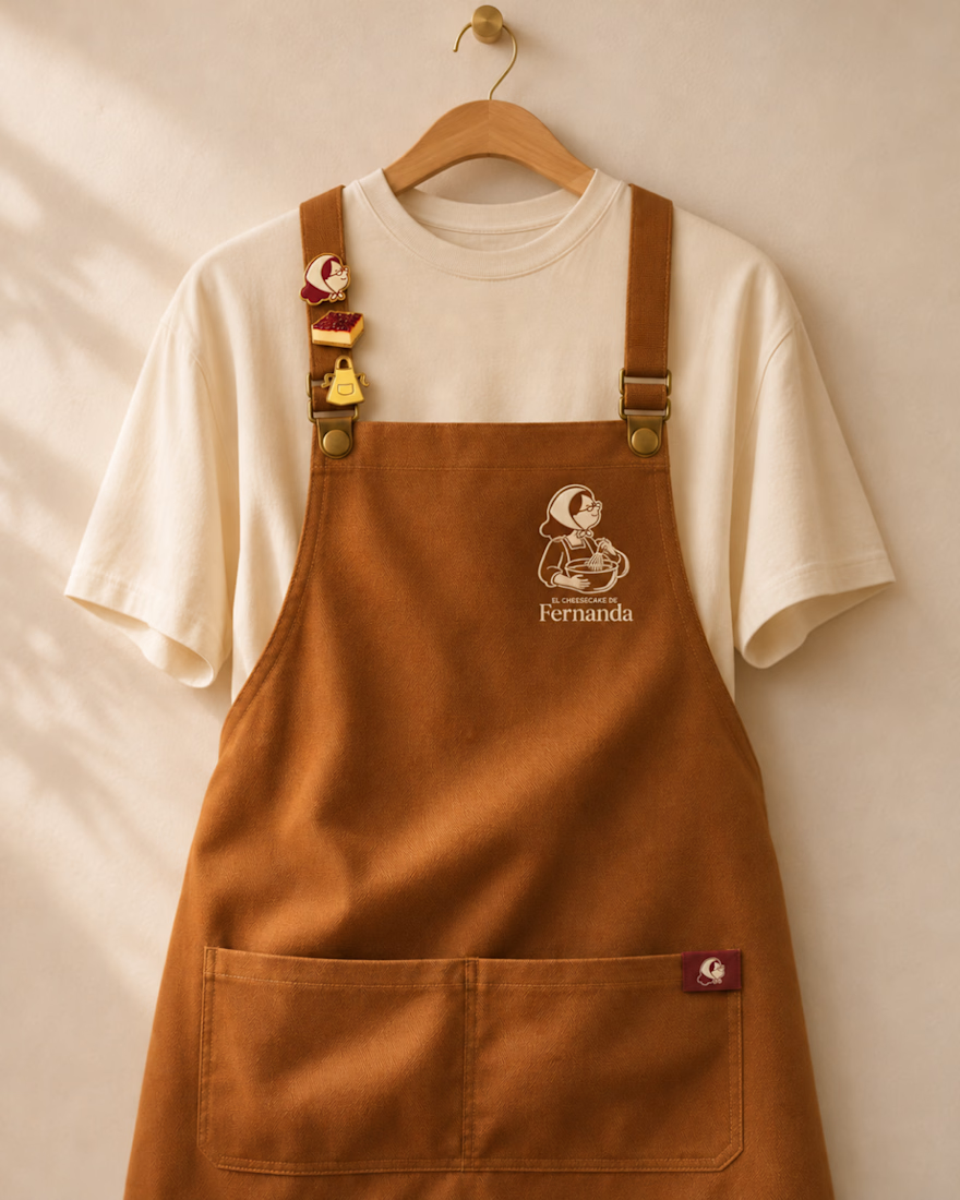
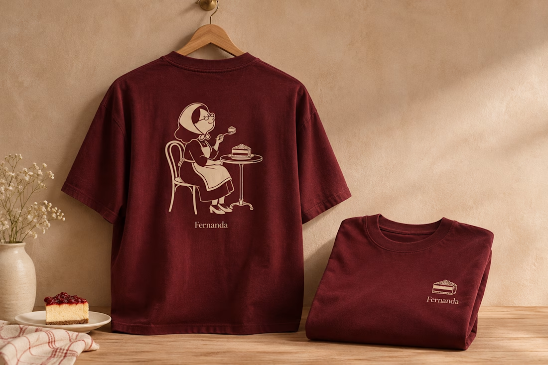

Nice logo design I like how logo is placed in clothes

Which one would you rather see on a muddy Sunday morning?
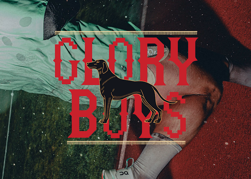
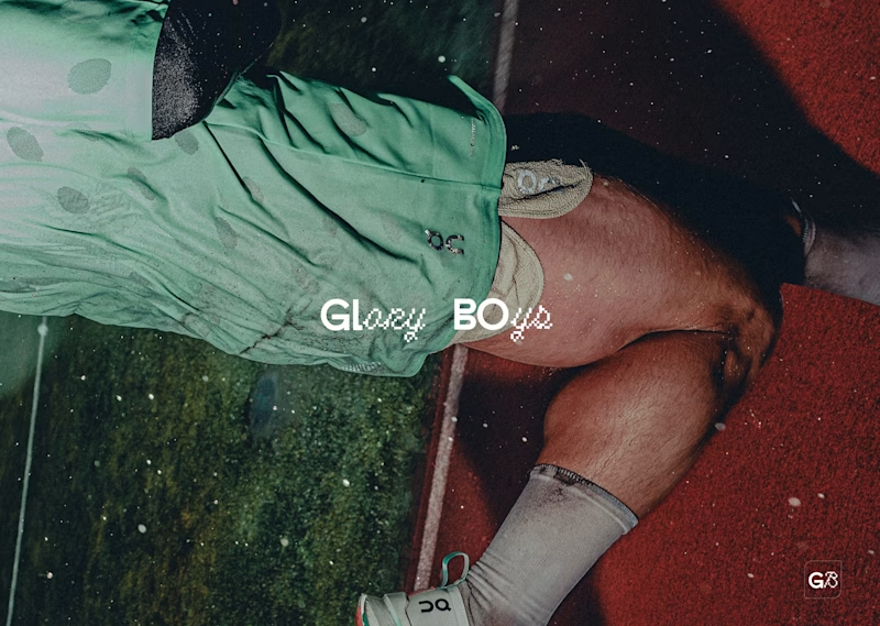
Two logos for the same five-a-side team. Same photo, same sweaty energy, very different personalities.
Option A: red slab serif with pixel notches, a black hound in the middle, gold ticker rules top and bottom. It looks like a pub sign that got into a video game. Loud, heritage, a bit smug.
Option B: tiny white wordmark, half clean sans, half pixel script, with a little G8 stamp in the corner. It looks like it already has a sponsor and a good agent. Quiet, modern, a bit cool.
One screams “we have a trophy cabinet.” The other whispers “we are not telling you about the trophy cabinet.”
Reply A or B. Be honest, nobody’s feelings are on the line except mine.
17 voted
57%
13 voted
43%
30 votes
Closed

Big news! We opened an agency. To deliver the best mascot work the world has seen, me @Mary Delaney and @Arsen Airyan are teaming up with mascot.berlin
Check it live, and stay tuned for more!

Looks cool, kepp going!