The network for creativity
Join 1.25M professional creatives like you
Connect with clients, get discovered, and run your business 100% commission-free
Creatives on Contra have earned over $150M and we are just getting started
Back to feedPost
CapCut reimagined as a Tokyo streetwear brand, Born to Cut 😉 A complete brand identity inspired by 1980s Japanese advertising: bold yellow, navy blue, and red. Logo, campaign posters, packaging, and merchandise. Built with CapCut Design Studio
Logo DesigncapcutdesignstudiobrandidentitypresentationdesigBrand DesignGraphic DesignAdobe PhotoshopCapCut


Loved the color palette and the layout, it looks so cool 🔥

Thank you so much! I’m really happy you liked it 😊


this is awesome
Thank you 😊

Nice one! This will be hard to beat! ✌️
Thank you 😊


Well designed 👏
Thank you 😊

This is so fun!

Great Design

SO good! Love the palette

Great Work!

thank you for goat 😊

Very nice 👍

love it
thank you😊

I love the hood 😍
me too 😍

Great job.
Well done
thank you 😊

Awesome!


Branding 🔥

Joyful look & feel! I like that ❤️

The network for creativity
Join 1.25M professional creatives like you
Connect with clients, get discovered, and run your business 100% commission-free
Creatives on Contra have earned over $150M and we are just getting started



Related posts

Brand work for HauntChain
I'm loving building this brand and the results so far
A deFi platform with some gamification


That's cute ❤️

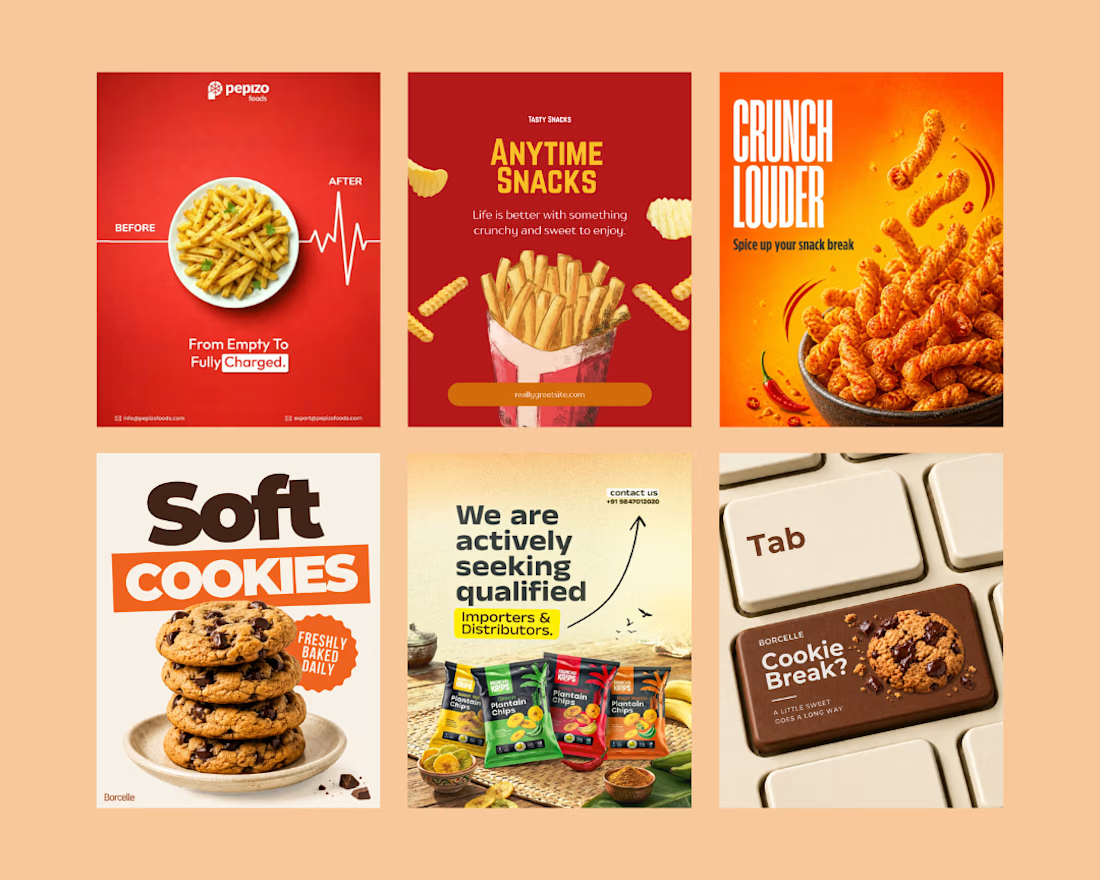
Created eye-catching social media creatives for a snack brand, focusing on mouth-watering visuals, bold typography, and engaging layouts.
The designs highlight product appeal, grab audience attention, and help the brand promote its snacks, offers, and new launches effectively across social media.
Social Content DesignphotoshopposterdesignSocial Media MarketingTypographyAdobe PhotoshopCanvaChatGPT



great job🙌

Behind the wall: a homepage concept for Studio Cesare
I’m testing a new landing page for my studio, made with Brik.
A pixel-brick grid covers the screen. Move through it and the bricks fall away to reveal the person behind the work, mid-coffee, slightly off balance. Then the wall closes again.
It’s a small metaphor for how I approach next-generation branding: a strong system on the surface, with a real person and a real point of view underneath.
Exploring this for the studio site launch. Open to feedback, and to new projects 🤝🏼

This is amazing!!