The network for creativity
Join 1.25M professional creatives like you
Connect with clients, get discovered, and run your business 100% commission-free
Creatives on Contra have earned over $150M and we are just getting started
Back to feedPost
Surf your targeted market. Print ready double sided business card designed to a US buyer on another platform in 2014.


The dark card with the warm color accents works well for a salon brand. The contrast between the dark background and the lighter back side gives both sides their own distinct feel.

Thank you for your description I much appreciate it.
The network for creativity
Join 1.25M professional creatives like you
Connect with clients, get discovered, and run your business 100% commission-free
Creatives on Contra have earned over $150M and we are just getting started


Related posts

My latest branding project for the Atlanta Museum of Paleontology.
Check out the full project at maximjungle.com

A T-rex drawn in one thin outline is such a good mark 🦖 I'd happily visit that museum.

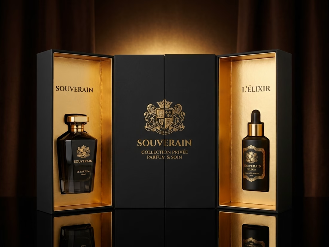
Four luxury black-and-gold skincare packaging and gift box concepts with label design, brand styling, and product mockups.


Nice mockup!


Built to become an icon.
First or Nothing came to us with ambitions beyond their first product. They wanted a brand mark that could live on a supplement bottle, across apparel, or even become someone's next tattoo.
The result? A bold, distinctive identity with four layers of meaning and a hidden '1' in the wordmark.
Once you see it, you can't unsee it.
A brand built for where they're going, not just where they started.


The hidden 1 in the wordmark is a clever find. I can see that mark working as a tattoo too.