The network for creativity
Join 1.25M professional creatives like you
Connect with clients, get discovered, and run your business 100% commission-free
Creatives on Contra have earned over $150M and we are just getting started
Back to feedPost


The network for creativity
Join 1.25M professional creatives like you
Connect with clients, get discovered, and run your business 100% commission-free
Creatives on Contra have earned over $150M and we are just getting started

Challenges
View all


Related posts

Designed a dashboard concept for tracking net worth across every asset type — stocks, crypto, property, pensions, funds, cash, and liabilities — all in one place.
Instead of the usual pie chart or bar graph, the centerpiece is a dial: a single, glanceable gauge showing where your wealth actually sits. Behind it, a quiet grid of every asset category fades in and out of visibility, reinforcing that everything's accounted for even when it's not the focus.
Dark UI, a single confident green accent, and a lot of negative space — built to make a genuinely overwhelming task (seeing your entire financial picture at once) feel calm instead of cluttered.


wow the animation feels super smooth, what is this animation for?

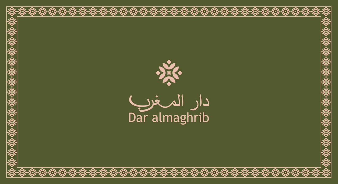
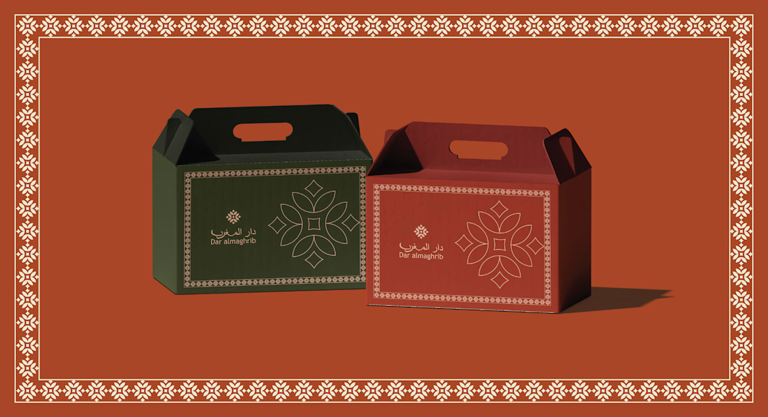
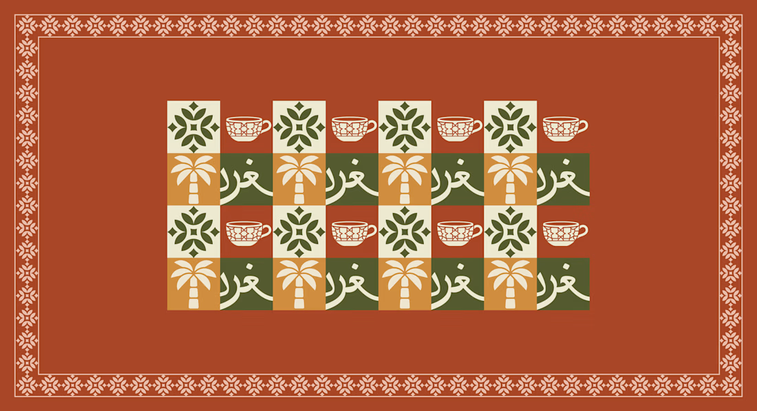
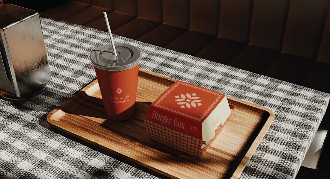
Dar Almaghrib Moroccan Café Brand Identity & Logo DesignA complete brand identity for Dar Almaghrib, a Moroccan-inspired café bringing the warmth of Marrakech to the Pacific Northwest.
The identity centers on a custom logo lockup pairing fluid Arabic calligraphy for "دار المغرب" with a clean, modern English wordmark, supported by an original geometric icon inspired by traditional zellige tilework sharp-edged and fully custom, not a stock motif.
The palette blends deep olive green, warm terracotta, cream beige, and a soft brass-gold accent colors drawn from Moroccan earth tones and the calm forests of the PNW, built for a premium, welcoming feel across cups, signage, packaging, and menus.


Which Phoenix Vector Logo You Guys Like Most?
These 100% Handmade Vector Logos Are Also Available For Purchase With Exclusive Copyrights Transfer Ownership, Feel Free To Contact Us.
5 voted
38%
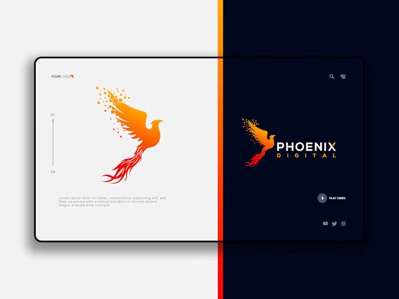
8 voted
62%
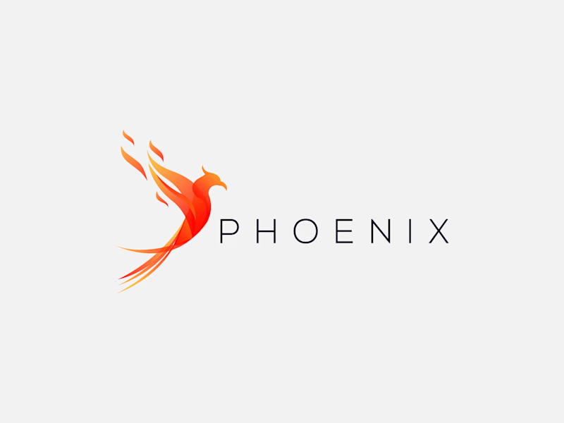
13 votes
Closed

B has more life to it, that wing gradient gives it some motion the flat mark in A doesn't have. Are you pricing these as one-off logo packs or is there a bigger identity system behind them?