The network for creativity
Join 1.25M professional creatives like you
Connect with clients, get discovered, and run your business 100% commission-free
Creatives on Contra have earned over $150M and we are just getting started
Back to feedPost

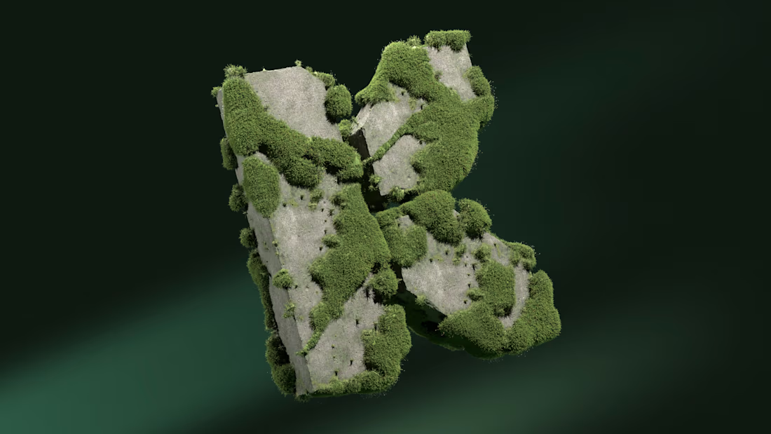
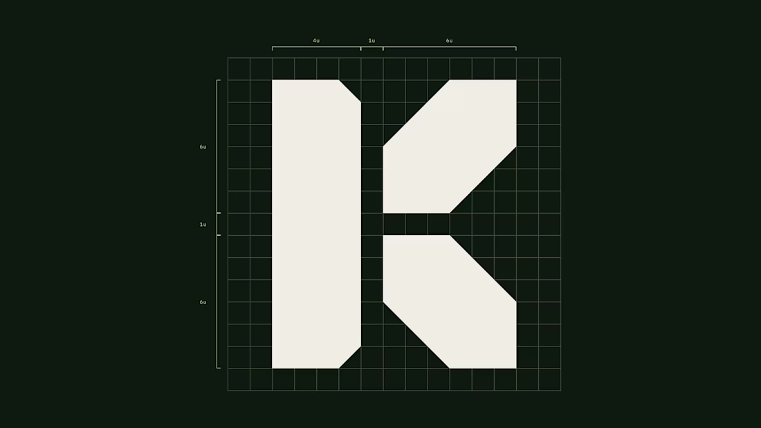
A blast from the past. Visual Identity for Kohinoor. Featuring a custom wordmark designed to reflect the eponymous diamond.

The network for creativity
Join 1.25M professional creatives like you
Connect with clients, get discovered, and run your business 100% commission-free
Creatives on Contra have earned over $150M and we are just getting started











Related posts

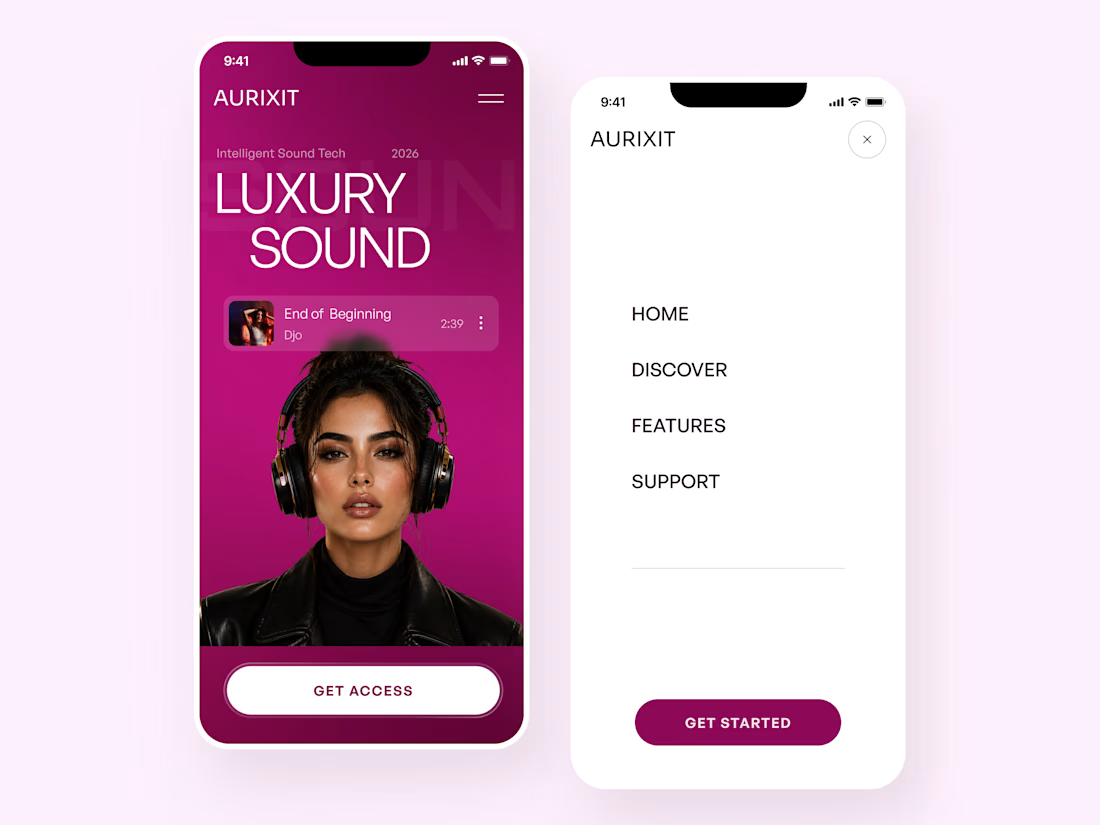
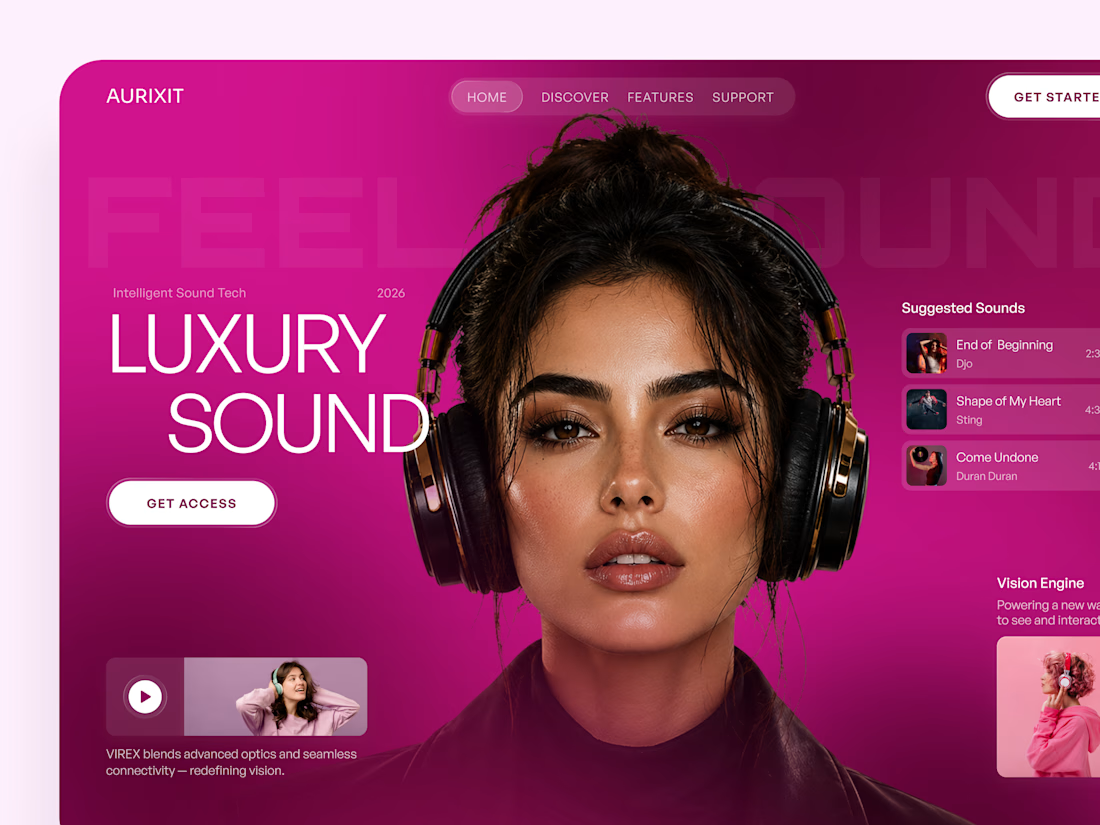
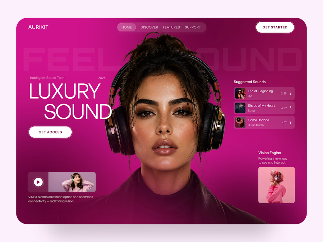
AURIXIT — Luxury Headphones Landing Page 🎧💗
A vibrant landing page concept for a premium audio brand, combining luxury sound, fashion-inspired visuals, and a bold digital experience
The design brings together bright magenta tones, oversized typography, lifestyle photography, and clean UI elements to create a modern, eye-catching aesthetic
Special attention was given to:
• Bold lifestyle-focused hero composition
• Vibrant pink and magenta color palette
• Clean, oversized typography
• Music playlist and suggested tracks
• Premium headphone presentation
• Clear CTA and minimal navigation
• Responsive mobile experience
The result is a fresh, stylish landing page that connects premium audio technology with fashion, music, and personal expression ✨



Magenta with the black headphones really pops. Was the small playlist text on pink tricky for contrast?

A mark for a financial app spends most of its life very small: an app icon, a tab, a notification.
So the Keystone K is drawn on a strict grid, as one solid shape with no thin details to lose. It holds on a billboard and still reads at app-icon size.
Do you design the small version first, or the big one?

Brutal logo mark. really like this direction

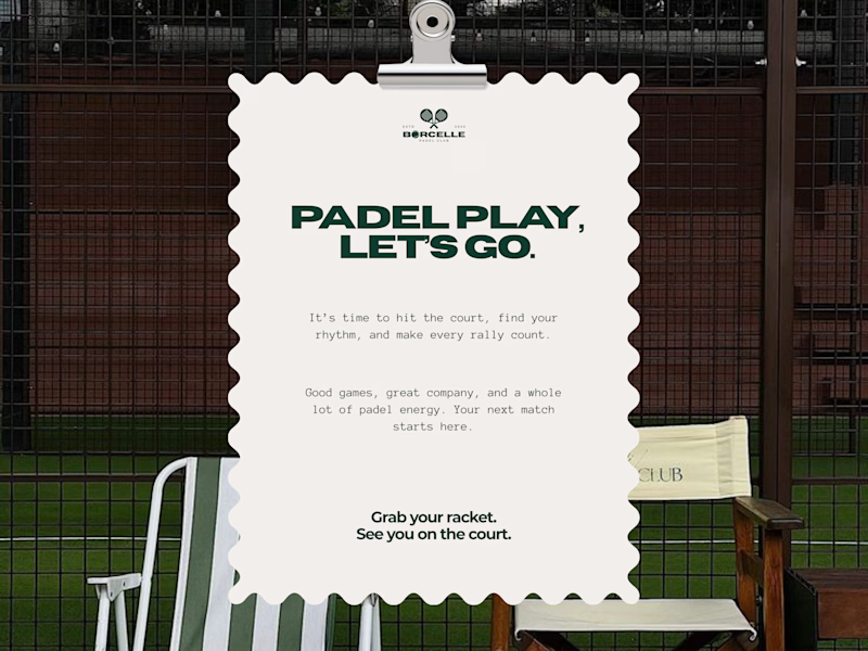
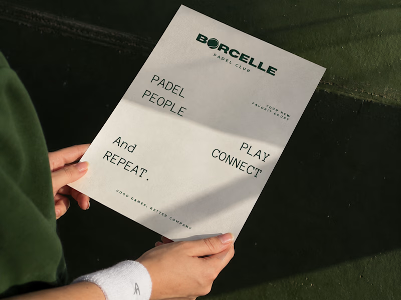
From the court to the little details, every touchpoint is an opportunity to bring the brand to life.
Good games, better company. 💚
What do you think of this direction?
11 voted
69%
5 voted
31%
16 votes
Closed

The green carries so nicely from the court to the small touchpoints. Feels sporty and friendly at the same time.