The network for creativity
Join 1.25M professional creatives like you
Connect with clients, get discovered, and run your business 100% commission-free
Creatives on Contra have earned over $150M and we are just getting started
Back to feedPost

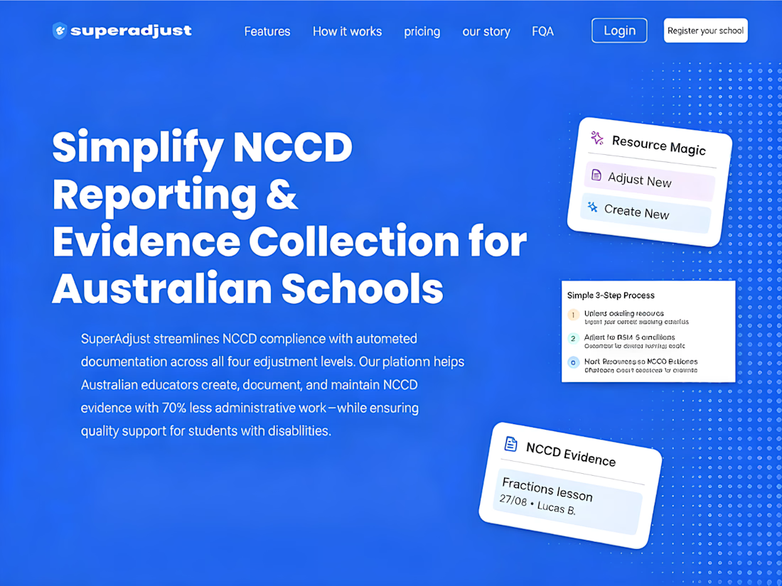
Superadjust is an AI-powered SaaS automating Australian NCCD compliance. Its minimalist UI and invisible AI reduce teacher admin time by up to 85%.


The network for creativity
Join 1.25M professional creatives like you
Connect with clients, get discovered, and run your business 100% commission-free
Creatives on Contra have earned over $150M and we are just getting started

Challenges
View all


Related posts


built a little timezone app because “what time is that for you?” shouldn’t take this much effort.
each city gets a window. drag through the day and watch the light change. green slots show when your working hours overlap.
calling it sunroom. what do you think?

Love it!!! Sure I'm gonna use this!

What should a platform for tokenized private equity look like?
Probably not like another traditional bank.
For ICME, the client wanted a visual direction that felt modern, disruptive, and native to a new kind of financial market.
The challenge was finding the balance: make the experience bold enough to feel different, while keeping a complex product understandable and credible.
I developed a digital-brutalist direction with retrofuturist touches - oversized typography, hard contrast, pixel textures, raw layouts, blue gradients, and controlled motion.
I worked with Arash Attar and the ICME team across the landing page and parts of the wider product interface. This video focuses specifically on the landing-page experience.
The goal was to:
— Explain tokenized private-company equity more clearly
— Create a memorable visual identity for the product
— Speak to both investors and founders
— Make financial technology feel ambitious rather than conventional
Would this visual direction make you want to explore the product - or should financial platforms feel more restrained?


This is amazing, man.
Good job!

The category default for AI products is dark backgrounds and gradient glow. Heron's audience is architects, so we built the visual system out of their working material instead.
Everything on the site is drawn as architectural line work. Plans, elevations, dimension strings, and annotation boxes styled like redline mark-ups, each one holding a genuine code reference rather than lorem text.
The system does two jobs. It reads as native to someone who spends their day inside Revit, and it supports the product story, because Heron works inside the drawing rather than beside it.


Super thoughtful! 👍


