The network for creativity
Join 1.25M professional creatives like you
Connect with clients, get discovered, and run your business 100% commission-free
Creatives on Contra have earned over $150M and we are just getting started
Back to feedPost
Taste Test


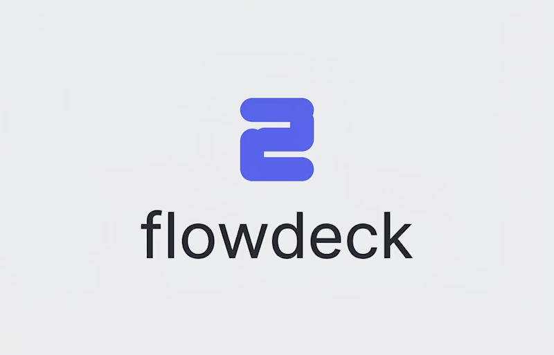
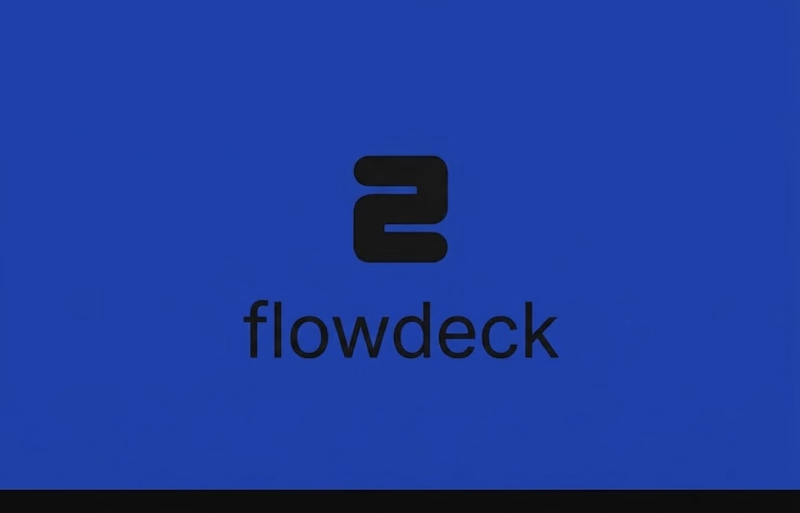
FlowDeck Logo Refinement — Which Direction Feels Stronger?
I’m exploring two visual directions for a developer-focused brand identity and would love some design feedback.
Option A: Blue + Black + White
A higher-contrast direction designed to give the identity more flexibility across light and dark interfaces.
Option B: Blue + Black
A more restrained direction with a simpler, more focused color system.
I’m evaluating both based on visual balance, versatility, scalability, typography, and how well the identity could work across a developer product and its marketing materials.
Which direction would you choose — A or B?
I’d especially appreciate feedback from designers on the color system, logo balance, and overall brand feel.
4 voted
100%
0 voted
0%
4 votes
Closed

Option A..Black which is a very deep color cannot work well on a Dark blue also.
Weldone


direction two hits harder.. contrast on the deck mark is crisp
The network for creativity
Join 1.25M professional creatives like you
Connect with clients, get discovered, and run your business 100% commission-free
Creatives on Contra have earned over $150M and we are just getting started







Related posts


The hardest brief in identity work is "make us look serious without making us look corporate."
Serious comes from consistency. Corporate comes from removing anything a person chose.


"Corporate comes from removing anything a person chose" is going straight in my notes. I'd push it further though, I think a lot of that removal happens in legal and stakeholder review, not the initial design pass. Do you find the fight is more with the client's own instincts or with whoever signs off after them?

Aurum - Brand Identity System
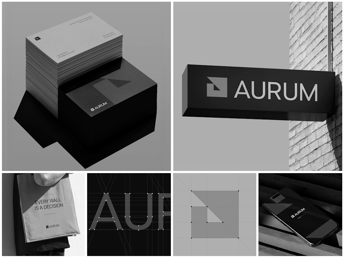
When Aurum came to me, they had a name and a vision a studio that wanted to feel deliberate, architectural, and unapologetically bold in every space it touched. No logo, no system, just a line that stuck with me from our first conversation: "every wall is a decision."
That phrase became the seed for the entire identity. I started with the simplest possible geometry a square split by a triangle and built the mark from a strict construction grid so it would hold its proportions at any size, from a business card to a building-mounted sign. Once the mark was locked, I stripped the palette down to black, white, and grey. No color to hide behind just contrast, shadow, and negative space doing the work.
From there, the system grew outward: letterpress-style stationery with generous shadow and texture, exterior signage designed to read cleanly against brick and daylight, a minimal mobile app screen, and a tote bag that turned the brand's own tagline into a quiet piece of merchandise. Every touchpoint had to pass the same test does it still feel like Aurum at this scale, in this material, from this distance?
The result is an identity that's confident without shouting restrained enough for a business card, strong enough for a wall.
Curious how I'd approach building out a system like this for your own brand want to talk through it?

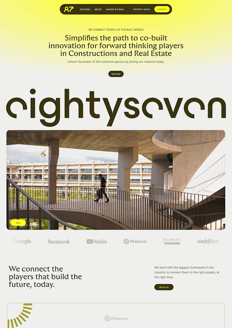
I love building brands, but seeing them come alive on a website might be my favourite part.
some favourite web work from the archive

Great Job, Lucie