The network for creativity
Join 1.25M professional creatives like you
Connect with clients, get discovered, and run your business 100% commission-free
Creatives on Contra have earned over $150M and we are just getting started


The network for creativity
Join 1.25M professional creatives like you
Connect with clients, get discovered, and run your business 100% commission-free
Creatives on Contra have earned over $150M and we are just getting started











Related posts

Title: Proper Form — Brand Identity & Visual Language
A brand identity for Proper Form built around a more modern, movement-driven take on recovery and healthcare.
The visual system extends the logo into a complete language through color, typography, imagery and layout, creating a consistent identity across different brand touchpoints.
Created by Lepisov Branding in collaboration with @Creative Mints
Logo design: Ilya Gorchanyuk
Creative direction: Dmitry Lepisov
Brand identity: Lepisov Branding × Creative Mints


Using the logo mark as the big graphic across the layouts is smart. The purple to pink gradient gives recovery a more energetic feel.

VELAIRE — Beauty & Fragrance Visual Identity
A self-initiated identity exploring custom lettering, sensual art direction and a refined visual system across packaging, editorial and digital applications.
Currently open to freelance and remote collaborations in branding, music, fashion and culture.
Visual Identity · Art Direction · Logo Design · Campaign Design
#VisualIdentity #ArtDirection #BrandDesign #LogoDesign #GraphicDesign

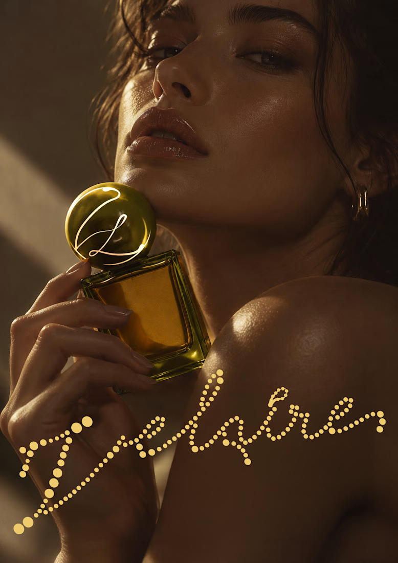
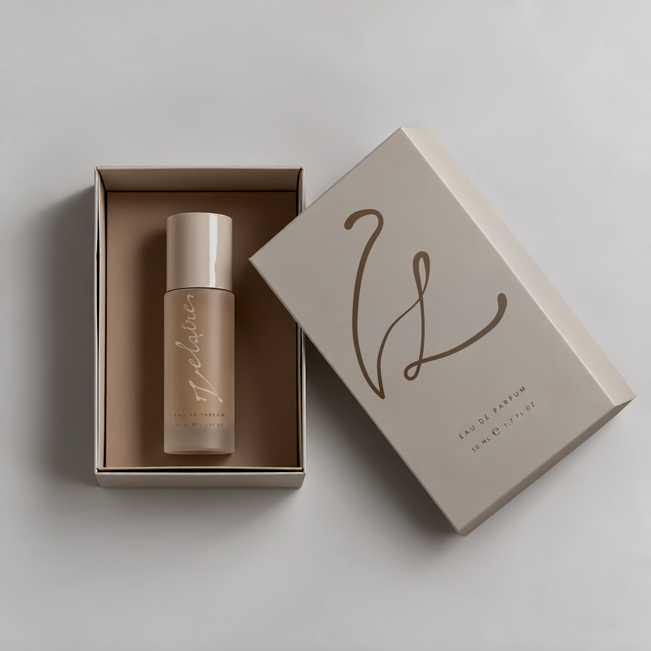
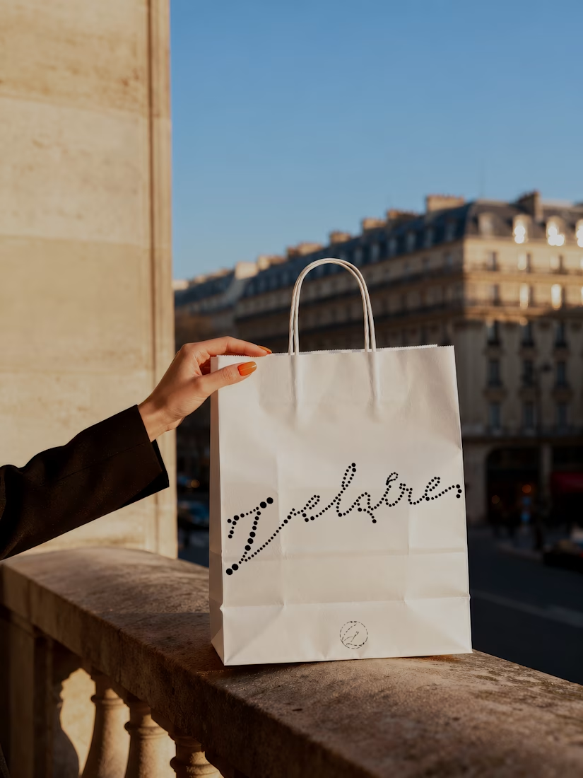
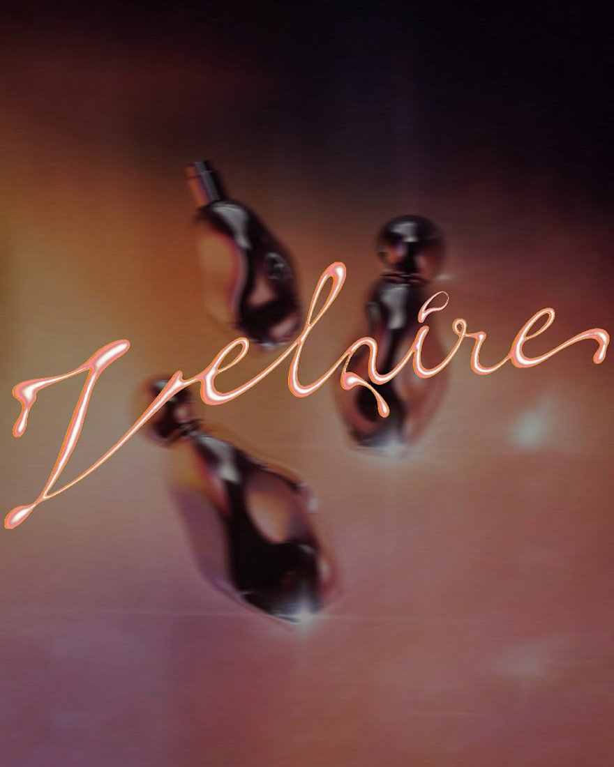

Great brand identity Yaren that's really luxury 🔥🔥

Which N works better? 🗳️
Worked on a logo for Nelcos, a Canadian company that refinishes interiors with architectural film instead of replacing them.
The idea: an unrolled roll of film that turns into the letter N.
The green is there to highlight eco-friendliness: less demolition, less waste.
Two directions for the symbol:
A: rectangular, compact
B: hexagonal, more dynamic
Vote and tell me why in the comments 👇
logodesignlogodesignerbrandidentityLogo DesignBrand DesignGraphic DesignAdobe IllustratorAdobe Photoshop
6 voted
43%
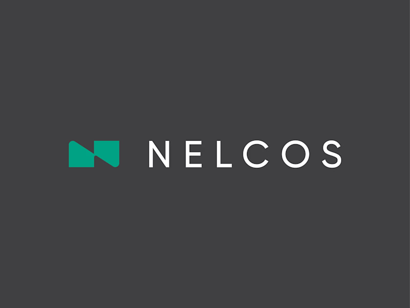
8 voted
57%
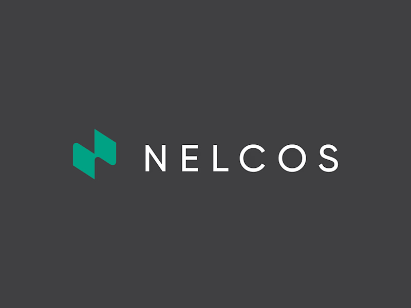
14 votes
Closed

Love the concept! The rectangular N feels more architectural and stable, which fits interiors. Hexagonal feels too techy. The unrolled film idea is brilliant - green for eco is perfect. I'd vote rectangular for this brand. Great work! 👏