The network for creativity
Join 1.25M professional creatives like you
Connect with clients, get discovered, and run your business 100% commission-free
Creatives on Contra have earned over $150M and we are just getting started
Back to feedPost
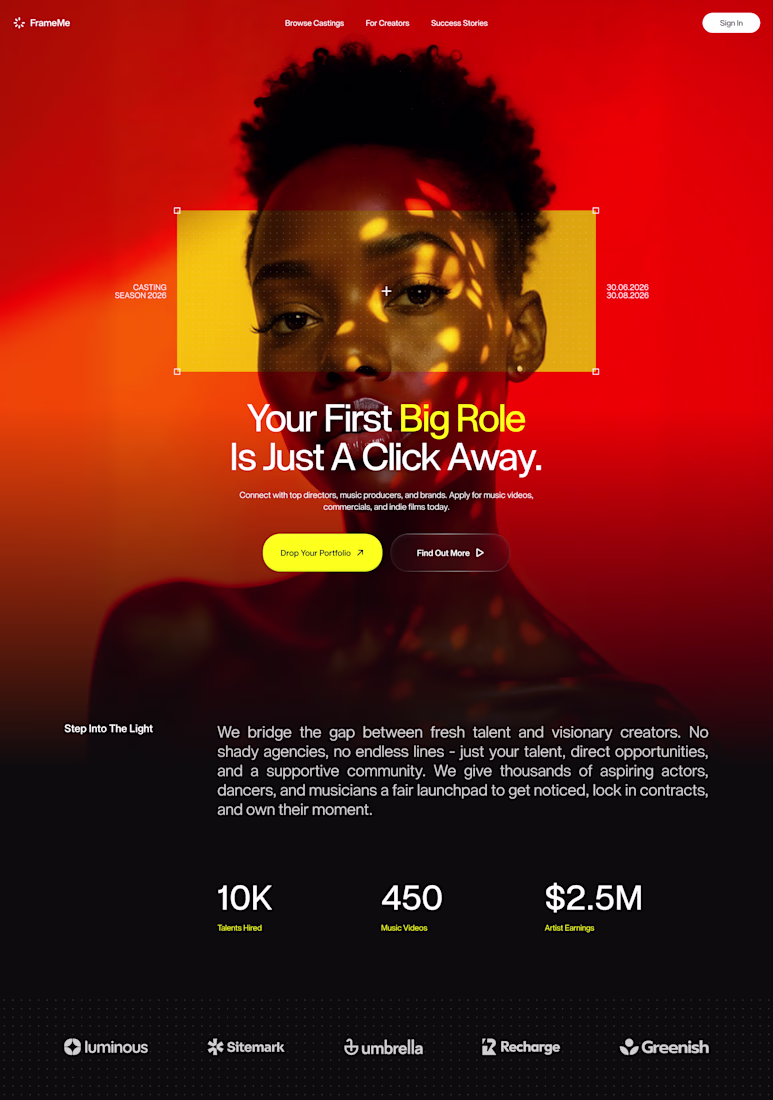
The results are in! 🔴
First of all, thank you all for voting on my previous post! The engagement was wild! The red version took a decisive lead, and it’s easy to see why.
While the blue direction felt the high-contrast and mysterious, red represents a perfect balance between expressive, confidence-inducing visuals and a strict, professional layout. My goal here was to command immediate attention and give the product a strong, premium visual authority right from the first second.
I focused on strict vertical grid discipline and a tight typography layout to keep the interface structured, while the yellow framing acts as a strategic focal point that instantly captures the eye. By balancing the intense, hot gradients at the top with a grounded, rich black base for the metrics, the hero section feels incredibly impactful without sacrificing readability.
For those who voted: what specific element made the red version stand out the most for you?
i think it's a tougher color combo to pull off, to begin with. my brain associates it with other fields, & as a performer, the way you utilized blocking the colors in your design made my eye linger longer! the detail in the sizing around the model's eyes also feels dialed into...
impressive work 👌, very clean and professional
The network for creativity
Join 1.25M professional creatives like you
Connect with clients, get discovered, and run your business 100% commission-free
Creatives on Contra have earned over $150M and we are just getting started
Related posts
This hero was built from one prompt in Codex.
Not a mockup. Not a static image.
Amazing prompt library by @bogdan_qclay
Top notch
Imagine a Figma plugin that guides your creative direction simply by selecting the vibe. Ambitious? Yep! This is just a taste of what's to come!
I have to checkout more of the figma weave.
Now you can also import designs straight from v0 directly into Framer with the new plugin I'm working on.
I have used the plugin all weekend and it's already saving me so much time.
A v0-to-Framer import plugin is a game changer, Frederik! That bridges two of the best parts of the modern web design workflow. Will definitely keep an eye out for the release.
Challenges
View allTrending
Claude
Claude has entered the design space. How are you using Claude Design?
Contra University
Learn from expert creatives how to earn more using next-gen AI tools.
MagicPath
The canvas is infinite, and exploration is becoming the workflow. How are you using MagicPath?
creativeaiflow
Creative AI workflows are evolving. What tools do you use, and what are their strengths and weaknesses?
freelancerlife
Freelancer life is wins, pivots, and everything in between. What’s yours right now?