The network for creativity
Join 1.25M professional creatives like you
Connect with clients, get discovered, and run your business 100% commission-free
Creatives on Contra have earned over $150M and we are just getting started
Back to feedPost
Taste Test


Light or dark? I shipped Golf Travel Passport with both, which one would you keep open on the first tee?


23 voted
59%
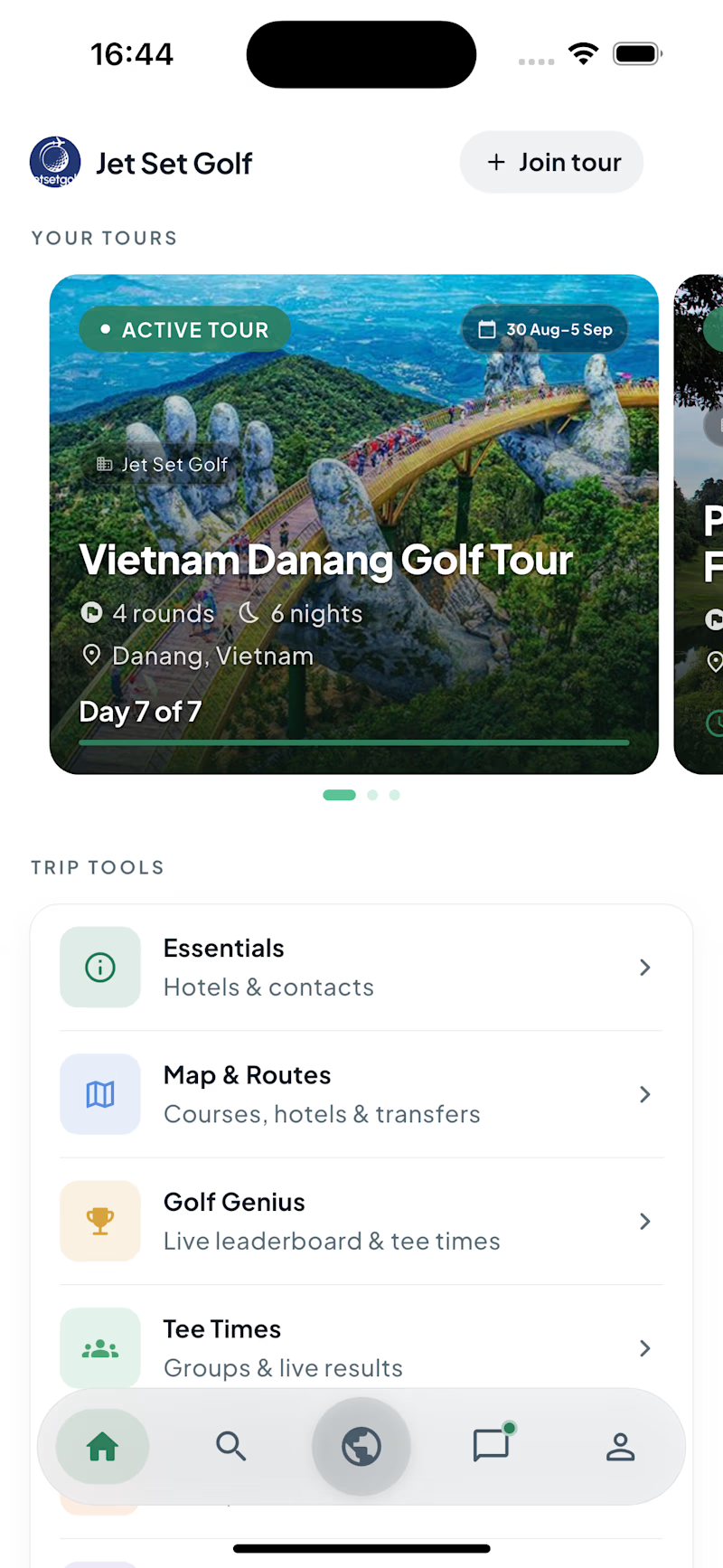
16 voted
41%
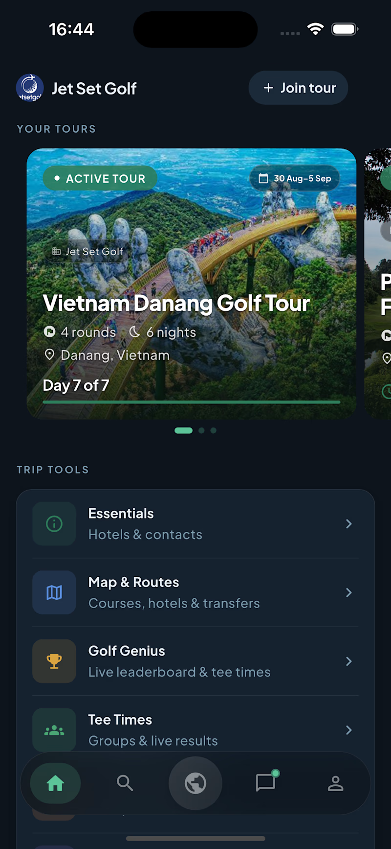
39 votes
Closed

Dark looks great with the images
Thank you, love it!

great
Thank you a lot.

White
I also prefer white!

White for me. It feels cleaner and easier to scan.
Good choice!


dark for me
Thank you for feedback!


Dark💯
Thank you, it's great choice!

white feels so much easier on the eyes to navigate!
Yeah that's true!

Dark for me on this one, a golf app is going to get opened outdoors in bright sun way more than at a desk, and dark mode usually loses contrast exactly there. Did you test either version outside in direct light before shipping both?


the dark screen looks great. which one do you use?

Great work

The UI is visually appealing while keeping everything clean and easy to use. Good job!

I'd go with white on this one! 💯

Went with White here. On a golf course you're fighting direct sunlight most of the day, and light backgrounds just hold up better for glare than dark mode does.

For me traveling means “light, sun and air” and that means light mode is better for this business. If you have a night party section then dark will work the best only for this page


Creative work !

Love the simplicity here, it gives the brand such a nice feel


White, it works like relaxation

depends on the time of day and lighting when you use it :) I'd do both options with a possibility to switch between, if that's do-able
The network for creativity
Join 1.25M professional creatives like you
Connect with clients, get discovered, and run your business 100% commission-free
Creatives on Contra have earned over $150M and we are just getting started











Related posts


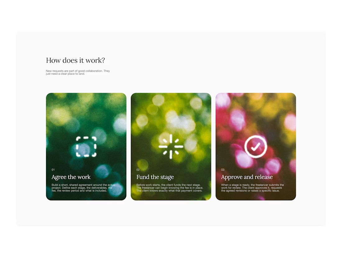

Your web sections always have such strong art direction. Great to see the brand carried right into the layout.


🌲 Nordhaus | Prefab Timber Homes Website (Framer)
Homes that grow quietly with the forest, now on the web. 🏡
Nordhaus is a website for a Latvian builder of prefabricated timber homes, created in Figma and built in Framer as a responsive site for desktop, tablet and mobile. It brings the brand's calm Nordic character through full-screen photography, a scroll-driven process story, a horizontal model gallery and interactive testimonials.
✨ Template coming soon to Framer.


Wonderful design man


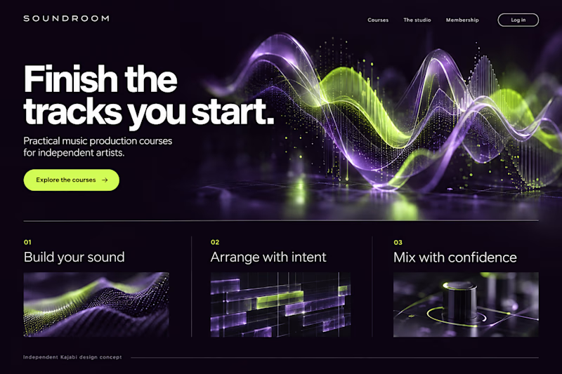
Which Kajabi music-course design makes you want to hit play?
Two original AI-generated website concepts for Soundroom, a fictional music-production academy. Analog Studio pairs warm recording-room imagery with cream and burnt orange. Digital Rhythm brings luminous waveforms, midnight plum and acid lime. Same course, two different first impressions.
Which direction would you choose?

13 voted
41%
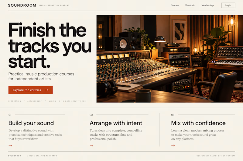
19 voted
59%
32 votes
Closed