The network for creativity
Join 1.25M professional creatives like you
Connect with clients, get discovered, and run your business 100% commission-free
Creatives on Contra have earned over $150M and we are just getting started
Back to feedPost
A logo is only the start. This is how the CORIOM brand comes to life.
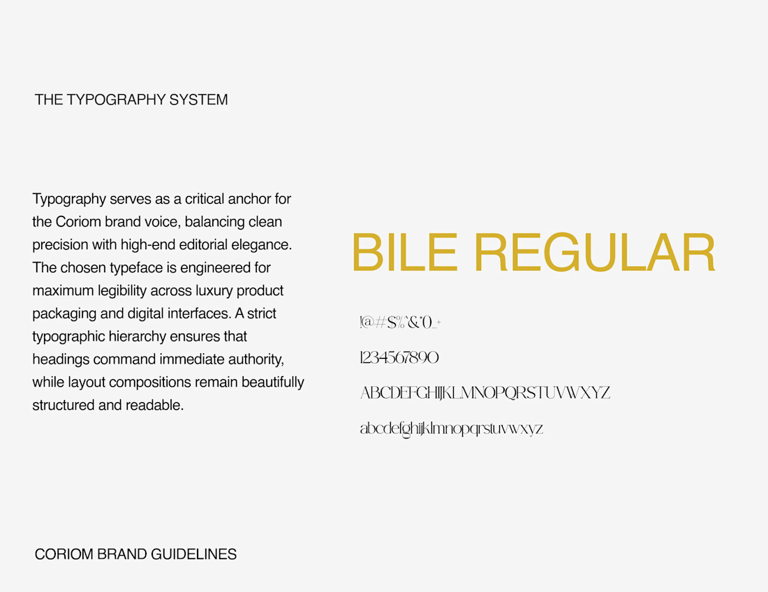
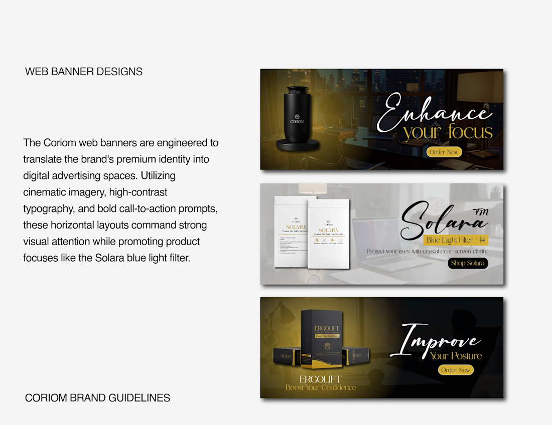
A clean editorial typography system, a gold letterhead with an oversized watermark of the emblem, and web banners that carry the same premium look into ads, including the Solara blue-light filter and Ergolift launches.
Every piece follows one system: the same gold, the same black, the same custom wordmark. That's what makes a small brand look established.
I design logos, labels, packaging and full brand systems for product brands. If you're launching something and want it to look this consistent, message me.
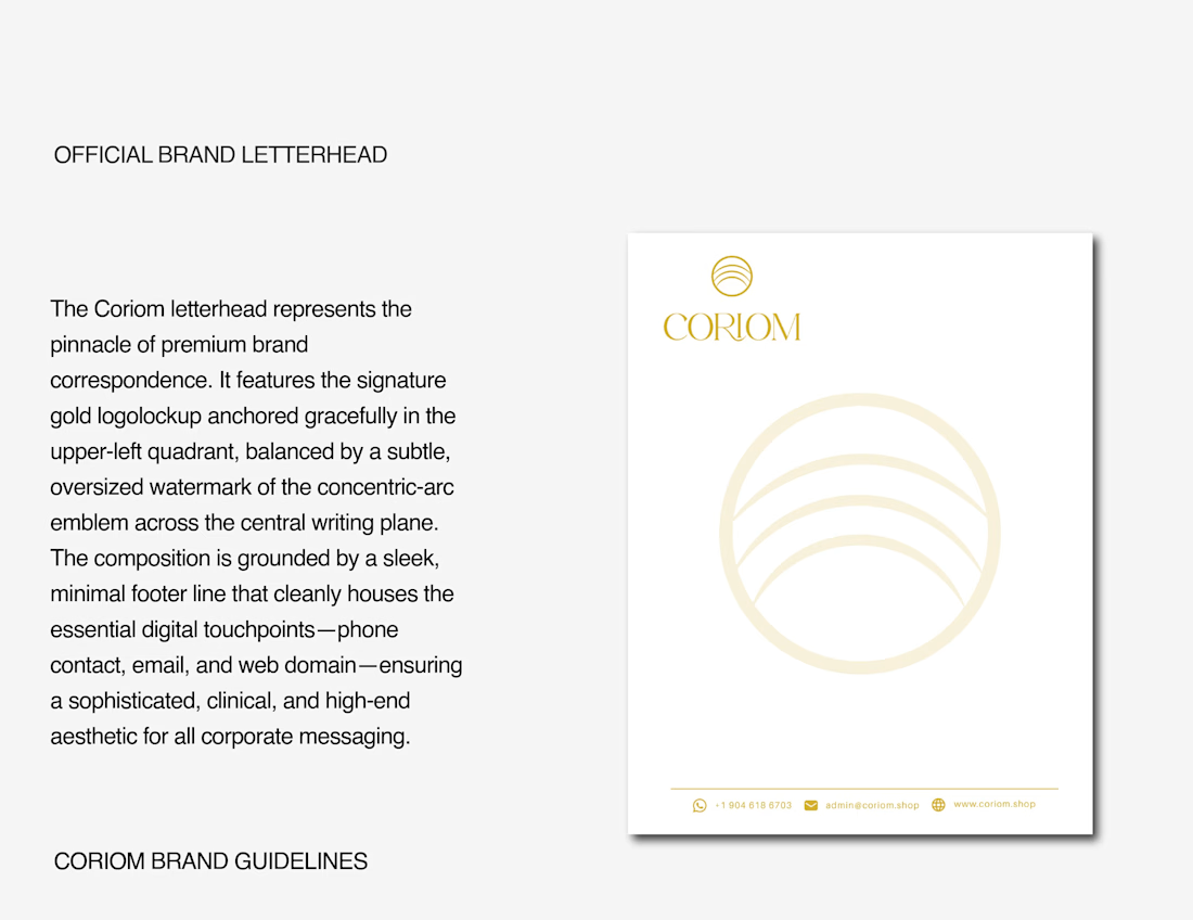

That oversized emblem watermark on the letterhead is a nice touch

Thank you, Thayline! I wanted the emblem to feel present on every page without competing with the actual message, so a large, very light watermark felt like the right balance. Really appreciate you noticing it.

Good work
Thanks a lot, Saeed! Glad you liked the CORIOM system.
The network for creativity
Join 1.25M professional creatives like you
Connect with clients, get discovered, and run your business 100% commission-free
Creatives on Contra have earned over $150M and we are just getting started
Related posts


Celvana brand identity & packaging for a red light therapy brand launching in the US.
The category is crowded with identical, unbranded panels. Celvana sells precision, so the brand had to look like medical equipment you can trust: clinical, exact and professional.
Brand identity case study
Packaging case study

This is high end branding

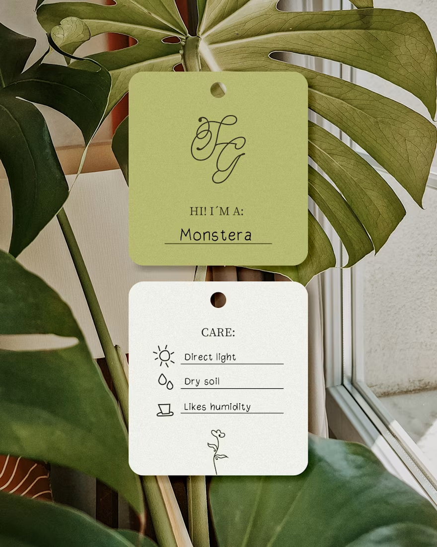
A cozy botanical shop that not only sells beautiful plants, but also takes care of yours while you’re away on a trip!
For the logo, I customized the typography to give it a soft, fluid effect inspired by growing branches and leaves.🌱

I like this calligraphy style.


Cool branding