The network for creativity
Join 1.25M professional creatives like you
Connect with clients, get discovered, and run your business 100% commission-free
Creatives on Contra have earned over $150M and we are just getting started
Back to feedPost

I’m a Product (UI/UX) Designer with a background in teaching and project coordination, focused on creating intuitive, user-centered digital products that solve real problems and support business growth. I work closely with startups and product teams to simplify complex ideas, improve usability, and deliver scalable design solutions.
I bring strong communication, attention to detail, and project management skills, ensuring smooth collaboration and timely delivery. I design with clarity, strategy, and empathy, so products don’t just look good, they truly work.
Here is the link to my portfolio: https://selimatportfolio.framer.website/
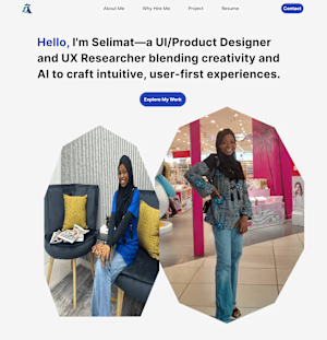
selimatportfolio.framer.website
Selimatakinwaleportfolio
Showcasing clean, user-focused design and smart digital solutions—crafted with intention.
The network for creativity
Join 1.25M professional creatives like you
Connect with clients, get discovered, and run your business 100% commission-free
Creatives on Contra have earned over $150M and we are just getting started




Related posts


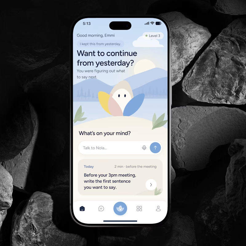
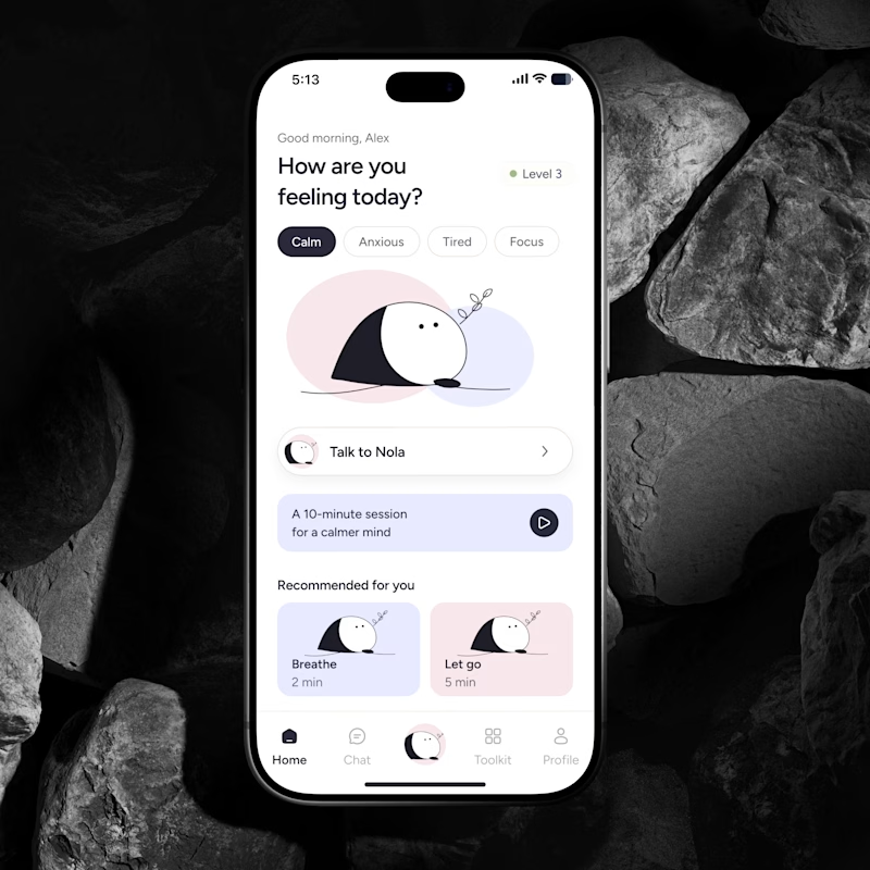
🔥 If you were building an AI Wellness Companion today, would you design a feature or a brand people could actually form a relationship with?
I explored two directions for the same product.
🅰️ Emotional Companion
Built around context, continuity and the feeling that it remembers you.
🅱️ Character Led Companion
A recognizable character that becomes the emotional anchor of the product.
Imagine you’re the founder. Which concept and character would you bet the brand on for the next few years?
Which feels more distinctive, memorable and scalable?
👇 A or B and why?
#AI #WellnessApp #AICompanion #ProductDesign #MobileAppDesign #BrandDesign #UXDesign #HealthTech #AsolDesign


30 voted
39%
46 voted
61%
76 votes
Closed

Character definitely wins here. I think it's like verion2.0 of the emotional one.


Hot take: aesthetics and clinical results should walk hand in hand.
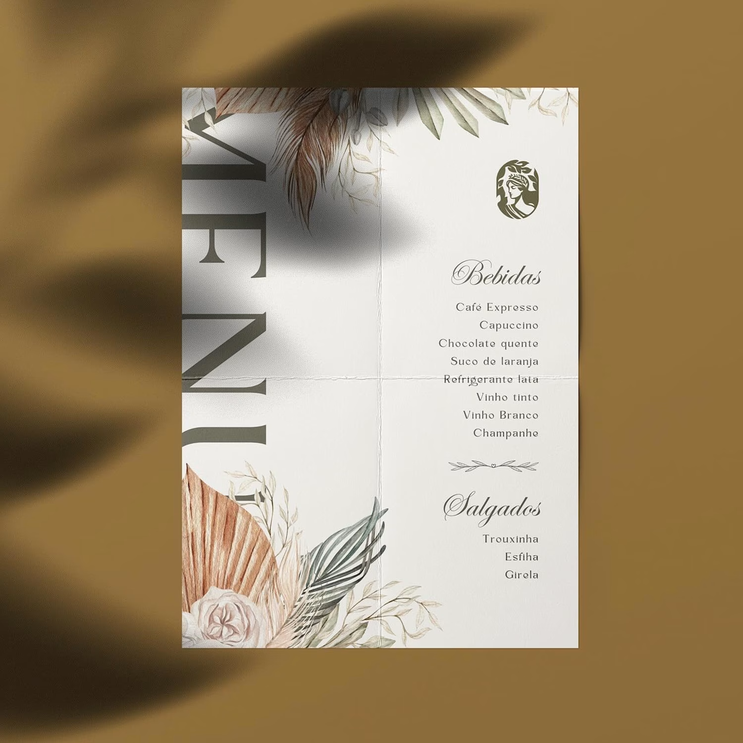
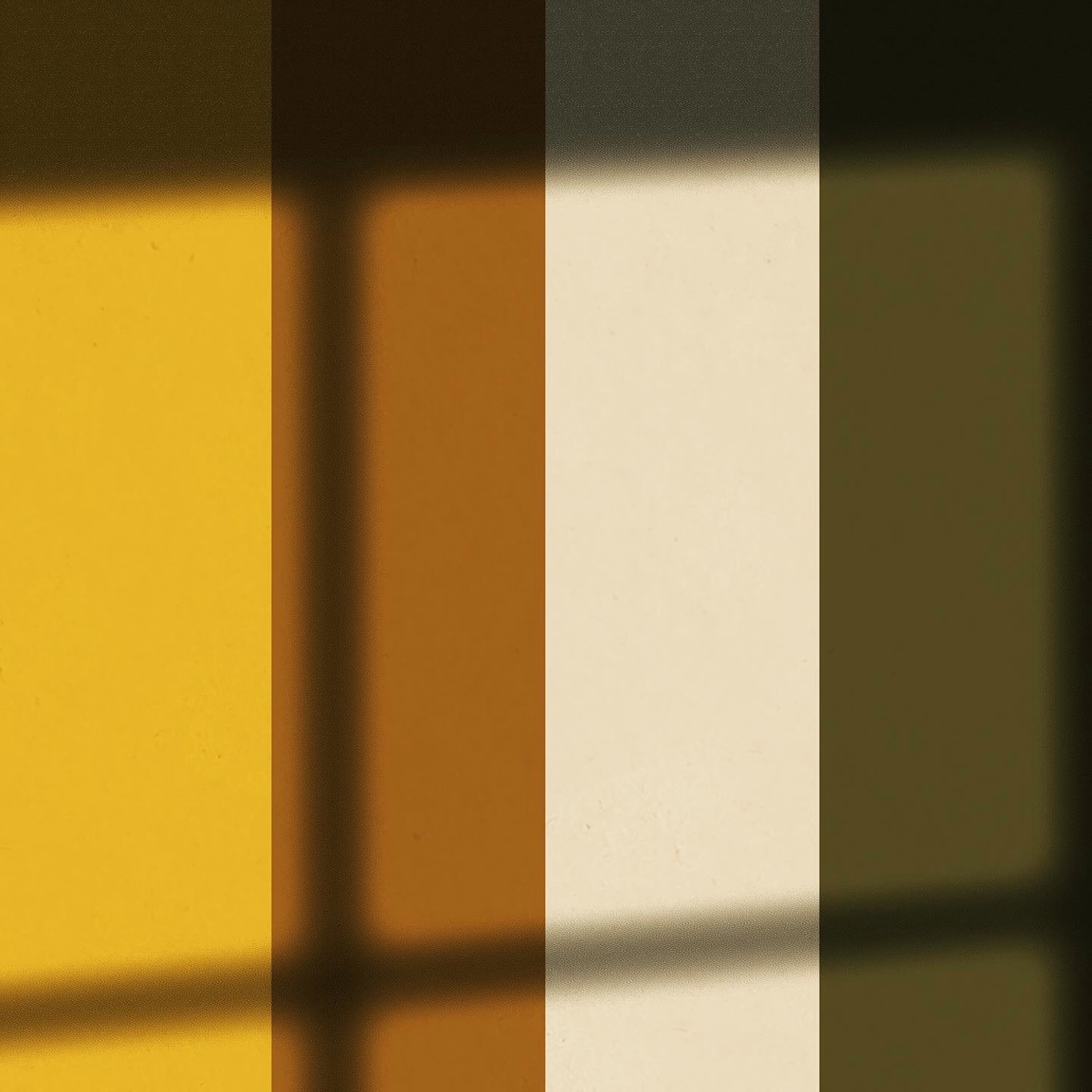
Most brands in this space lean into cold, sterile whites or aggressive dark tones. It reads functional, but it also feels like something you'd hide in a medicine cabinet, not display on your vanity.
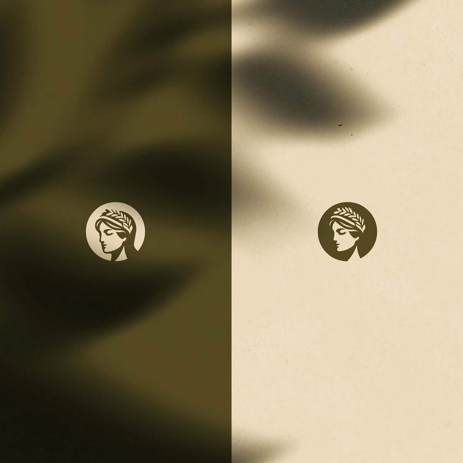
For this rebrand, we anchored the identity in classical beauty and organic sophistication. By combining warm earthy tones, botanical cues, and timeless iconography, we moved away from the "pharmacy product" feel into true high-end personal care.
It was a deliberate shift: positioning the brand not for someone who feels like they are treating a flaw, but for someone investing in a premium daily ritual.
Would a piece like this deserve a spot on your display shelf?




This is brilliant!

Most consulting sites try to look impressive. This one tries to look trustworthy.
Hallam, a Framer template for boutique advisory firms. Work in progress. ✨

The arches in that hero shot do a lot of the trust-building on their own, they read stable and established without a single line of copy yet. Was there a version of this template that leaned harder into typical consulting-site cues, like team headshots or client logos up top, before you stripped it back to this?