The network for creativity
Join 1.25M professional creatives like you
Connect with clients, get discovered, and run your business 100% commission-free
Creatives on Contra have earned over $150M and we are just getting started
Back to feedPost

Need a professional roll-up banner to promote your travel agency, tour packages, or holiday offers?
I design modern, eye-catching roll-up banners that help travel agencies and tourism businesses showcase their services, destinations, and special offers with a professional look.
What's included:
Custom travel agency roll-up banner design
Attractive destination photos and visual layouts
Clear headlines and promotional offers
Professional typography and color combinations
Organized service and contact information
QR code placement, if provided
Print-ready design files according to your printer's specifications
High-quality presentation mockup
Why choose my service?
I focus on visual hierarchy, readable typography, attractive imagery, and clean layouts to make your promotional banner stand out. The design can be customized to match your brand colors, target audience, and marketing goals.
Ideal for:
Travel agencies, tour operators, tourism companies, holiday packages, travel exhibitions, events, and promotional campaigns.
What I need from you:
Your logo, banner dimensions, preferred colors, destination images, promotional text, contact information, and any design references.
Let's create a professional travel banner that presents your services beautifully. Contact me before ordering to discuss your requirements.
graphicsdesigningbannerdesignerrollupbannerdesignPrint DesignGraphic DesignWeb Banner DesignAdobe IllustratorAdobe Photoshop


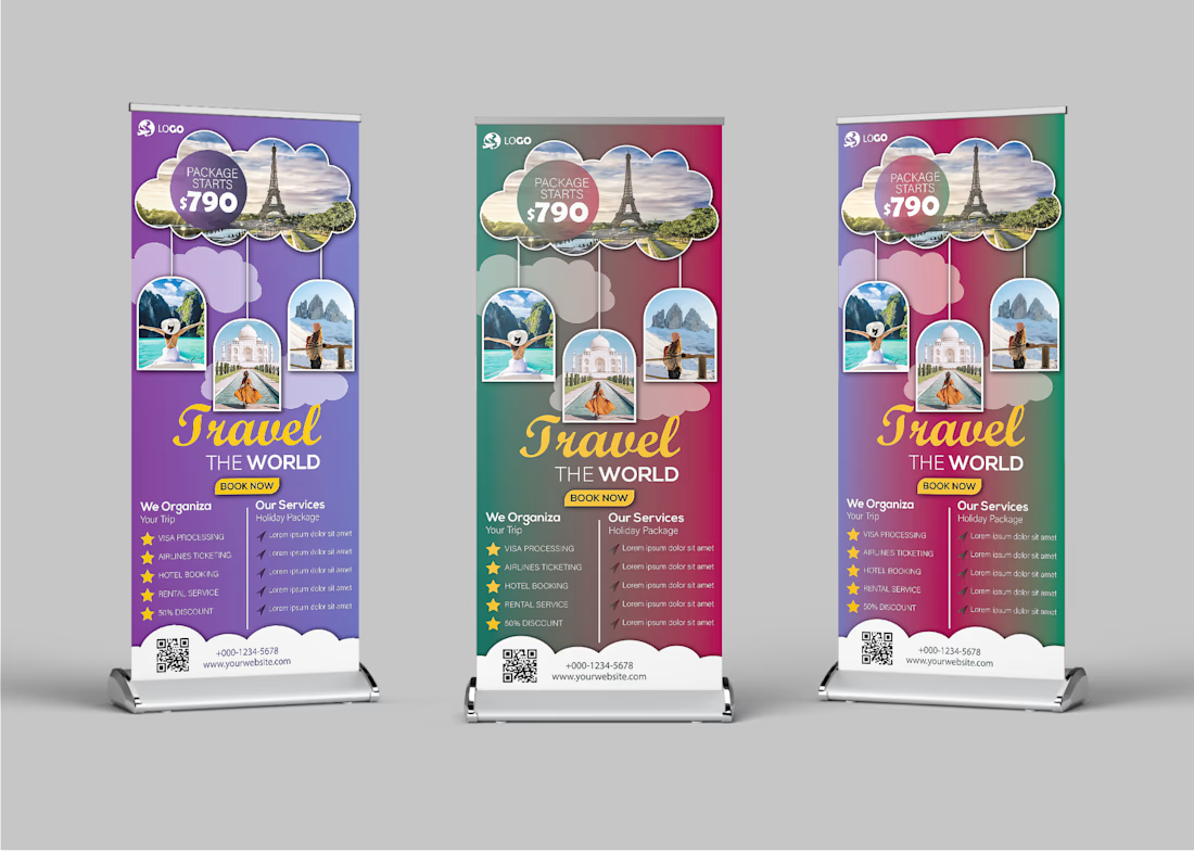
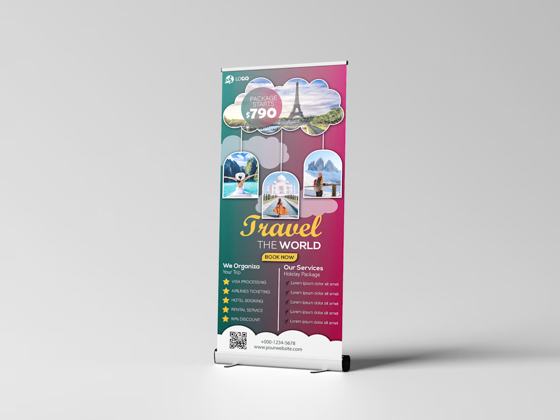
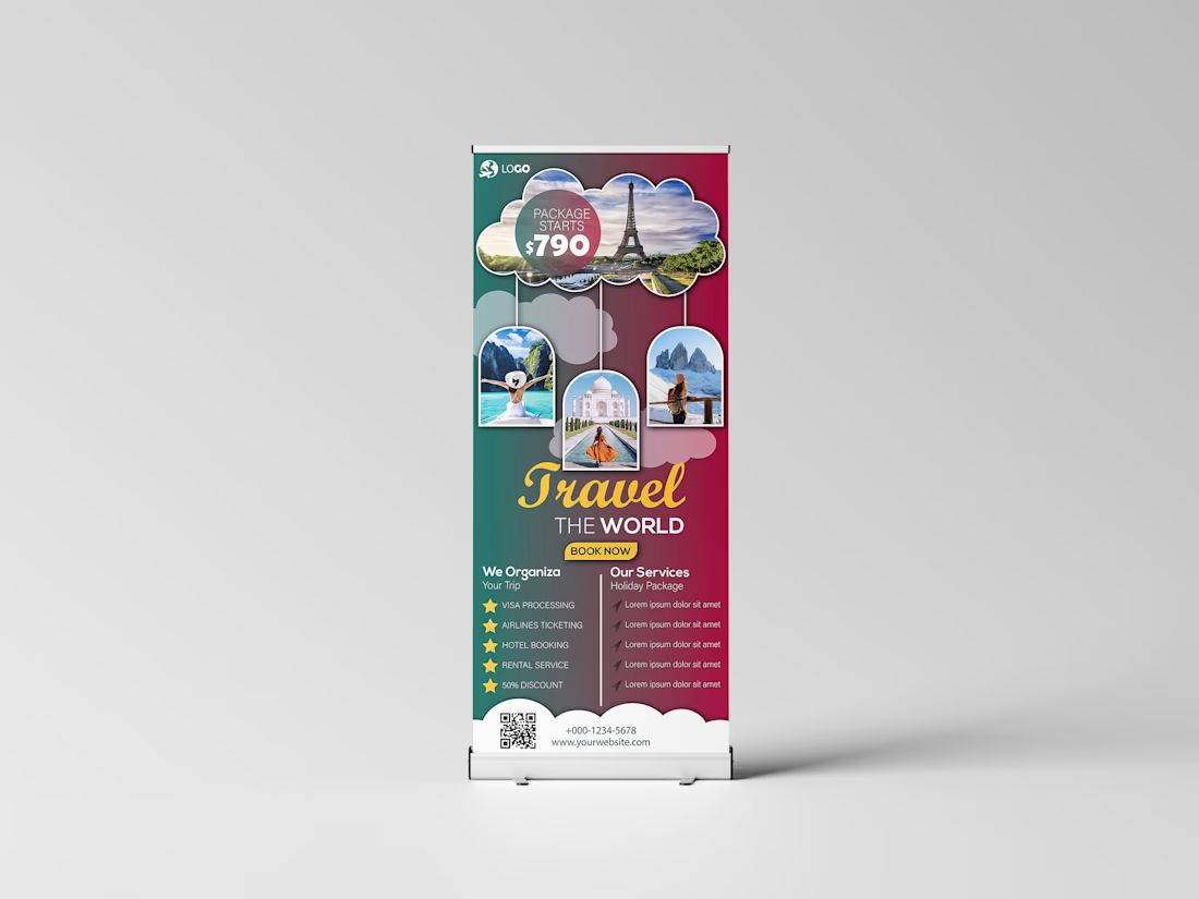
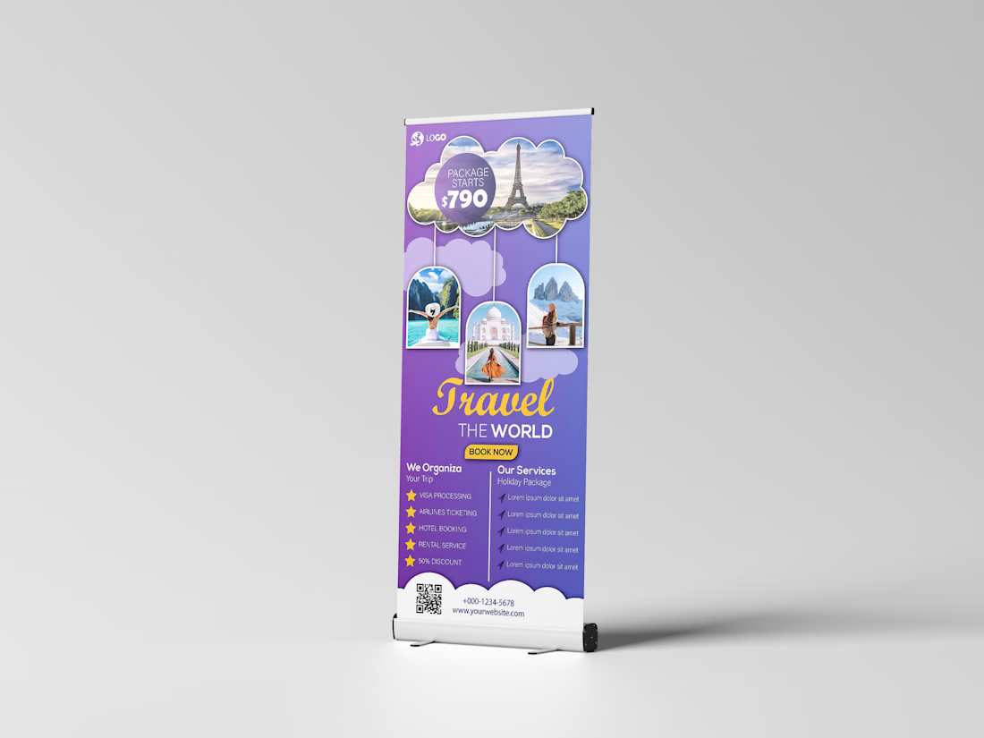

Showing the same Travel the World banner in three colorways on a stand lets a client choose in seconds. Do you point the QR code at a booking page or at the agency's Instagram?
The network for creativity
Join 1.25M professional creatives like you
Connect with clients, get discovered, and run your business 100% commission-free
Creatives on Contra have earned over $150M and we are just getting started
Related posts

Your crypto landing page has 3 seconds to earn trust. Which direction gets it right?
One crypto homepage feels built for serious traders. The other makes crypto feel effortless.
Which one would make you click “Start Trading” without hesitation: #1 or #2?


10 voted
37%
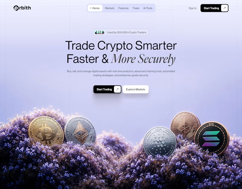
17 voted
63%
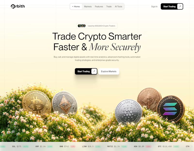
27 votes
Closed


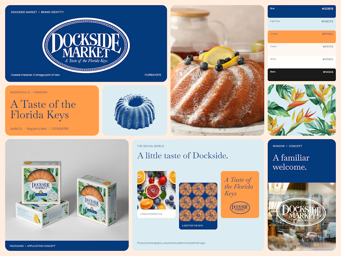
A brand identity inspired by the Florida Keys.
Dockside Market brings together vintage character and contemporary design, creating a visual identity that feels distinctive, warm, and full of personality.
From the iconic circular logo and editorial typography to the color palette, vintage-inspired illustrations, patterns, and packaging, every element works together to build a cohesive brand world.
This Bento brings the identity system together, showcasing how the brand translates across visual assets and real-world applications.
Brand identity, art direction & visual design.

Tremendous

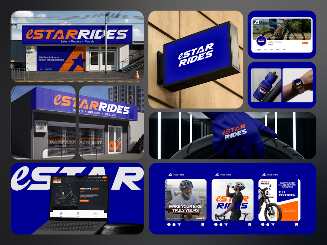
If you sell e-bikes, repairs and rentals, your brand should feel energetic before the customer even walks into the shop.
That was the challenge behind eStar Rides.
The brand needed to feel modern, confident and instantly recognizable across both physical locations and digital touchpoints.
So the identity was built around:
🟠 High-energy orange for visibility and impact
🔵 Deep electric blue for trust and technology
⭐ A bold star-led symbol for direction and recall
🔤 Custom typography with a strong, performance-driven feel
📱 A visual system designed to stay consistent everywhere
Then the identity was carried across:
Storefront signage
Retail environments
Website
Social media
Merchandise
Water bottles
Wearables
Campaign graphics
Digital applications
The goal was not just to make eStar Rides look modern.
It was to make the brand feel established, distinctive and ready to compete.
Because strong mobility branding should communicate:
Energy.
Freedom.
Confidence.
Reliability.
Before a customer even starts comparing options.
eStar Rides
Built for the ride.
What gives the brand the strongest presence?
A. The orange + blue palette
B. The custom wordmark
C. The storefront applications
D. The complete visual system
Drop A, B, C or D below.
If you are building a mobility, automotive, e-bike, transportation or tech-driven service brand and your visuals still feel generic, send me a message.
I help businesses build identities that feel more recognizable, credible and commercially ready.
#BrandIdentity #MobilityBranding #AutomotiveBranding #VisualIdentity #LogoDesign #RetailBranding #CreativeDirection #TransportationBranding


e bikes need branding with this kind of energy,, most of them look like appliance brands