The network for creativity
Join 1.25M professional creatives like you
Connect with clients, get discovered, and run your business 100% commission-free
Creatives on Contra have earned over $150M and we are just getting started
Back to feedPost

Tropolis Logo Design
Project Overview
Tropolis is a professional insurance broker with a strong focus on innovation, trust, growth, and community. The brand serves individuals, families, businesses, and smaller insurance agencies looking for modern insurance solutions, investment opportunities, or acquisition support.
The goal of this project was to design a modern logo identity that feels professional, secure, technology-forward, and fresh without relying on common insurance symbols such as umbrellas, houses, shields, or traditional protection icons.
Project: Tropolis Logo Identity
Industry: Insurance / Technology
Project Value: $450 USD
Scope: Logo design, visual direction, color palette, and brand presentation.
The Challenge
The existing Tropolis logo felt simple but too plain and lacked the stronger visual personality the brand needed for its next stage of growth. The client wanted a logo that could communicate professionalism and trust while also feeling modern, innovative, and scalable for future expansion.
The main challenge was to create a distinctive brand mark that felt suitable for the insurance industry but avoided predictable visual clichés. The logo needed to feel secure and established, yet still fresh, advanced, and memorable.
Design Direction
The design direction focused on creating a clean, modern, and confident identity system. The client preferred the wordmark style with a capital “T” followed by lowercase letters, giving the brand a more approachable and refined appearance.
The overall visual style was built around these key attributes:
Professional
Secure
Innovative
Technology-advanced
Modern
Community-oriented
Growing
Clean and sophisticated
Concept
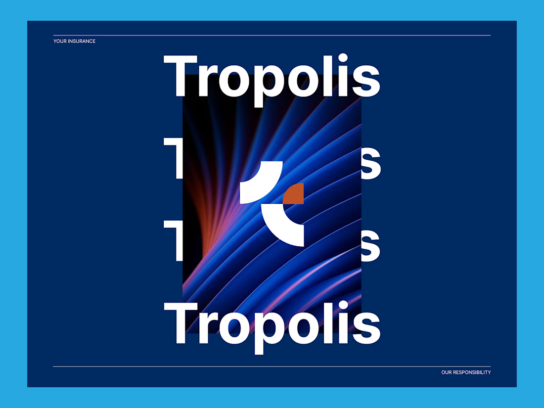
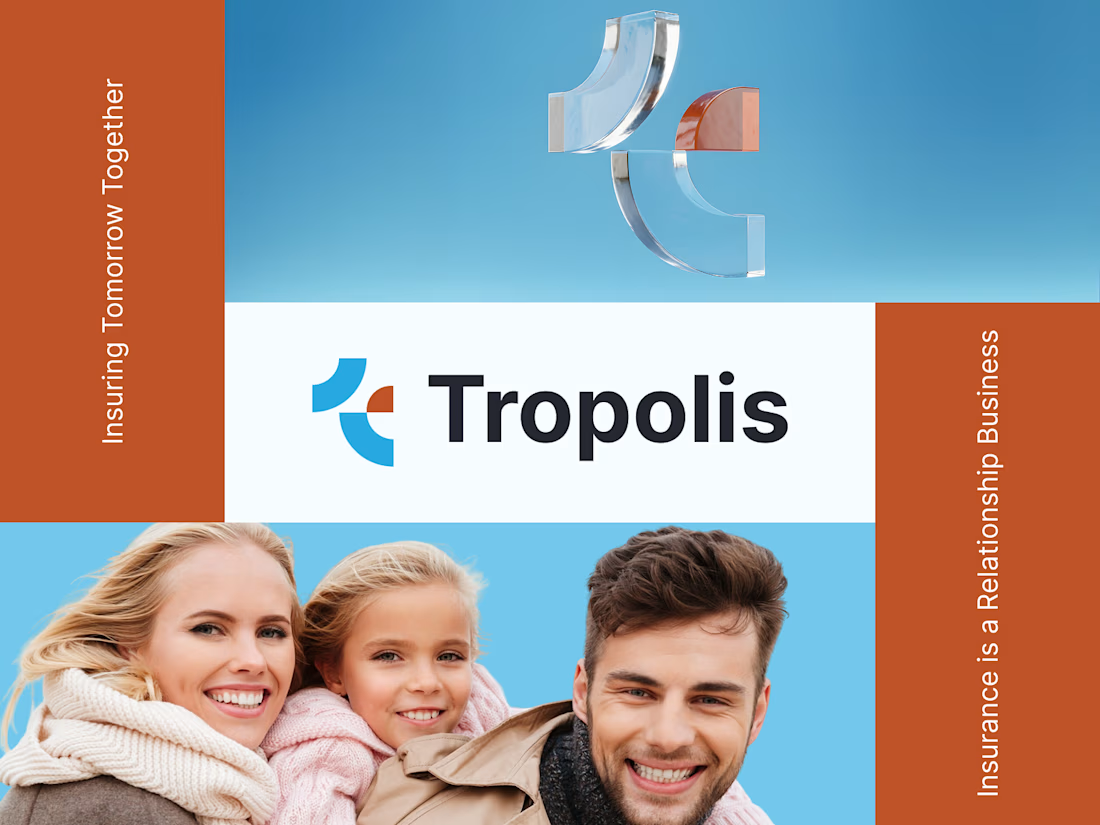
The final logo direction was developed around a strong and memorable “T” identity, supported by clean typography and a balanced visual structure. The mark was designed to feel abstract, modern, and flexible, giving Tropolis a more unique presence without using obvious insurance-related imagery.
The logo combines simplicity with a strong brand character. Its clean geometry gives it a technology-driven feel, while the balanced proportions help communicate stability, confidence, and trust.
Color Palette
The selected color palette was based on the client’s preferred brand colors:
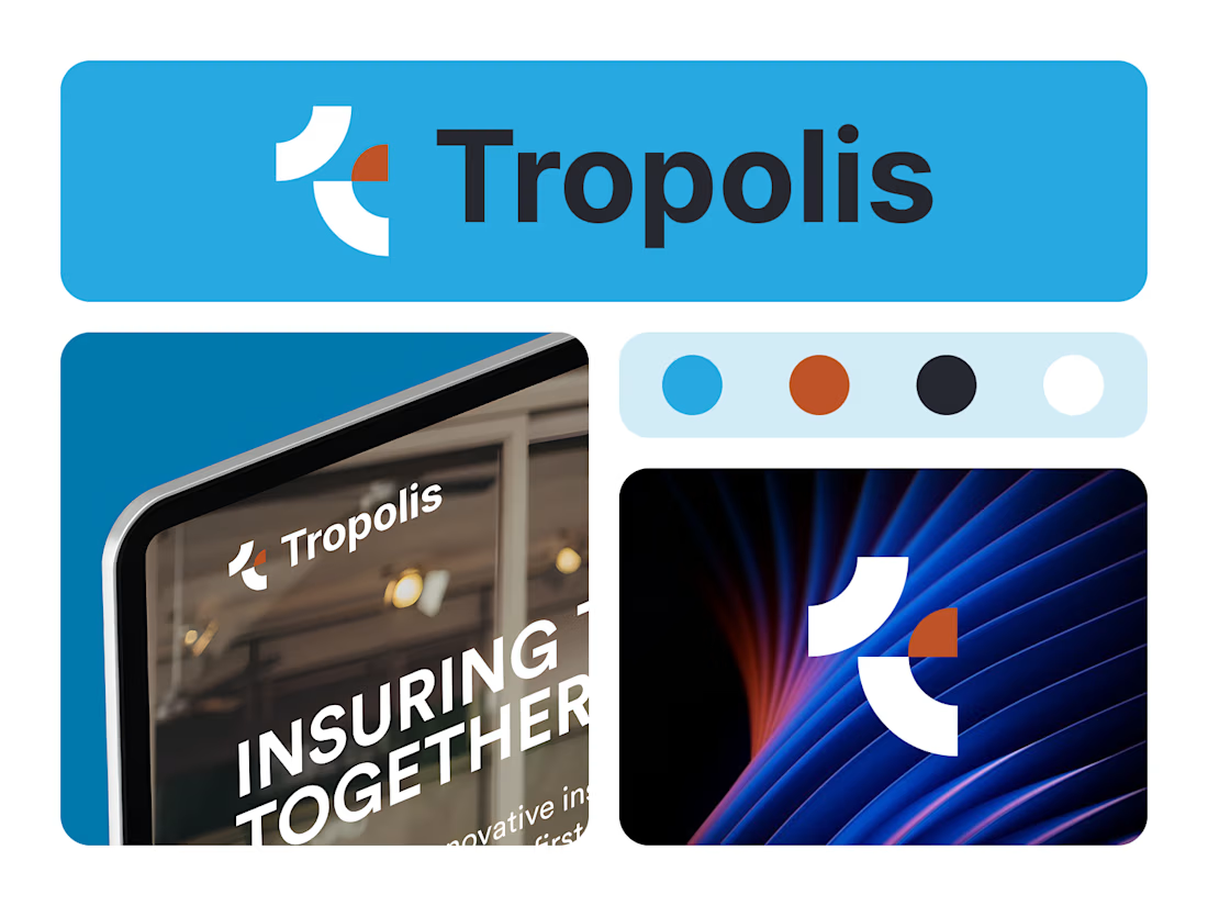
Primary Blue: #26A9E0
Accent Orange: #BF5002
Dark Background: #262830
Light Background: #F4F6FA
White: #FFFFFF
The blue represents trust, clarity, and professionalism, which are important qualities for an insurance and financial services brand. The orange accent adds energy, warmth, and a modern touch, helping the identity feel more human and approachable.
The dark background option gives the brand a premium and technology-focused appearance, while the light background keeps the identity clean, open, and easy to use across digital and print applications.
Typography
The wordmark was designed to feel strong, modern, and highly legible. The use of a capital “T” with lowercase letters creates a professional yet approachable balance.
The typography supports the brand’s personality by feeling confident and established without becoming too corporate or rigid. It gives Tropolis a polished identity that can work well across websites, presentations, business cards, social media, and marketing materials.
Visual System
The logo was designed with scalability in mind. It works clearly in full color, single color, light background, dark background, and small-size applications.
This makes the identity flexible for different brand touchpoints, including:
Website header
Social media profile
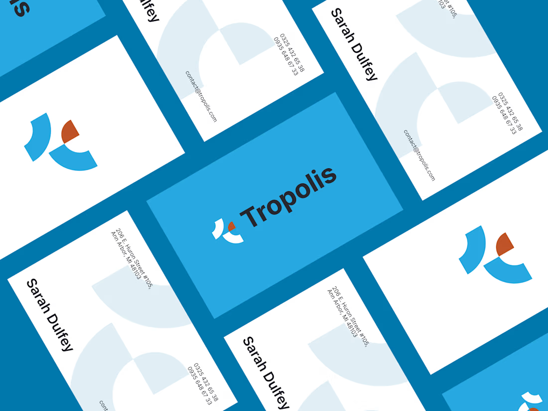
Business cards
Presentation decks
Email signatures
Digital ads
Print materials
Brand documents
Partnership and acquisition materials
Final Outcome
The final Tropolis logo identity gives the brand a more confident, modern, and memorable presence. It moves away from traditional insurance visuals and introduces a cleaner, more innovative direction that better reflects the company’s technology-forward and growth-focused personality.
The result is a professional logo system that feels trustworthy, fresh, scalable, and ready for future brand expansion.


The network for creativity
Join 1.25M professional creatives like you
Connect with clients, get discovered, and run your business 100% commission-free
Creatives on Contra have earned over $150M and we are just getting started
Related posts

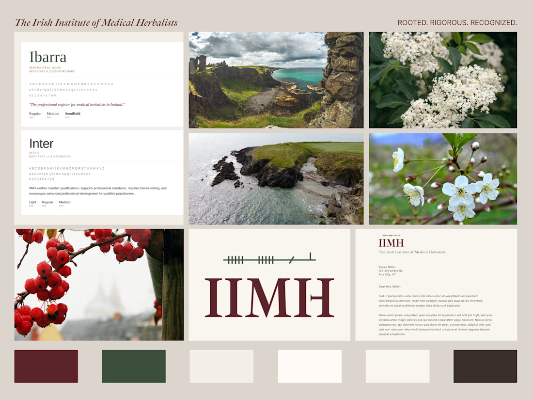
The IIMH is the professional register for qualified medical herbalists in Ireland. A small organisation, but one with serious credentials and a story worth telling visually.
The brief was clear from the start. Clinical authority first. Irish identity second. Nothing that reads as wellness, herbal tea, or alternative therapy.
The logo draws on Ogham, the ancient Irish tree script. Written horizontally as it appeared in Irish manuscripts rather than carved vertically on stone. It sits quietly above the IIMH wordmark.
The brand is built to live across a professional register site, membership certificates, a Code of Ethics document, and formal correspondence. Every decision made with one question in mind:
Would a GP take this seriously?
The answer is YES.

I like the feel

Quick A/B test for this hero section redesign for Aventura Swimwear.
Here, I focus on highlighting what's unique to the brand above the fold.
Which variation do you think is better? The original design is also attached.

4 voted
31%
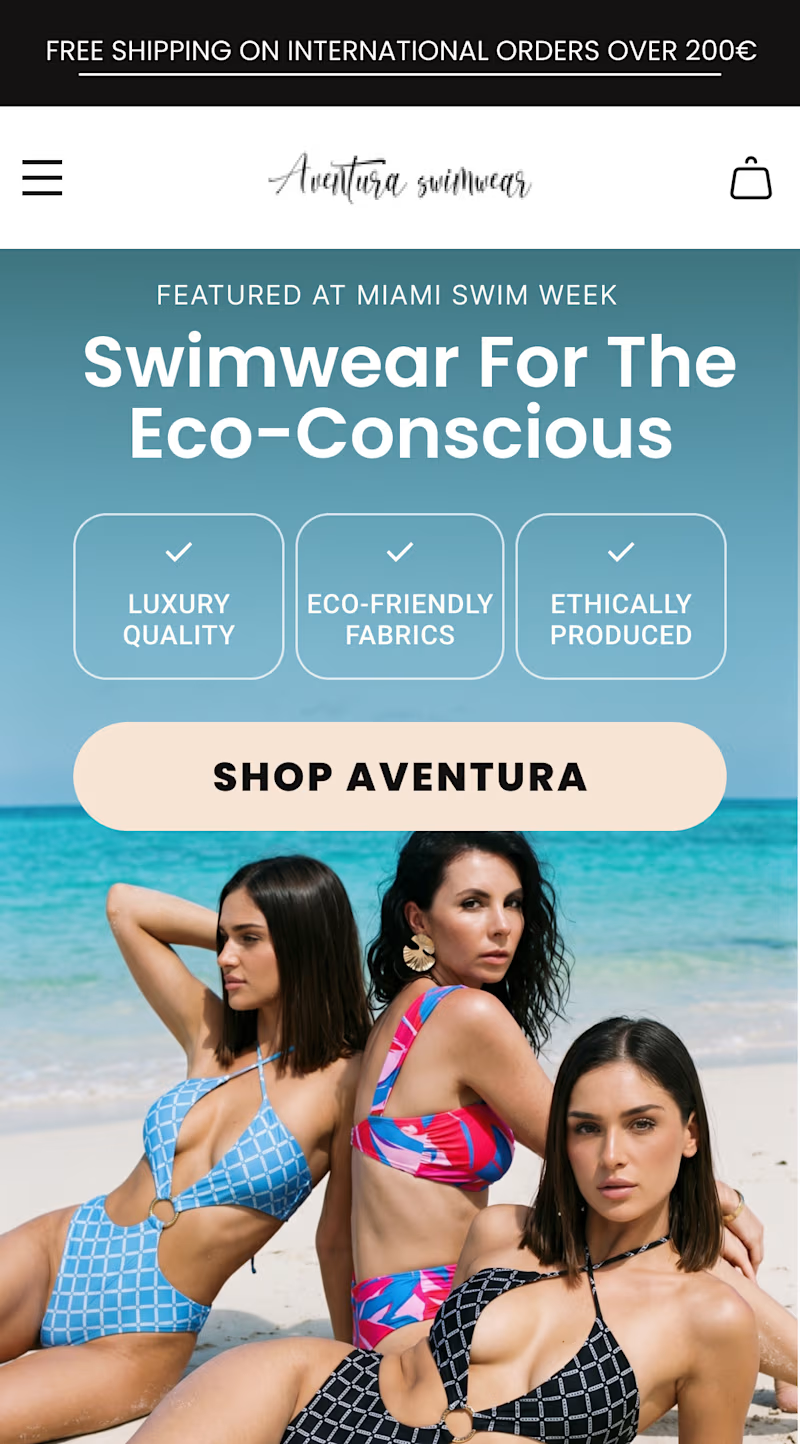
9 voted
69%
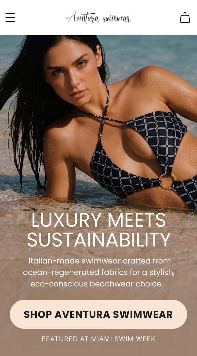
13 votes
Closed

Option 2
Hi everyone! 👋
This is my first post here, so I thought I'd share something I've been really excited to work on.
I recently designed the AI Project Setup experience for ThinkEasy from scratch. The goal was to make creating research projects feel simple and intuitive, while using AI to guide users instead of overwhelming them.
It was a fun challenge to figure out how to balance flexibility with clarity, and I'm really happy with how it came together.
I'd genuinely love to hear your thoughts or feedback!
#UXDesign #ProductDesign #AI #CaseStudy #UserExperience


This is nice 👍




Trending

Claude
Claude has entered the design space. How are you using Claude Design?

Contra University
Learn from expert creatives how to earn more using next-gen AI tools.
fifaworldcup2026
The World Cup is here and the whole world's watching. How are you designing for the world stage?
creativeaiflow
Creative AI workflows are evolving. What tools do you use, and what are their strengths and weaknesses?
freelancerlife
Freelancer life is wins, pivots, and everything in between. What’s yours right now?