The network for creativity
Join 1.25M professional creatives like you
Connect with clients, get discovered, and run your business 100% commission-free
Creatives on Contra have earned over $150M and we are just getting started
Back to feedPost

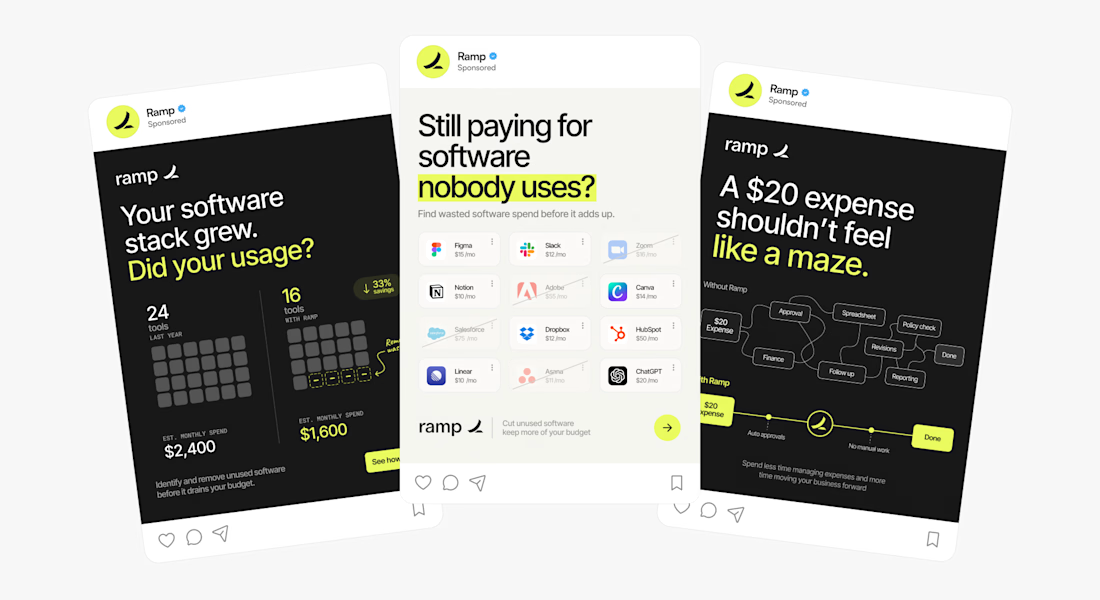
Some static ad work for @ramp
Who said static has to be boring? 🤟
The network for creativity
Join 1.25M professional creatives like you
Connect with clients, get discovered, and run your business 100% commission-free
Creatives on Contra have earned over $150M and we are just getting started



Related posts

Taste Test: Bounce vs. Blueprint
Two 30-second motion pieces in two very different design languages, randomly drawn from a list of 60 styles.
Sprout: Flat Design
A houseplant-care app told with bright, shadowless shapes and springy bounce-in motion. Friendly icons, a weekly watering chart, a testimonial bubble and a “Pick your pal” shop all pop in with a circle wipe between scenes.
Atelier Nord: Modernism
An architecture studio told with restraint. Line drawings build themselves, from a house elevation to a floor plan, in a warm grey, black and off-white palette with a single orange accent. Clean type and sliding wipes keep it calm and precise.
One format, two moods: playful and rounded vs. quiet and exact.
2 videos · 30s each · 1080×1080 · 30 fps
Styles: Flat Design · Modernism


3 voted
43%
4 voted
57%
7 votes
Closed

Flat design, colors are eye catchy😊

Two ad directions for Aura Aesthetics’ Botox Flash Sale. Same offer, different layout and feel.
Option A: split layout, model left, price card right, olive green accents, bold and direct
Option B: model fills the right, soft rounded cards on the left, all warm neutrals, quieter and more elegant
Which one makes you tap “Schedule Your Discount”? 👇
9 voted
53%

8 voted
47%

17 votes
Closed
Botox Flash Sale feels more natural😊 Nice creativity


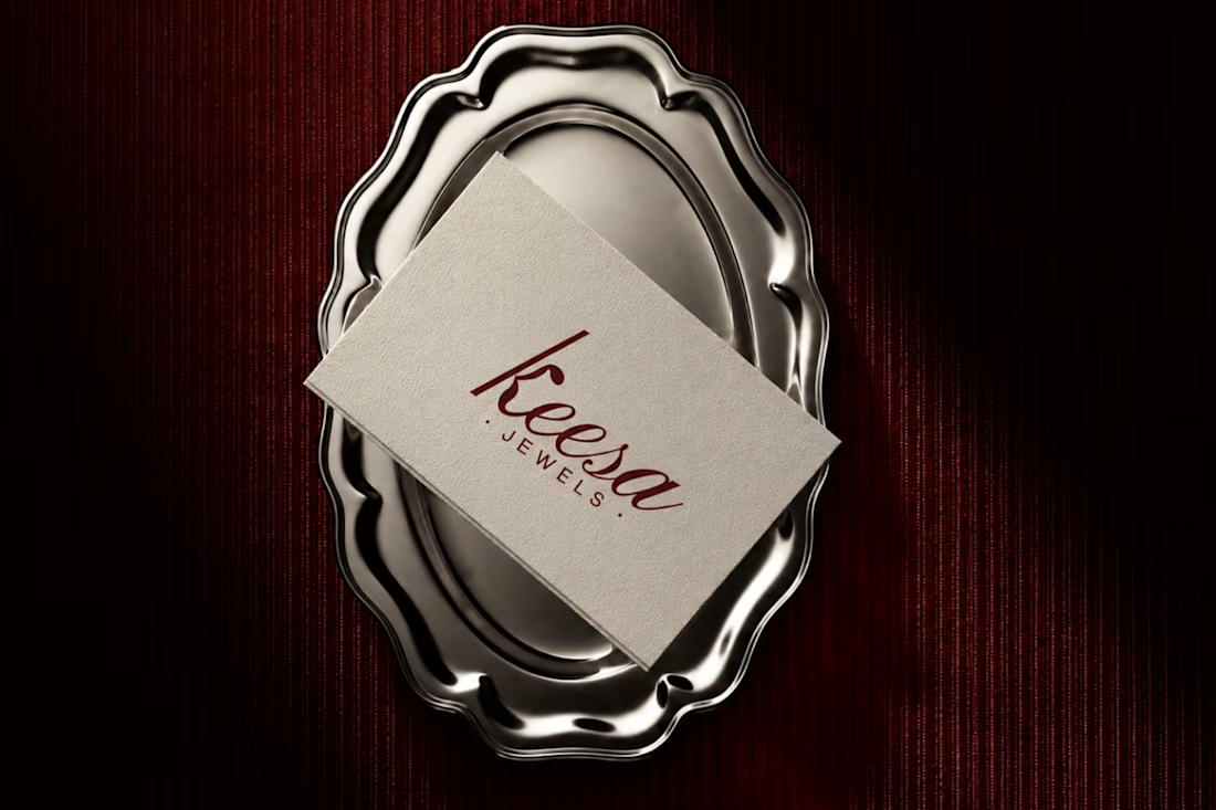
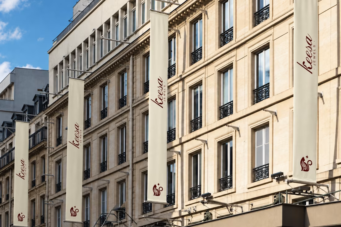
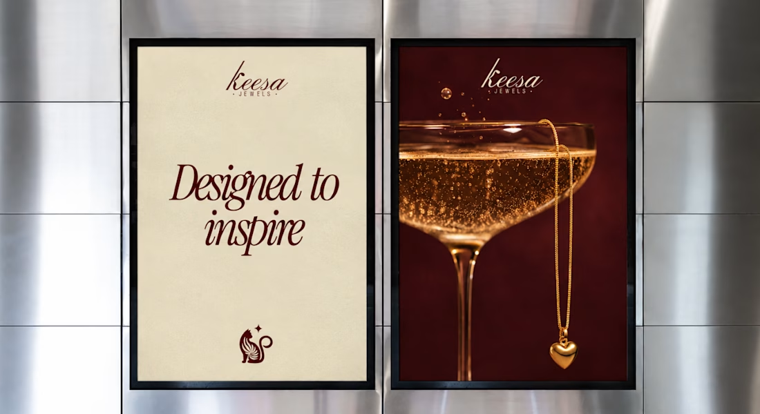
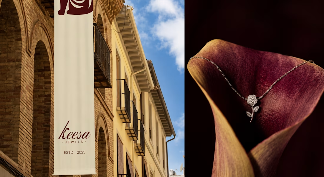
Most jewelry brands don’t have a logo problem.
They have a “who is this for?” problem. When KEESA Jewels came to me, the brief was [what they asked for]. But the real issue was "they looked like everyone else in the category"
So before opening Illustrator, I ran Discovery:
→...

Thats really Professional