The network for creativity
Join 1.25M professional creatives like you
Connect with clients, get discovered, and run your business 100% commission-free
Creatives on Contra have earned over $150M and we are just getting started
Back to feedPost
Taste Test

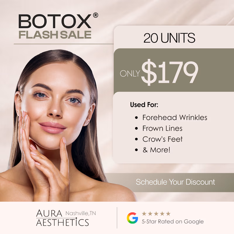
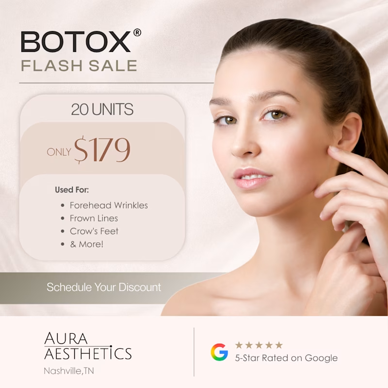
Two ad directions for Aura Aesthetics’ Botox Flash Sale. Same offer, different layout and feel.
Option A: split layout, model left, price card right, olive green accents, bold and direct
Option B: model fills the right, soft rounded cards on the left, all warm neutrals, quieter and more elegant
Which one makes you tap “Schedule Your Discount”? 👇
4 votes
Ends in 1d
The network for creativity
Join 1.25M professional creatives like you
Connect with clients, get discovered, and run your business 100% commission-free
Creatives on Contra have earned over $150M and we are just getting started











Related posts

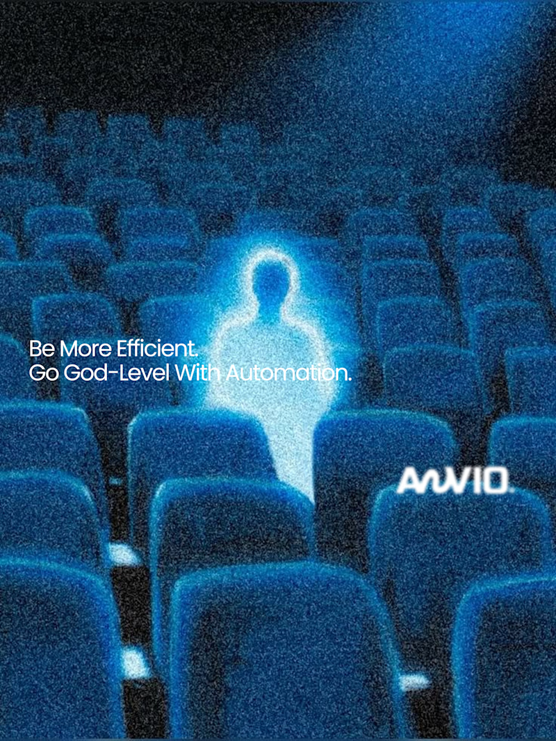
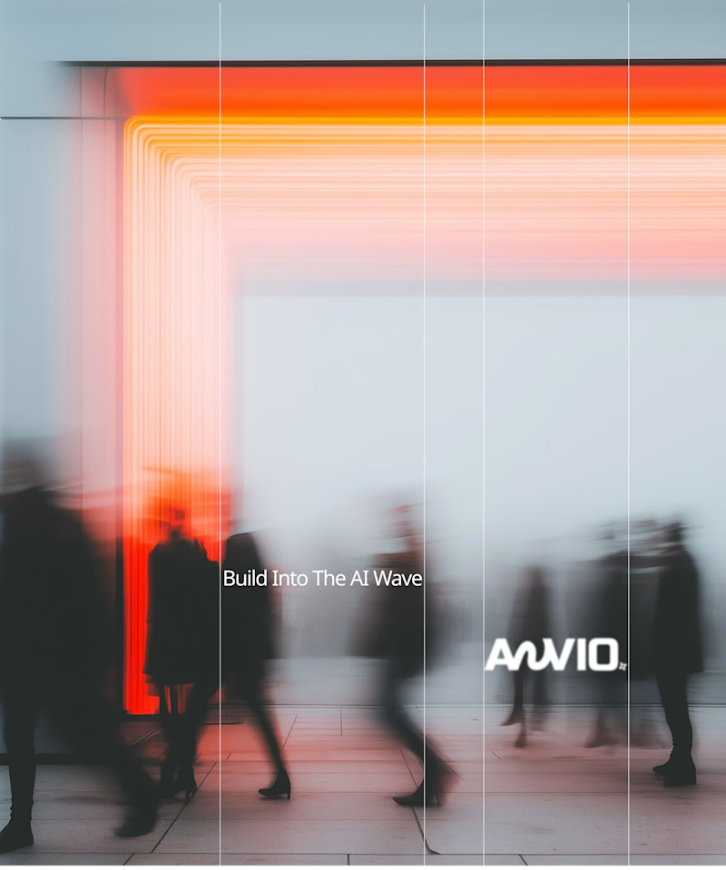
Which creative direction better communicates a Tech-Forward AI Brand Identity for anvio.online ?
25 voted
44%
32 voted
56%
57 votes
Closed

Fast vibrant energy gets my vote. The warm glow feels more human, which is nice for an AI brand.

Two camera distances for the same Movable Ink cut. One leans in, one shows the whole layout. 1 or 2.
10 voted
50%
10 voted
50%
20 votes
Closed

2 is more stunning the animations feels unique and that's unbelievable 🎉🎉🔥🔥
great job Blahomyr❤️❤️

What does trustworthy finance look like to you?
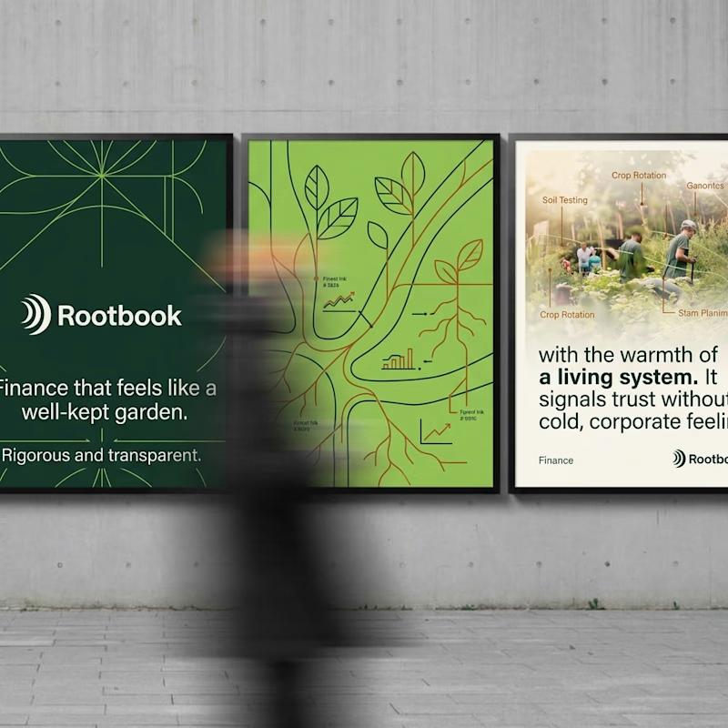
A) Rootbook: Finance that feels like a well-kept garden.
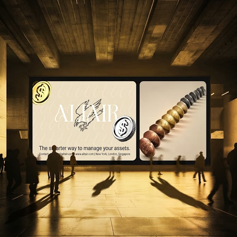
B) Altair: The smarter way to manage your assets.
Two finance brands I’m designing, two completely opposite worlds. Which one gets your money?
28 voted
61%
18 voted
39%
46 votes
Closed
Rootbook wins for me. A finance brand that feels like a well kept garden is such a refreshing idea.