The network for creativity
Join 1.25M professional creatives like you
Connect with clients, get discovered, and run your business 100% commission-free
Creatives on Contra have earned over $150M and we are just getting started
Back to feedPost
The Services page for Reverie is now finished.
Rather than treating services as simple cards, I built the experience around how a couple actually explores planning support:
Explore → Understand → Compare → Enquire
The page includes:
Three core planning services
CMS-powered service detail pages
Structured service descriptions and inclusions
Pricing information
Editorial image galleries
A dedicated enquiry path for couples who aren't sure where to begin
The goal was to keep everything useful without making the experience feel overly commercial.
Built in Framer, with a warm editorial direction inspired by Mediterranean weddings and contemporary European design


More of a starting range. I wanted to give couples enough context to understand the level of investment without making the services feel overly transactional. The exact quote would depend on the scope and celebration

Professional work
Thank u !!
The network for creativity
Join 1.25M professional creatives like you
Connect with clients, get discovered, and run your business 100% commission-free
Creatives on Contra have earned over $150M and we are just getting started




Related posts


cohestra’s journal in light and dark. which would you keep?
26 voted
41%
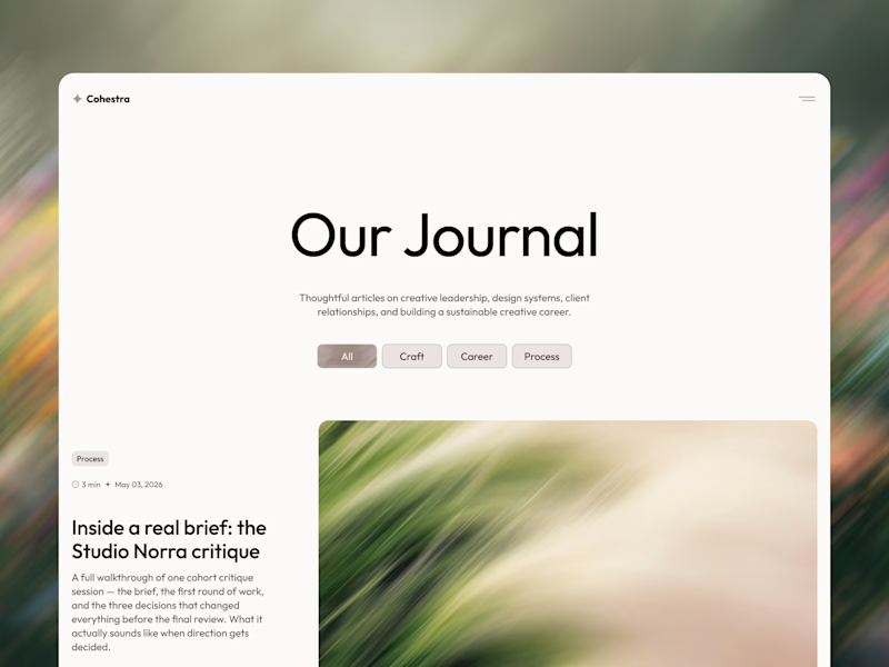
37 voted
59%
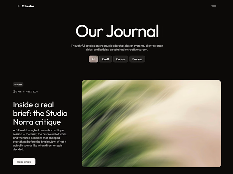
63 votes
Closed


light: more clear for me 🎉


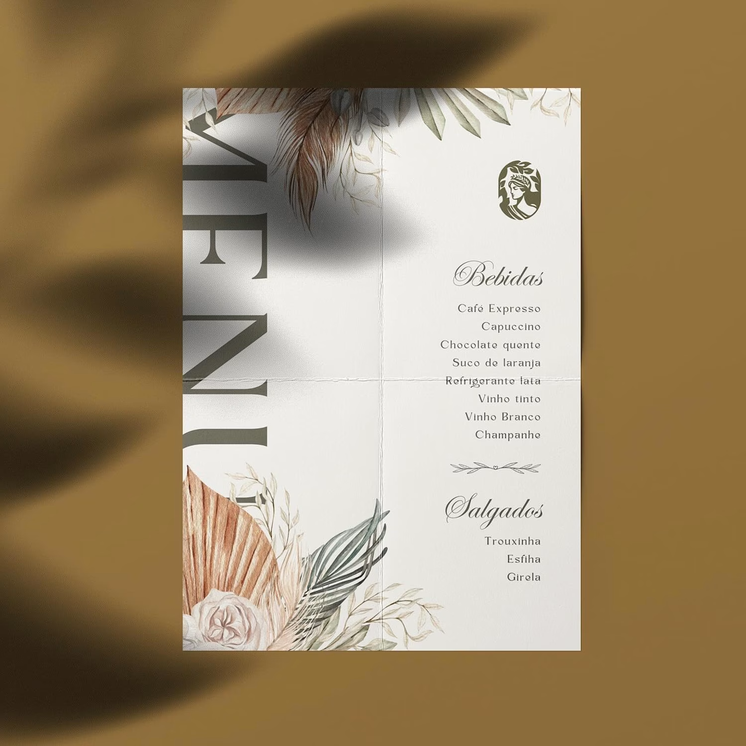
Hot take: aesthetics and clinical results should walk hand in hand.
Most brands in this space lean into cold, sterile whites or aggressive dark tones. It reads functional, but it also feels like something you'd hide in a medicine cabinet, not display on your vanity.
For this rebrand, we anchored the identity in classical beauty and organic sophistication. By combining warm earthy tones, botanical cues, and timeless iconography, we moved away from the "pharmacy product" feel into true high-end personal care.
It was a deliberate shift: positioning the brand not for someone who feels like they are treating a flaw, but for someone investing in a premium daily ritual.
Would a piece like this deserve a spot on your display shelf?






This is brilliant!


