The network for creativity
Join 1.25M professional creatives like you
Connect with clients, get discovered, and run your business 100% commission-free
Creatives on Contra have earned over $150M and we are just getting started
Back to feedPost


The network for creativity
Join 1.25M professional creatives like you
Connect with clients, get discovered, and run your business 100% commission-free
Creatives on Contra have earned over $150M and we are just getting started





Related posts


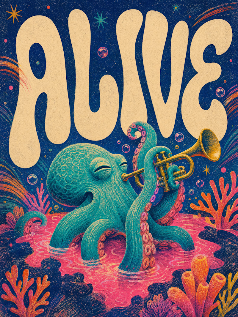
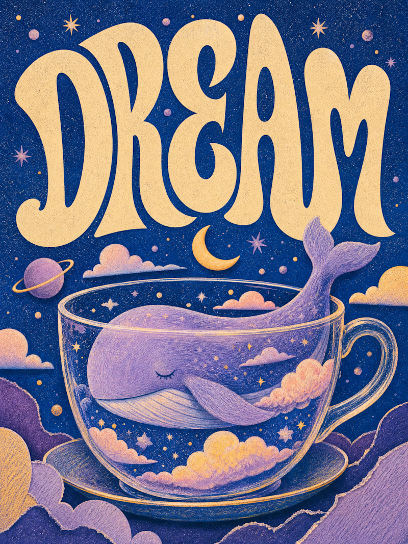
Only one will win, and you get to decide which.
Two AI-generated images. Same creative intent. Different visual outcomes.
The images were generated with AI, but the art direction, visual decisions, composition, styling, and overall creative direction came from me as the human behind the work.
Now comes the real taste test.
Which one has the stronger visual language? Which one feels more intentional, more refined, and more memorable?
11 voted
69%
5 voted
31%
16 votes
Closed

Outstanding work

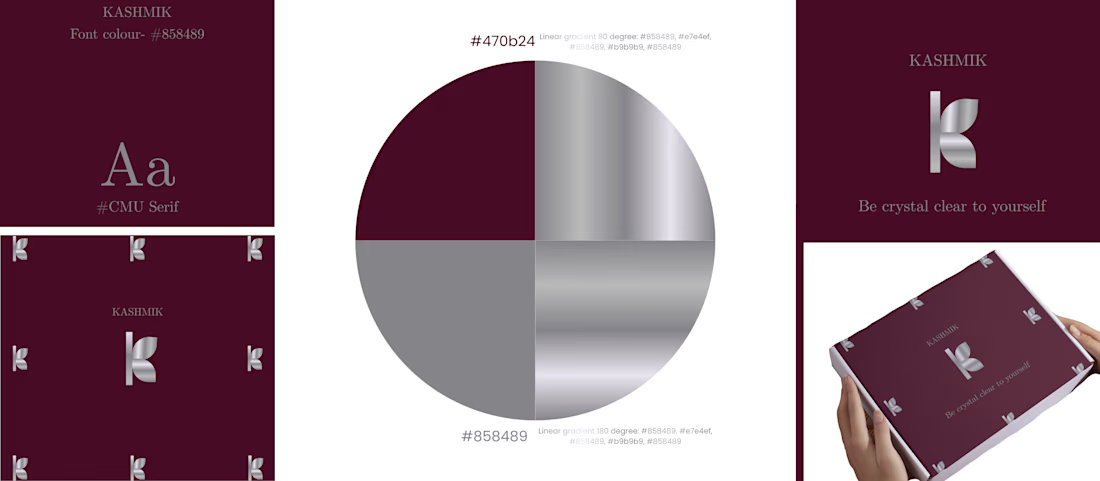
Designing Brand identity ✨
SILVER + DARK PINK = Luxury.
KASHMIK- 'Be crystal clear to yourself' , is a journal brand which is made to give you a feel of luxury and openness to yourself. The colour chosen is show how bold you are, how unique you are.

That's really great for luxury brands great job 🎉🎉

Hey everyone! 👋
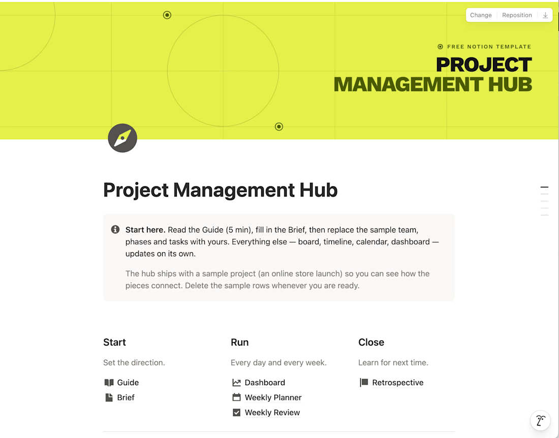
I built a Project Management Hub in Notion to run projects from brief to retrospective in one calm, minimalist workspace. It's for sale on Gumroad, but I'm sharing it for free with the Contra community.
It includes a guide, project brief, dashboard, weekly planner and review, plus 7 linked databases (tasks, phases, team, budget, risks and more). A sample project shows how everything connects.
It's for your personal use only, so please keep it within the Contra network.
Hope it helps! Let me know what you think 🙌


Love this!!