The network for creativity
Join 1.25M professional creatives like you
Connect with clients, get discovered, and run your business 100% commission-free
Creatives on Contra have earned over $150M and we are just getting started
Back to feedPost

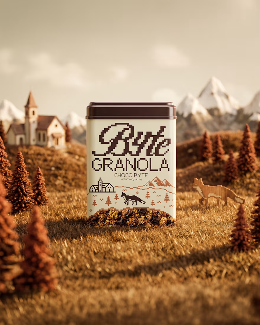
Granola is one of those products where a lot of brands start looking the same. Kraft paper bags, earthy colors, a simple logo and a picture of oats. There's nothing wrong with that, but I wanted Byte to feel a little different.
So instead of going with the usual bag or box, I used a tin. The whole brand is inspired by 90s gaming, with a pixel art fox, a landscape scene and colors that change with each flavor. I also added a little window so you can actually see the granola inside.
I didn't want to make these choices just for the sake of looking different. I wanted to take something as simple as granola and build a brand around it that feels playful and has its own personality. Something that you'd notice on a shelf, even when it's sitting next to so many other brands.
I think when you're designing a brand in a crowded category, it's worth looking at what everyone else is doing and asking yourself, is there another way to approach this?
The network for creativity
Join 1.25M professional creatives like you
Connect with clients, get discovered, and run your business 100% commission-free
Creatives on Contra have earned over $150M and we are just getting started








Related posts

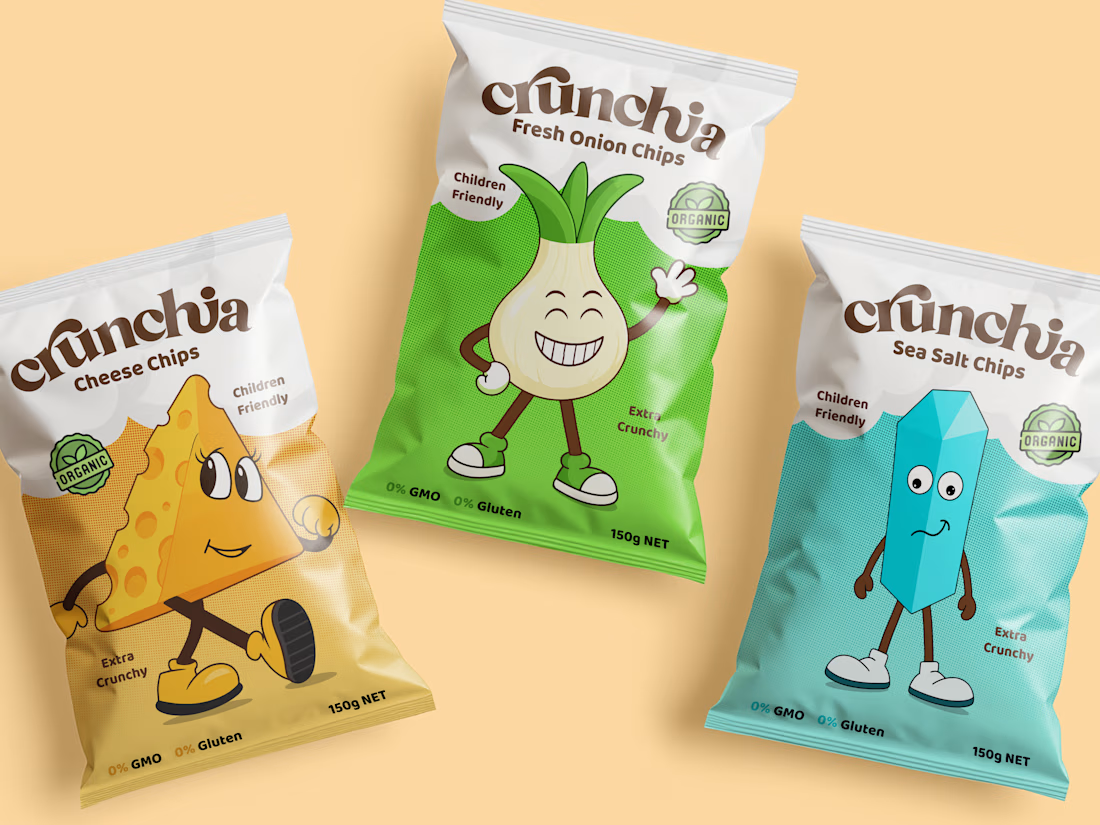
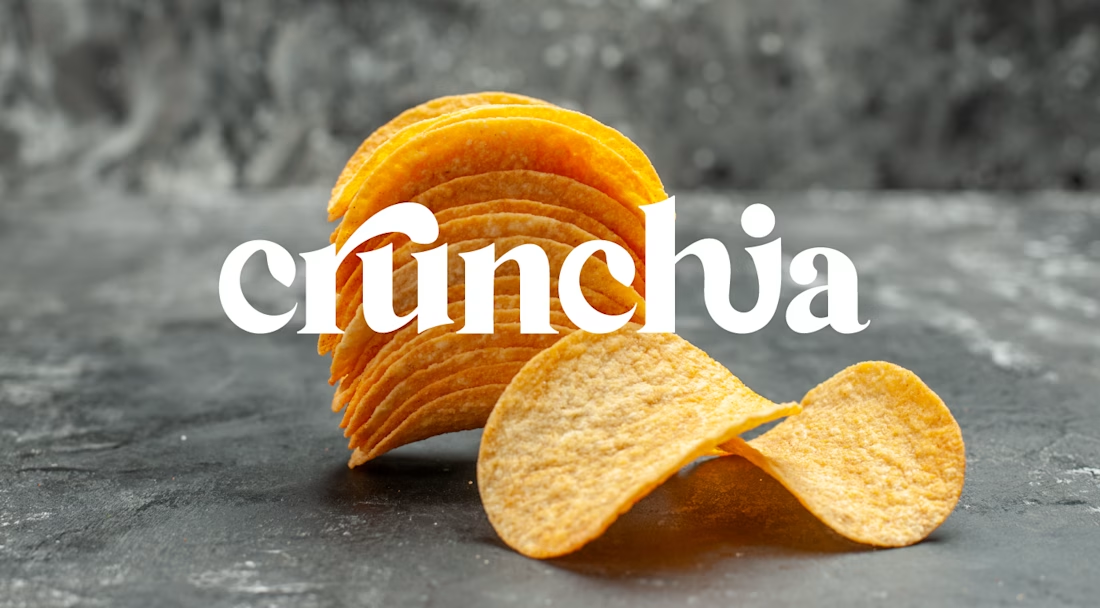
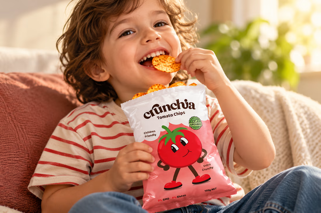
Crunchia – Brand Identity & Packaging Design
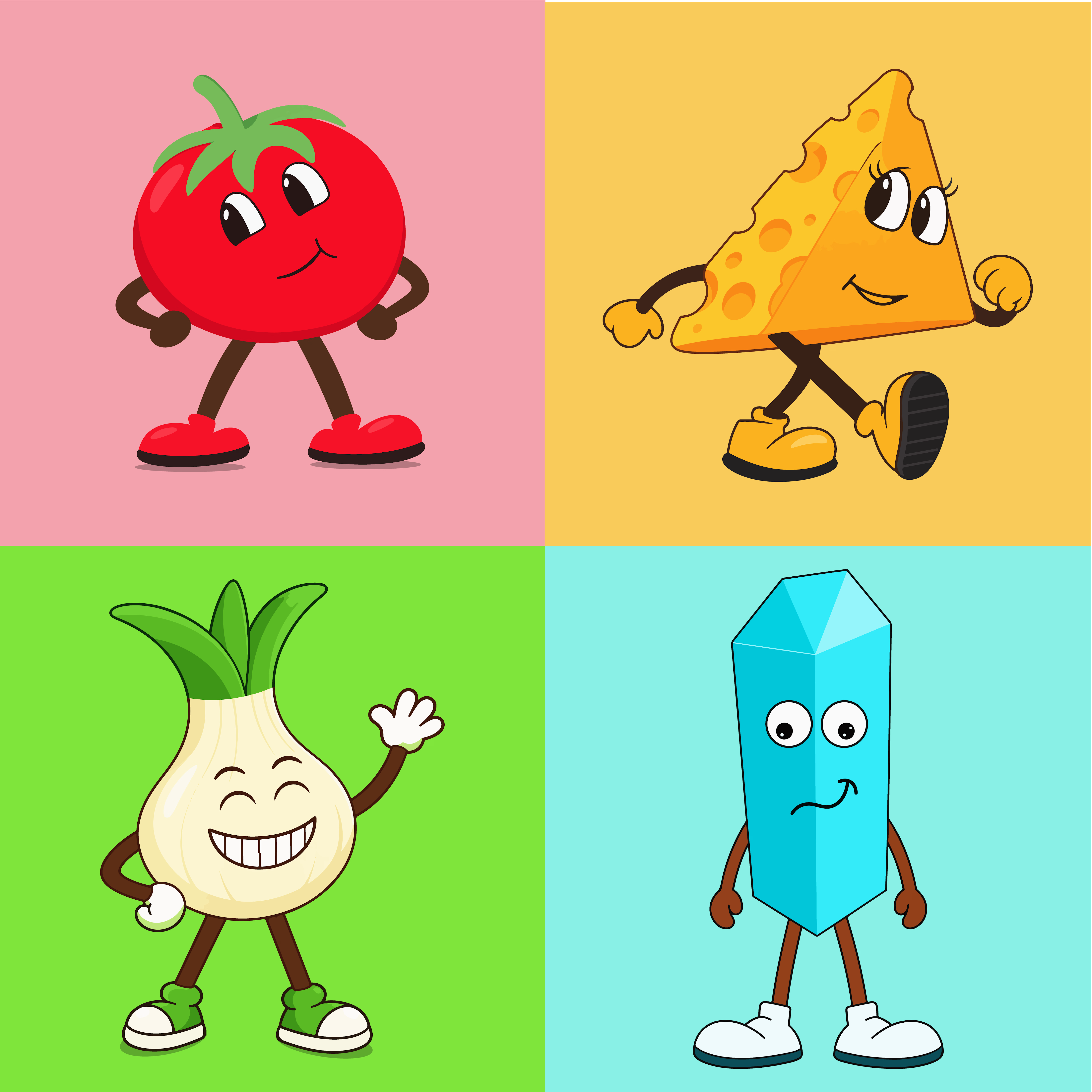
Developed a playful and eye-catching brand identity and packaging design for Crunchia, a tomato chips brand aimed at children and families. The project included a custom logo, vibrant packaging design, and a friendly tomato mascot to create a memorable and recognizable brand.
I also created realistic product mockups and lifestyle visuals to showcase the packaging and present the product in an engaging, market-ready way.




New case study is up on my profile! A fun passion project I worked on earlier this year🚲

super cool project! the typographic work is impeccable and super interesting

In just one monthly sprint, we built a fresh brand identity and a brand-new landing page for StocksWithJosh.
The goal was twofold: a logo that captures who Josh is and what his brand stands for, and a landing page that turns visitors into members of his Discord community.
Curious what a monthly sprint could do for you? Take a free brand scan to see where your brand can grow, or book a free call and let’s talk.

This is brilliant Tim! Love how you balanced personal brand with conversion focus. The SWJ logo mark is so clean and the Discord landing is smart - community > followers. Great strategy!

