The network for creativity
Join 1.25M professional creatives like you
Connect with clients, get discovered, and run your business 100% commission-free
Creatives on Contra have earned over $150M and we are just getting started
Back to feedPost
Taste Test
As a professional, what do you prefer?
Simple white or professional black?
6 voted
43%
8 voted
57%
14 votes
Closed

Professional black, especially for anything explainer-heavy where you want the content to hold focus over the frame. Does the answer change for you depending on the client's brand, or do you have a house style you default to?

Thanks, Maty. I'm currently also helping clients define gaps in their branding, so this is a great help. You know what you're talking about.🙌
That's exactly the kind of gap work that saves a rebrand from going in circles later. When you're helping clients spot those gaps, is it usually missing visual assets, or more that the messaging doesn't match across touchpoints?
Absolutely. I usually act as a consultant to review the project and reduce the GTM gap, and as a heolitic designer to ensure everything is integrated. Everything plays a role.

in this case, i think the white gives the motion design more clarity!

Option 1 with the white background, It shows more depth with the shadows.
I've thought that too; shadows get a little lost in black.

Upgoating Option 2

I usually avoid using white background.
The network for creativity
Join 1.25M professional creatives like you
Connect with clients, get discovered, and run your business 100% commission-free
Creatives on Contra have earned over $150M and we are just getting started


Trending
retrofuturism
Share your favorite designs from the past exploring the distant future. Or your own take on the aesthetic 🚀
halftone
Dots. Texture. Grain. Let's see your designs using the halftone technique.

Midjourney
Creatives are showing off what they're making with Midjourney.
colorgrade
Video editors sound off: How do you enhance the mood of your video in color grading?
Related posts


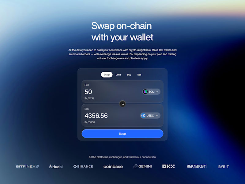
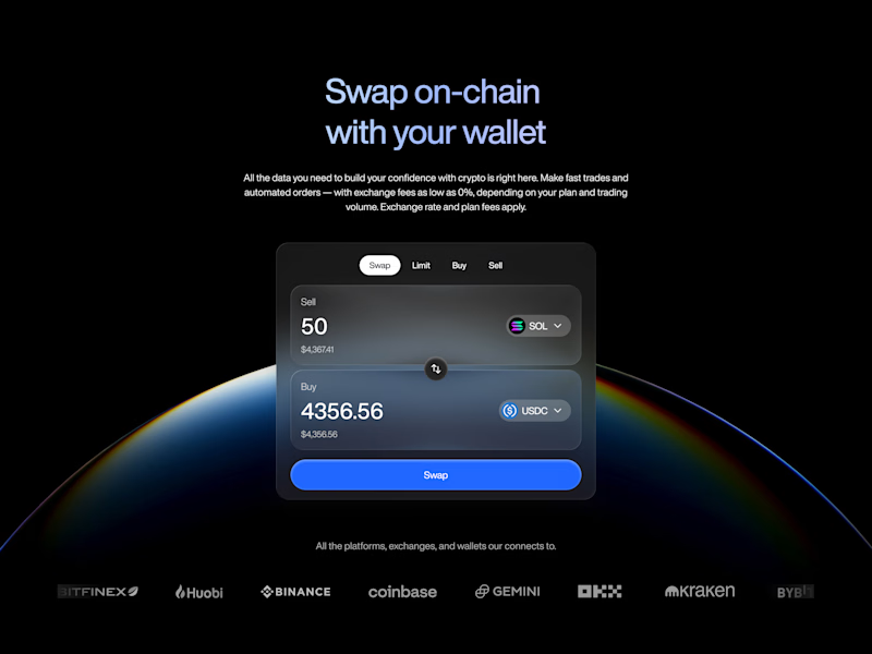

A very tough call tbh! But its B for me. the dark background makes the wallet pop way more.🙌

ASCII Filter - Same framer component. Two completely different outputs.
A --> subtle & organic
B --> bold & graphic
✨ Explore → for more such components.
Which one would you pick? 👀
👇🏻 A or B ?

14 voted
44%
18 voted
56%
32 votes
Closed
Misspelled Ascii Engine :)
A brand refresh doesn’t always start with one “perfect” direction.
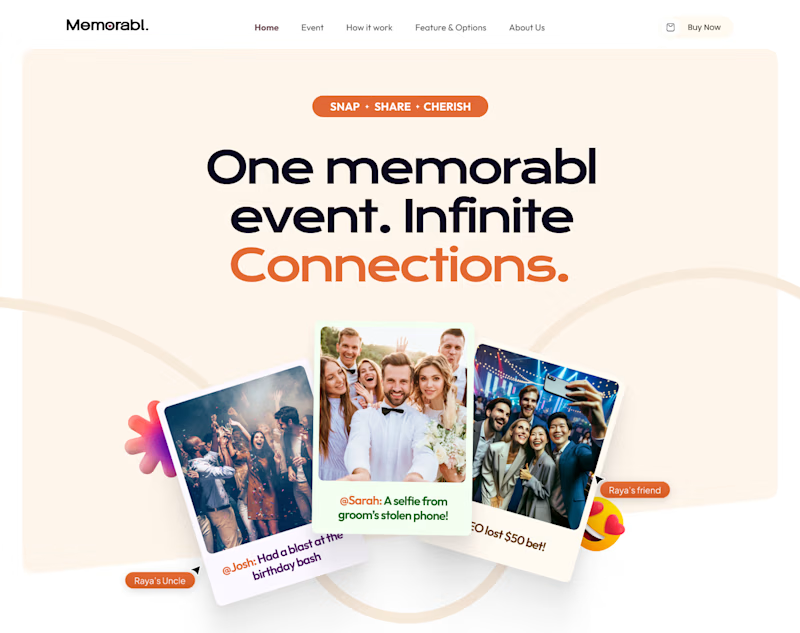
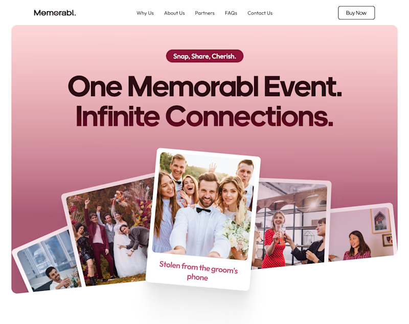
For Memorabl, I explored two very different homepage routes, both built around the same idea but with totally different personalities.
Option🅰️: Warm + playful
Soft neutrals, orange accents, layered photography, and a more expressive feel.
Option🅱️: Bold + editorial
A stronger pink palette, cleaner composition, larger typography, and a more polished look.
Since I was also refreshing the brand, I wanted the client to see how far the identity could stretch before choosing a direction.
Same product. Same goal. Two very different first impressions.
Which one would you choose and why? 👀
9 voted
64%
5 voted
36%
14 votes
Closed

I’ll go with option A, because it’s highly all the elements in your hero, and color combination goes very well all together.