The network for creativity
Join 1.25M professional creatives like you
Connect with clients, get discovered, and run your business 100% commission-free
Creatives on Contra have earned over $150M and we are just getting started
Back to feedPost
Taste Test

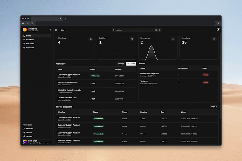
Redesigned Linea's home screen. The bit i care about most is the signals panel, the system watches every run and flags anything that looks wrong: "hallucination suspected", "tool error", last seen, how often. you catch it before a user does.
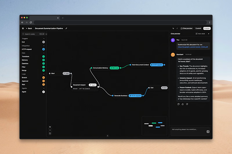
Each execution shows its cost. the support assistant's about a cent a run. Second shot is the canvas where the flows get built.
Is the home page enough at a glance, or would you pull executions higher?


0 voted
0%
1 voted
100%
1 vote
Closed
The network for creativity
Join 1.25M professional creatives like you
Connect with clients, get discovered, and run your business 100% commission-free
Creatives on Contra have earned over $150M and we are just getting started





Related posts


Your homepage should answer one question: what do you do? If a visitor can't answer that in five seconds, everything below the fold doesn't matter.


I just saw Bright Studios’ new website. You guys nailed it! Really like it.


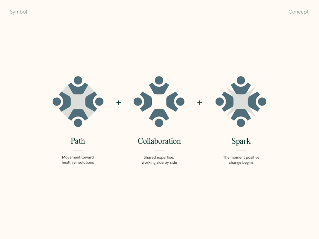
Mockups are great, but when presenting a visual identity to clients, we always include a slide explaining the thinking behind the logomark and connecting it back to the strategy.
It makes feedback and further revisions so much smoother too


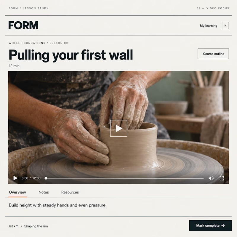
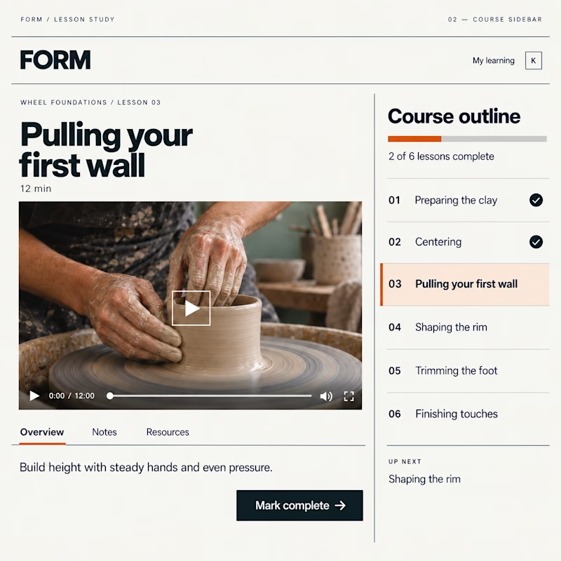
Which Kajabi lesson page would you rather learn in?
Same lesson. Two layouts: more room for the video, or the course outline always in view.
Vote below—what helps you stay focused?

19 voted
51%
18 voted
49%
37 votes
Closed

Course sidebar for me — when working through compliance training or technical documentation, seeing exactly where you are in the curriculum removes the mental overhead of 'how much is left?' The video focus layout makes more sense for story-driven content where you want the...